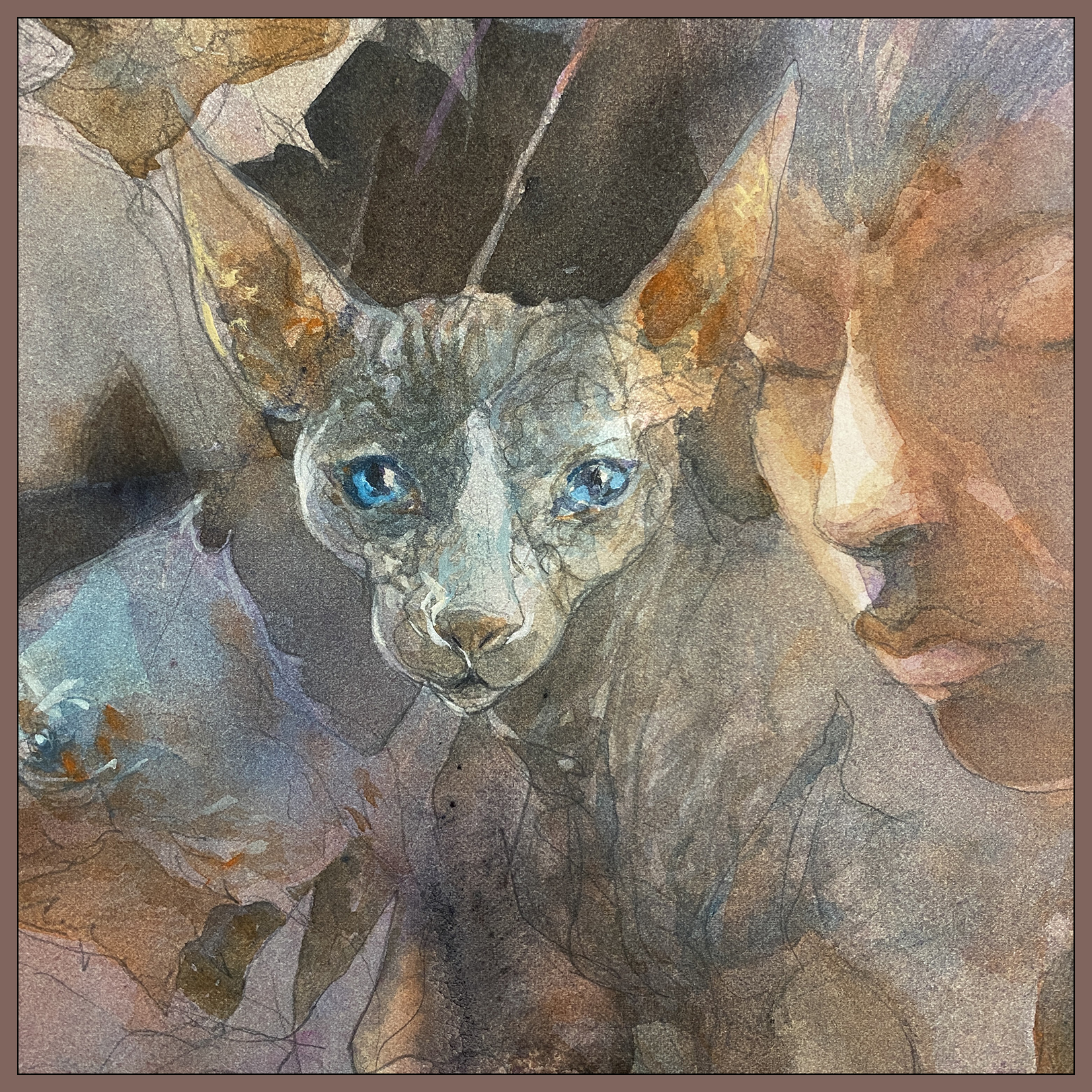
#30×30, 2025, Day 25: Inspiring Color

This one is a bit of an unusual palette – mostly Indigo Blue and Transparent Orange Oxide; two of my favorite watercolors. Indigo is probably a Pthalo + Black mix? someone can correct me – but it’s really a great complement to this rusty-red kind of color.

Though, I was running low on Transparent Oxide in my paintbox, so I’m also using some Shin Han Red Brown – PBr25 Benzimidazolone Brown – also labeled as Permanent Brown in the Daniel Smith line. Which is not really a proper replacement. That’s like taking a burnt sienna and using a maroon red instead.

Not sure how I did these rocks? Dirty water and maybe some Bloodstone Genuine? Sorry :)

I am finding it a little hard to get my favorite colors in my local stores, (nobody seems to carry all my preferred brands in one place).
I don’t actually like this PBr25 pigment that much – it’s a bit lacking in character, being transparent and dye-like, with no granulation, which I suppose makes for a clean color, but not what I’m looking for in an earth. I’m probably also mixing (on the paper) with Goethite, Naples Yellow and Olive Green. (All fairly opaque-ish watercolors).
I feel like if you alter the colors in your paintbox it might take you a dozen paintings to get used to them. Overall, I like this grey-blue/rust brown palette quite a bit so it worked out in the end!
~m
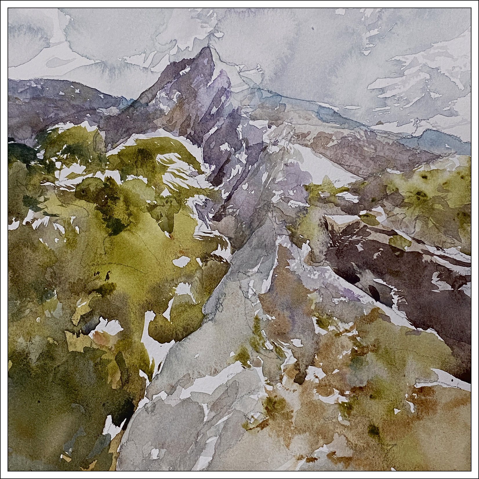
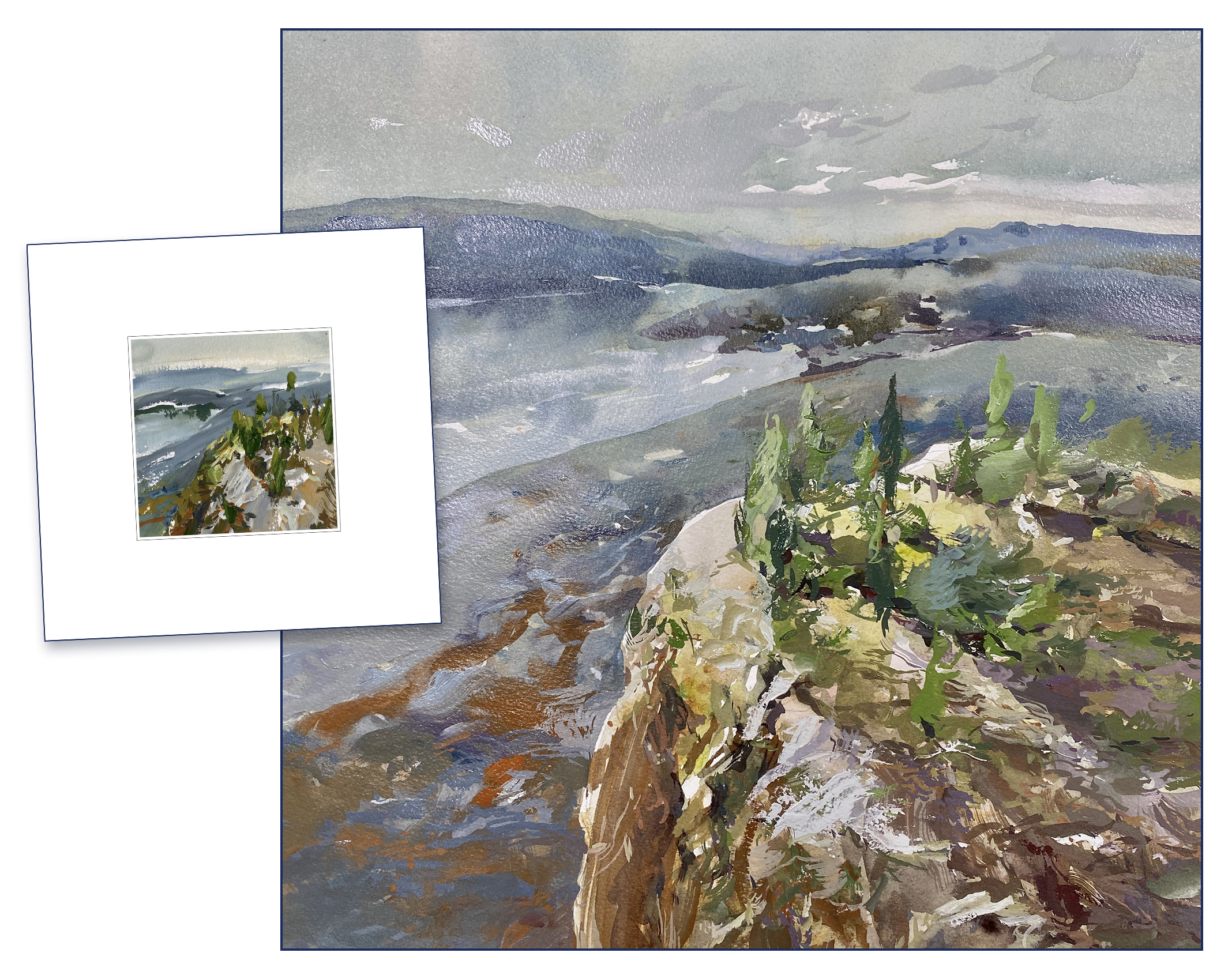
#30×30, 2025, Day 24: One Square Inch

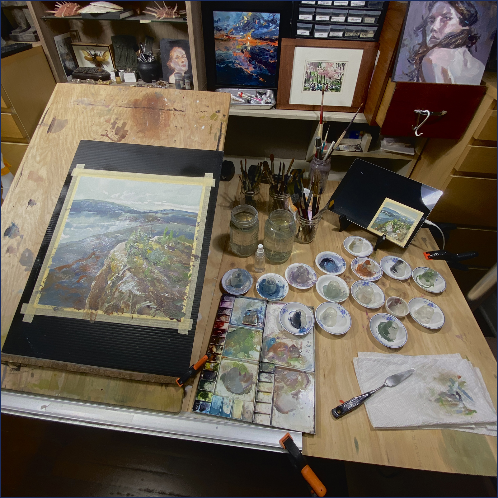
8×8″ Watercolor on Fabriano Artistico 140lb Cold Press.
There was a small part of this little 8×8″ painting that I had to fuss over a few times – rewetting and lifting color, painting in with some diluted gouache, and then wetting again – I was dangerously close to overworking the paper in that one little spot.
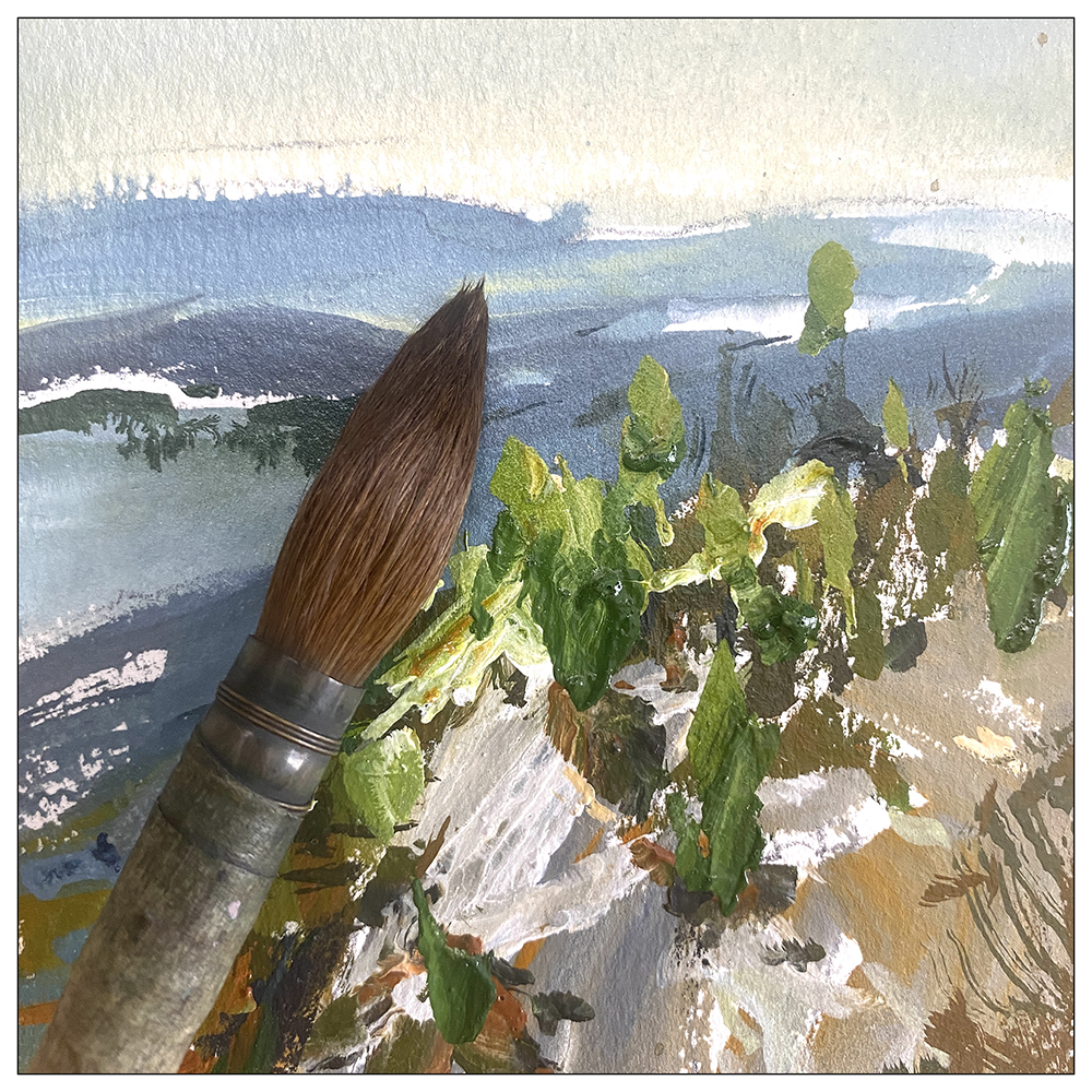
Can you guess what is the most crucial one-square-inch of this painting?

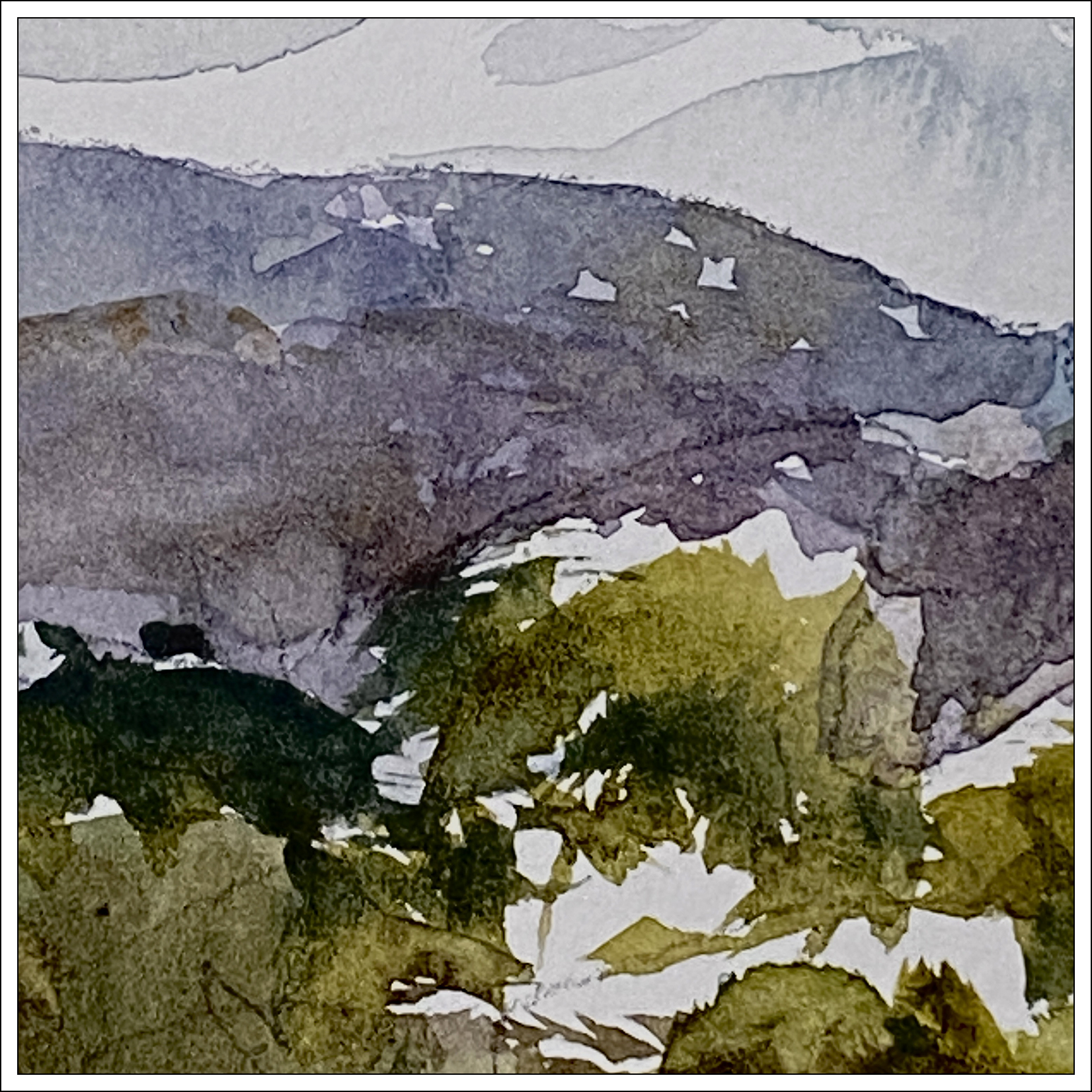
Of course, it’s this spot dead center in the image, where the white path ends at the top of the hill, and the distant horizon is pushed back with the haze of atmospheric perspective.
This point of overlap is where you most feel the sense of imaginary distance between these two planes; the foreground hill and the distant mountains.
I want the viewer to imagine themselves walking up this path, standing at that cliff edge, and looking out at the vista. If I hadn’t fussed with the value here – where dark edge meets light – subtly tweaking the contrast right here – the feeling of depth can be lost.

I did also tweak this little white hook on the left (white gouache!) to suggest that it might visually join the larger white blob on the right, and give the impression there is a distant lake behind the hill.
And then, here are some of the rake-marks you can make with a nice sable brush, with the stiff natural hairs splayed out :)
This goes back to the point from the other day about brush-size properly scaling with painting size. If you go bigger, you need bigger brushes, and more paint – but if you TOO big, you are really switching into pouring territory!
So maybe it’s a red herring – all my recent talk about painting larger? I am very used to how watercolor bleeds and creeps at this size.
I think about wall-size paintings every day – because I honestly feel like my sketchbook-sized work just doesn’t have the necessary appeal for galleries or awards. Working small seems like a limitation for a ‘serious artists’. Whatever that means as an ’emerging artist’ at 58 years old :) I’m not sure I should even be worrying about it any more :)
So!
Going to have to leave it there for today!
Leave me some comments people! I hope some of you are still with us as we’re stumping into the last week of the #30x30DirectWatercolor marathon.
Or perhaps you’re reading this years later, after this event has become a well-respected annual tradition, and many of our regulars are now famous painters. Here’s your chance to revive the thread and make me think about the good old days :)
See you tomorrow!
~m
#30×30, 2025, Day 23: Back to the Basics
8×8″ Watercolor on Fabriano Artistico 140lb Cold Press.
So! Just over a week left in the thirty day marathon!
I’m starting to feel a little mentally fatigued with so much learning of new things. I’ve been fussing around with gouache every day, with nothing to show for it on the ‘big panting’ goal. I’ve had a couple more giant-sized failures that I don’t think I’ll share – don’t want to belabor that point :)
Suffice to say; you can’t pick up a new medium and master it in a few weeks :)
It’s a kind of simple joy to go back to traditional watercolor. For me, it’s instinctive by now, so the paintings just happen on their own :)


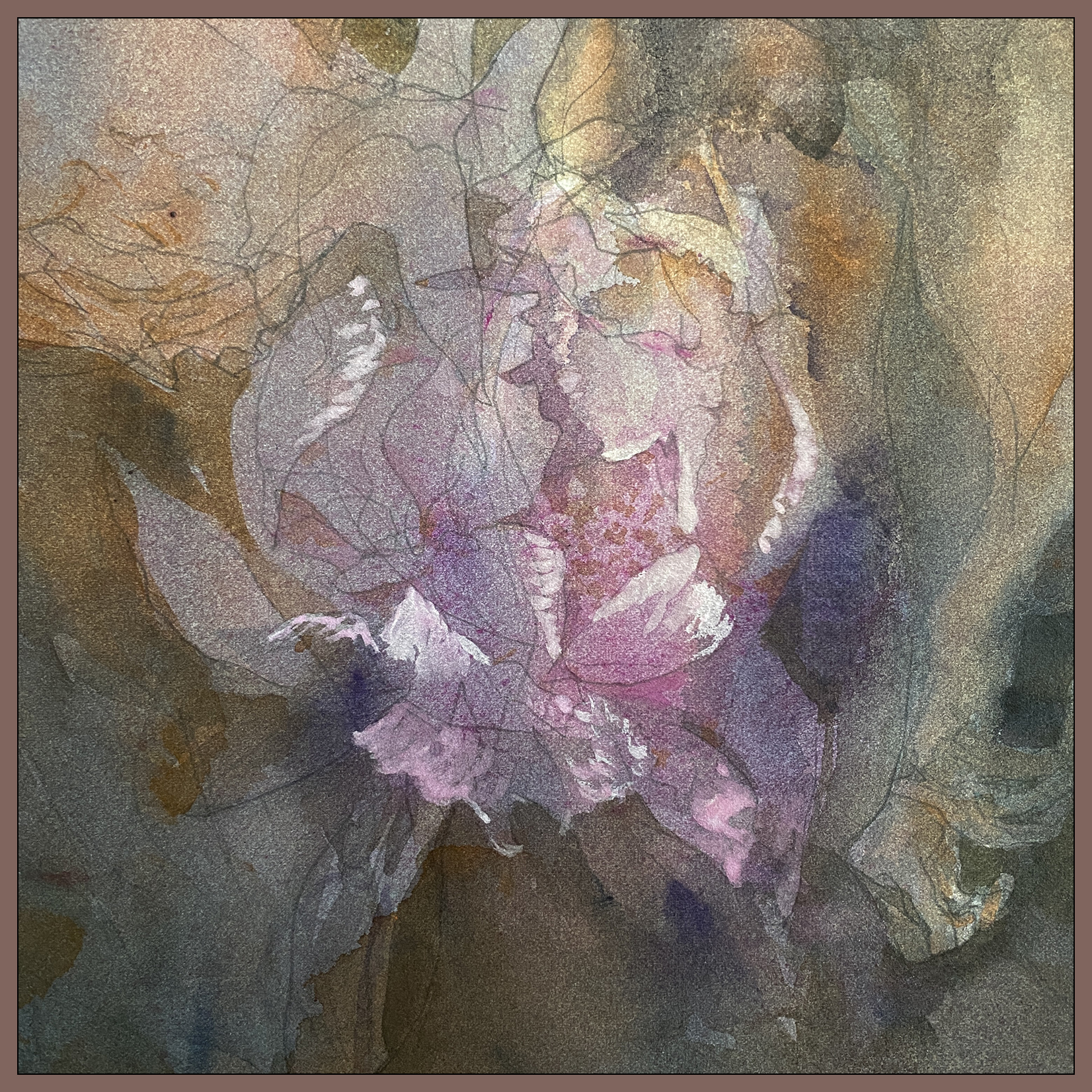
#30×30, 2025, Day 22: Peony Season
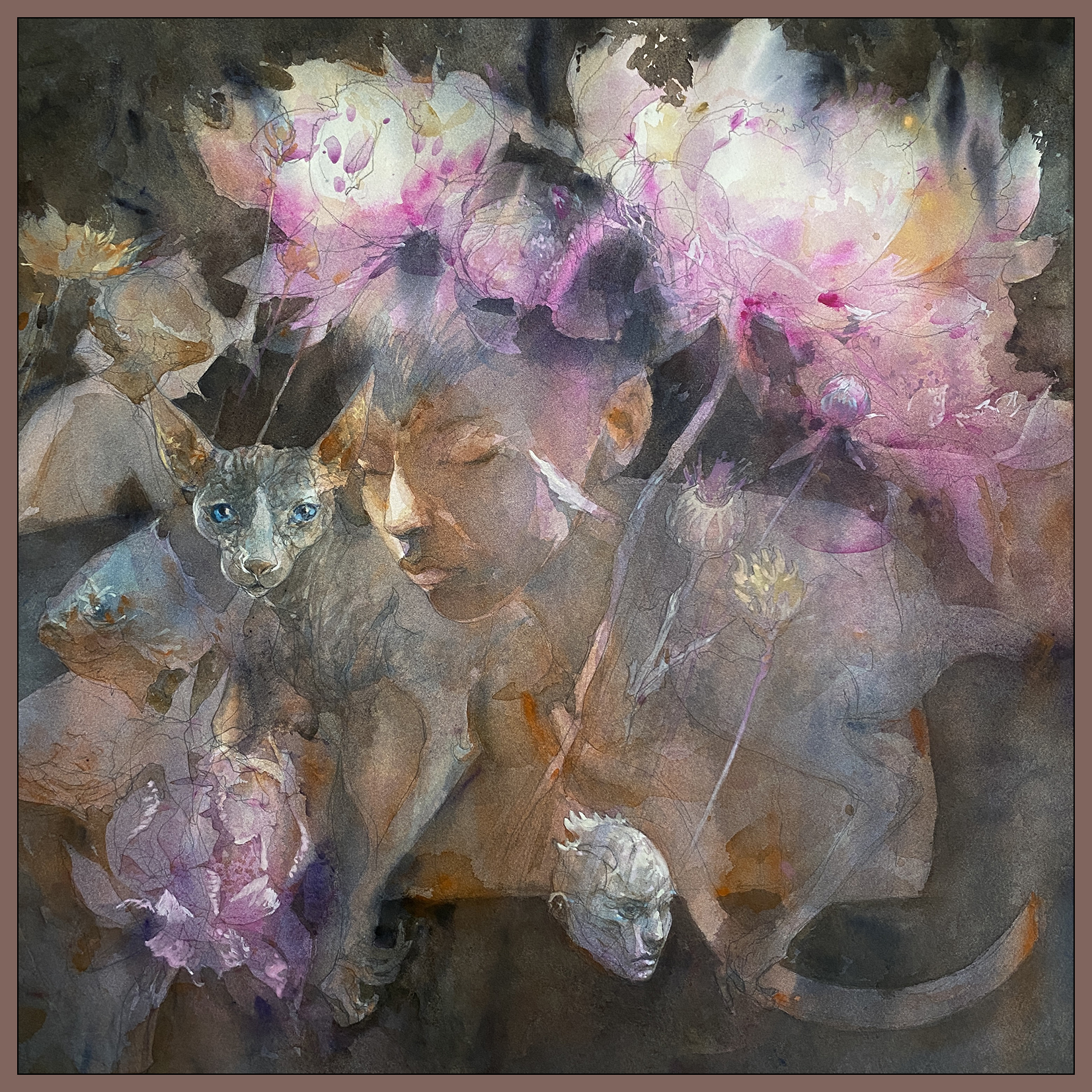
“Peony Season”, 22×22″ Watercolor on Fabriano Artistico 200lb Cotton Rag.
I’ve had to take a few days out of #30×30 to make a painting for the Canadian Society of Painters in Watercolour, as it’s time again for their annual Open Water Exhibition.
I’ve been meaning to make large-ish piece (22×22″) with this particular approach for a while now, so – despite the fact it’s Direct Watercolor this month – I’ve been spending a few days practicing with transparent glazing.
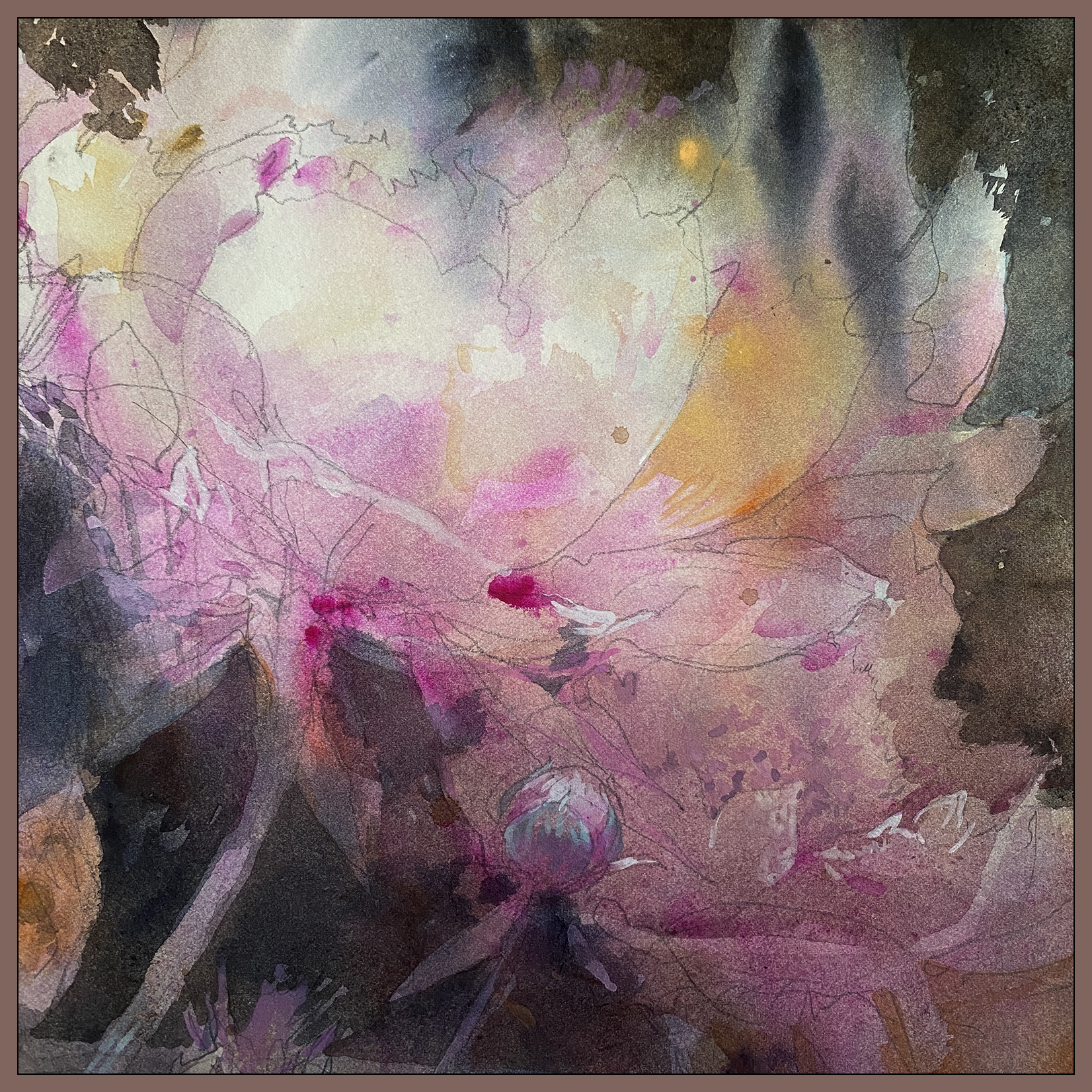
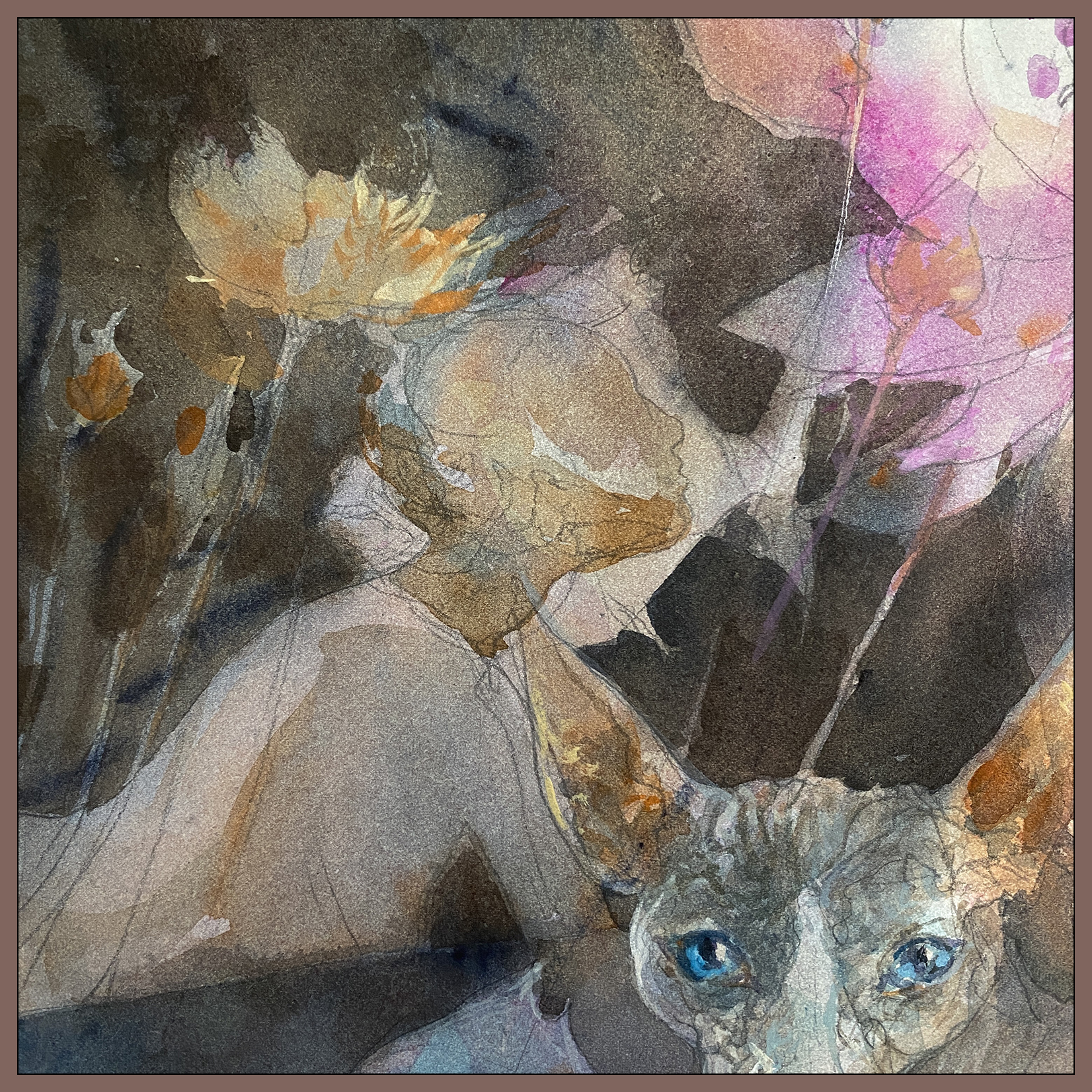
This one started with a drawing of course, but instead of trying for this depth of color with my usual wet-on-dry direct painting; I’ve flooded the paper probably 5-9 times with transparent glazes. (Depending what areas we’re talking about).
I’m of course waiting for it to dry between layers, either using a hair dryer for small areas, or actually flattening the paper in-between soakings.
I’ve made a table-top press with a HUGE stack of cardstock that I lay over top of a sheet of plexiglass, then the painting, and then thick stack of newsprint which serves to wick away the moisture from the damp paper.
If I want to flatten more than one thing at a time, I just interleave them in the stack between sufficient amounts of newsprint. I’m not using drawing-quality newsprint. We happened to have a few boxes of ‘moving paper’ – the same stuff you use to pack dishes, or lay on the floor when you’re house painting. Or at least, that’s how I paint ceilings. I should have bought a proper drop-cloth 20 years ago, but I’ve always used newsprint, and now it’s too late to get a lifetime’s value out of a proper drop cloth :)
This Rube Goldberg approach seems to work well enough, giving me back a perfectly flat sheet of paper the next day. Presumably, a few hours would suffice, but I’ve been managing to put in a little work each day and end up with a soaked sheet that is ready to flatten.
So; this is my first time in a long long time spending more than one day to paint a watercolor!
I had to learn from a book that drying was a necessary step for Tea, Milk, and Honey; but even then, when you’re painting plein-air you’re doing well if you have time to wait for one soaking of the paper, never mind all this layering.
And then of course, now that I’ve added Gouache to my toolkit – it’s remarkable what a tiny amount of retouching will do to pull an image out of a misty background.
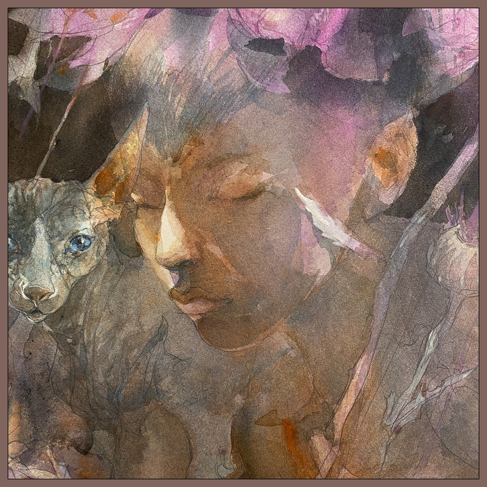
This year is the CSPWC’s100th anniversary – and I’ve already been rejected twice this year!!! Once for the King Charles Royal Collection Trust and once for the 2025 Members’ Exhibition, where I took a wild gamble on the oversize-works category, of which only ONE painting was accepted.
So this is my last chance for 2025 and the big 100th season! Wish me luck!
~m
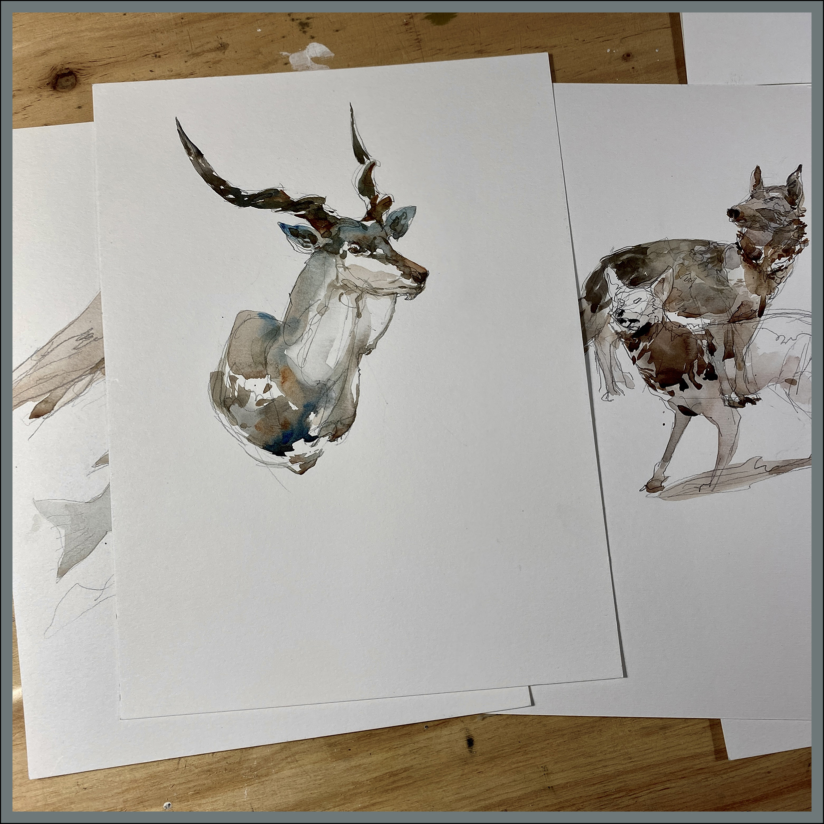
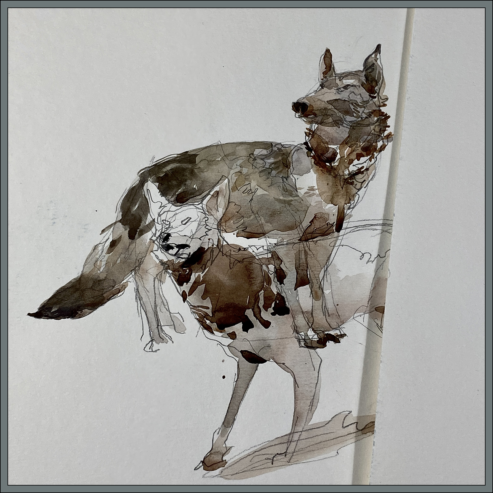
#30×30, 2025, Day 27, How much abstraction is too much?

“Greenhouse”, 4×4″, Watercolor on Cotton Rag

“Boat House”, 4×4″, Watercolor on Cotton Rag
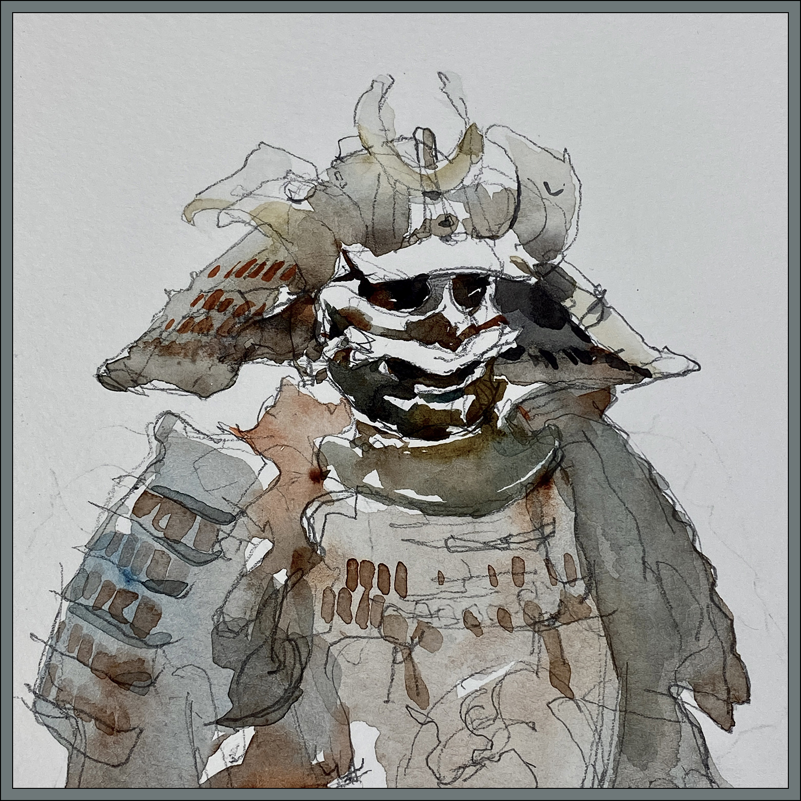
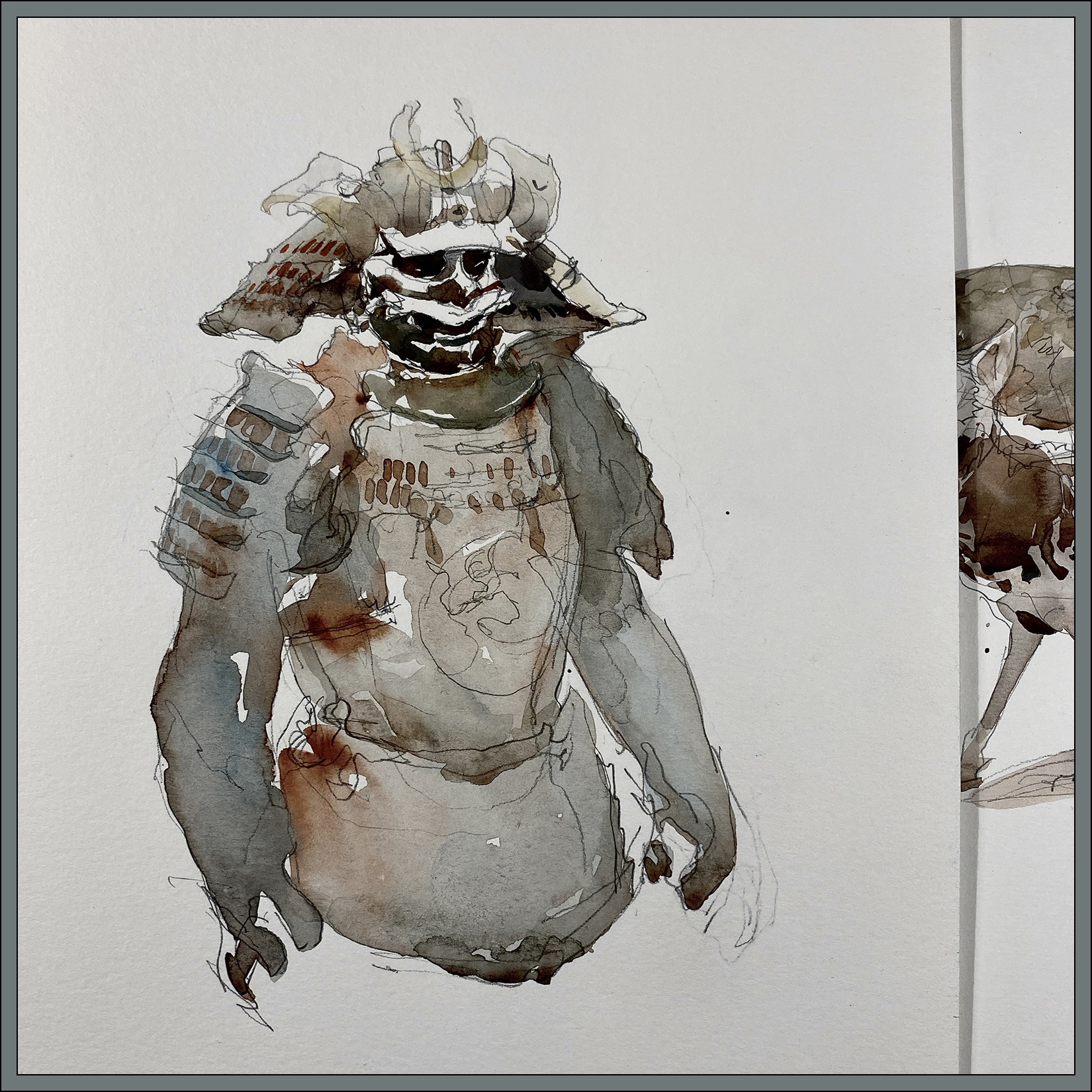
#30×30, 2025, Day 20: Look! Another Cheat Day!

One more delaying tactic to buy time for more serious painting :)
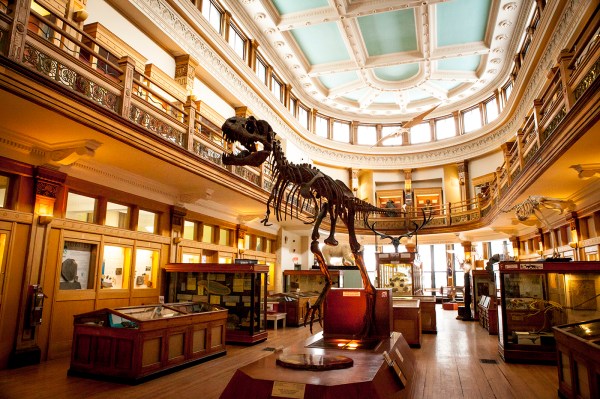
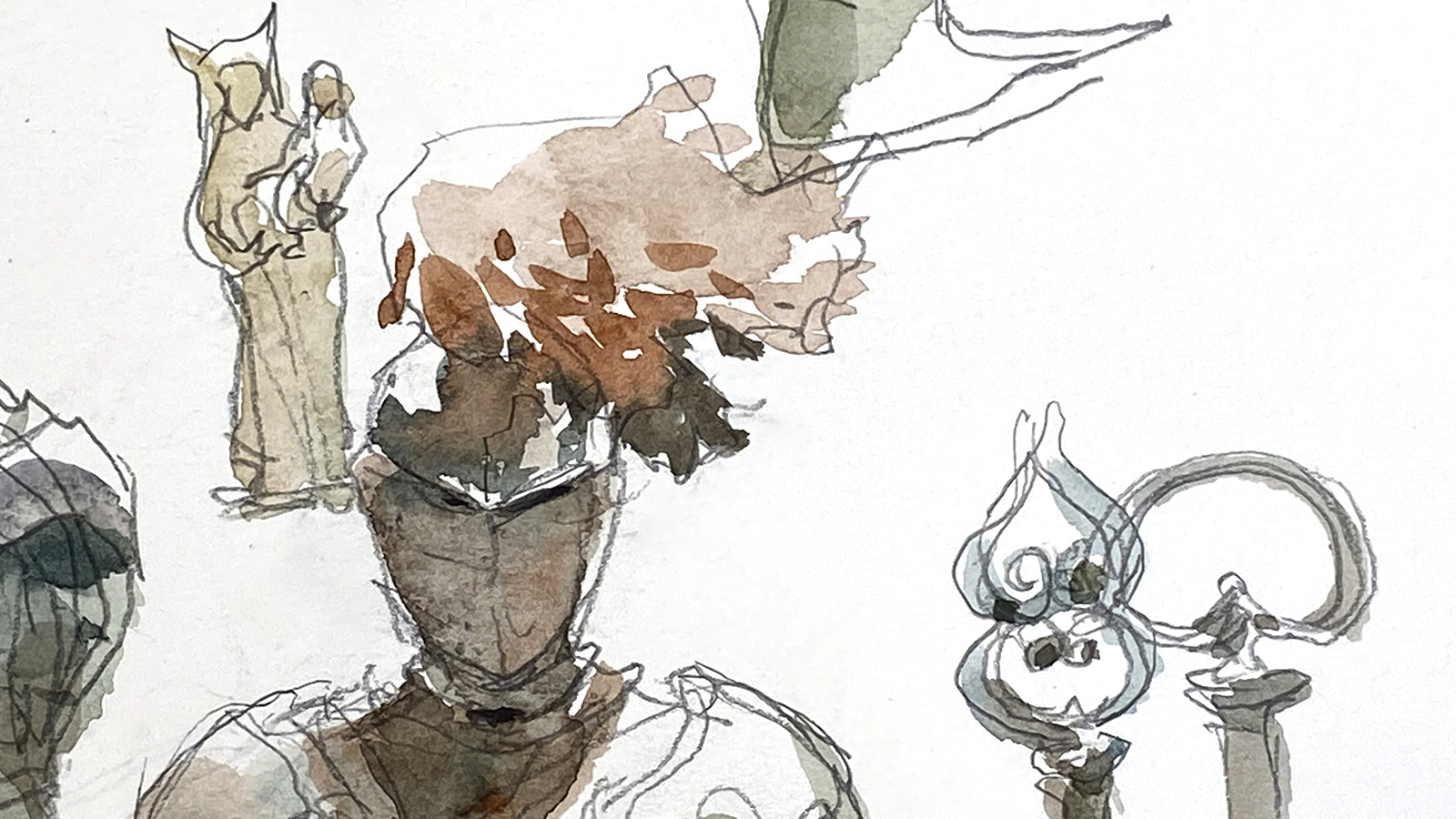
I’ve drawn everything in the cute little Redpath museum multiple times – but I keep going back because I love the quaint Victorian atmosphere. This recent visit, it was actually quite busy – so that’s a great sign. I hope McGill never finds it necessary to close this gem.

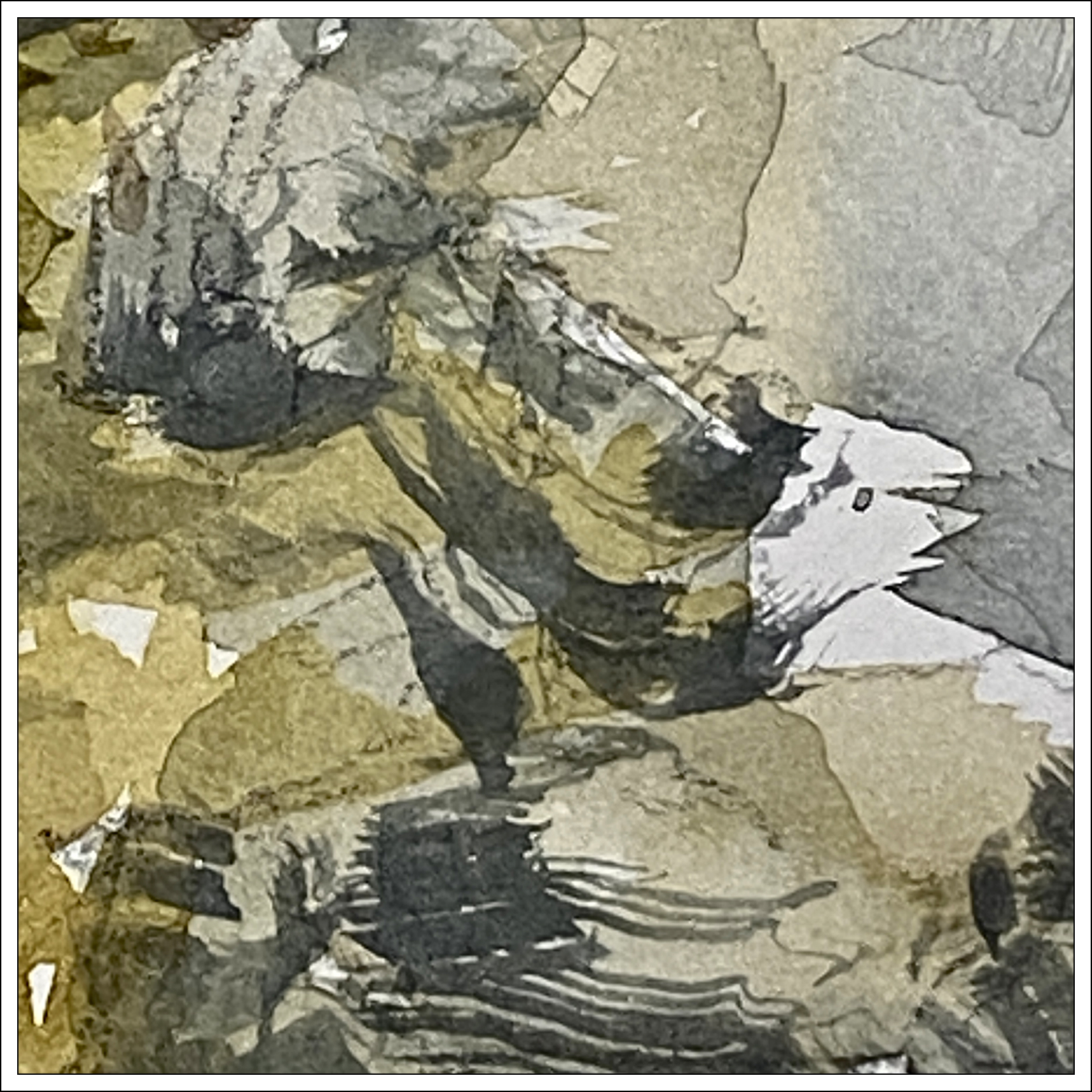
Interesting to look back at some other times I’ve painted this suit of armor :) Here it is 2015 and 2018.
So much more color! Am I becoming boring in my old age – or more sensitive to color? or it is just random :) Just a mood and nothing more :) Hard to say!
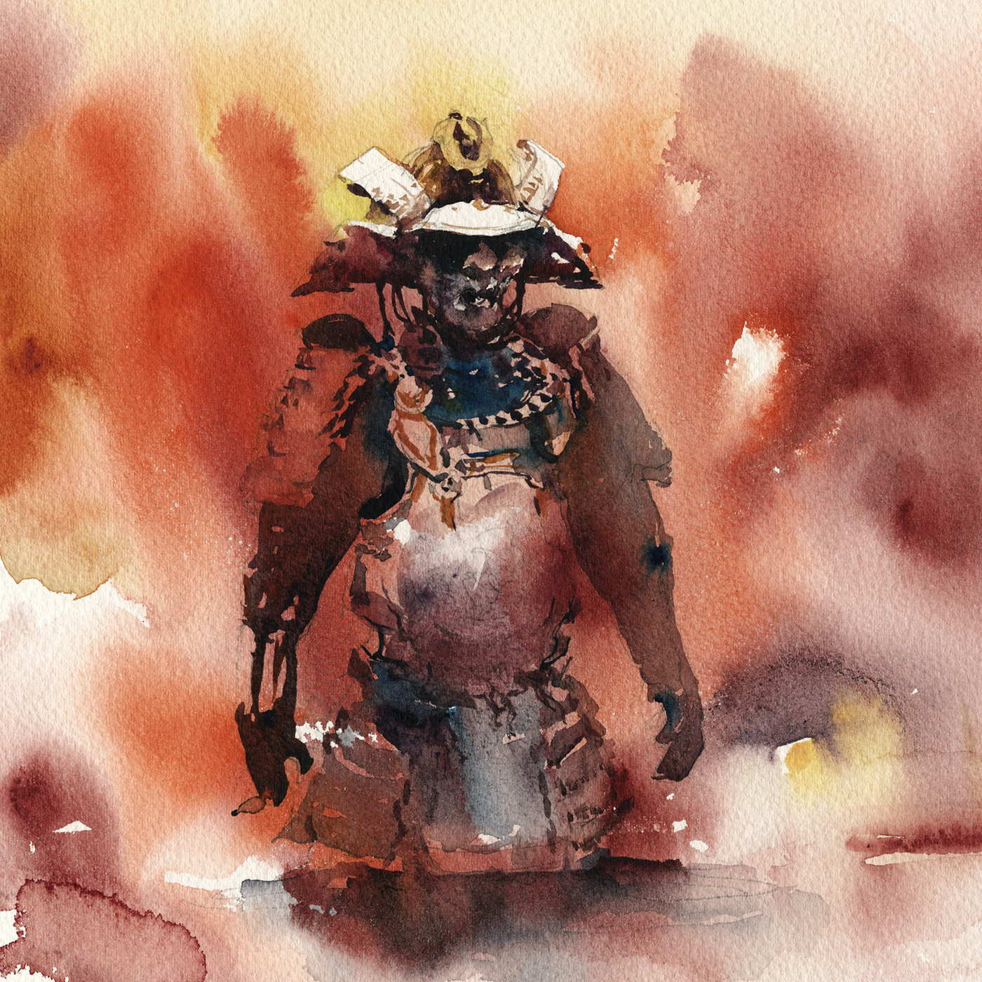

But also; Here’s a sketchbook page from 2012; thirteen years ago. Looking back, I’m not sure why I didn’t start with watercolor from day one? (This one has a little digital color on it). I know I’d been using watercolor in school, and at life drawing. Probably I was just travelling light. I do believe this one was in winter. I also did a sketch unit on ‘montage pages’ at some point and this might have been the start of that. I know I taught that a few times at various urban sketchers thingys.
Anyway! I’m sure I could go back three days in a row and it would come out different each time. I’m going to call it a mood thing, not a sign of losing my touch :)
~m
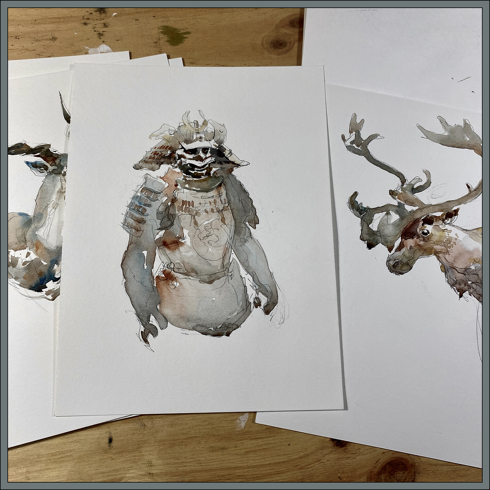
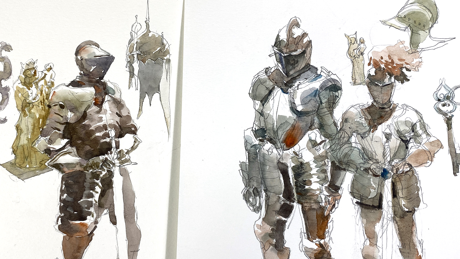
#30×30, 2025, Day 19: Cheat Day!

I’ve been out sketching at the Pointe-à-Callière museum’s current show; Les Chevaliers – Knights in armor.
I predict this show will be a hit for them – I’ve never seen so many men excited to be at a museum. I don’t mean to be sexist, but you don’t usually see a lot of retired guys or middle aged dads going to the museum by themselves – never mind their obvious delight at this well stocked show of arms and armor.
Of course there’s plenty of families, and I did see a couple of young girls trying on the reproduction armor pieces and lifting the swords. So there is something for the whole family at this one.
Either way, it’s a terrific show for sketching!


~m
#30×30, 2025, Day 17: Mo’Gouache, Mo’Trouble!
On the left is my ‘target’ – my 4×4″ miniature, on the right is a 15×15″ enragement< sorry *enlargement*. Hilarious typo. Both are, of course, gouache over watercolor.
Soooooo.
I have to say; I’m not impressed with this attempt.
This is actually my second try at enlarging this miniature. I’d painted this same image the day before and it was soooo bad I didn’t keep it. I won’t keep this one either to be honest.
My goal all along has been to create these miniatures, select my favorites, and enlarge them to ‘full size’ without losing their abstract composition. This one is only 15×15″. I hope to go significantly larger, but it’s a good thing I did this test!
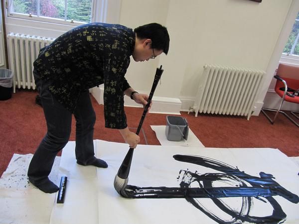
Probably there is a skill issue here, but it’s also to do with Brush size vs. Scale, if you think about it. (Random google image here, thanks to this artist whoever they are).
I *did* use much larger brushes! And I mixed up my little cups of paint! (20ml-ish).
But it’s simply not the same. In the miniature size, you can paint each passage in (almost) a single stroke. I’d need one of these Chinese calligraphy brooms to go up the size I’m imagining – and then you’d need actual BUCKETS of paint – you’d need an entire frying pan of gouache!
Soooo – yes.
Clearly – even with a 2″ flat, I can’t compete with a broom like that.
Brush size vs. Image scale! Right???
I’m also going to somewhat blame the basic nature of my home-made paint.
It simply dries to fast!
The problem with gouache – or acrylic. It leads to a panic-loop where often I don’t have exactly the colors I want, in exactly the right amounts, but I don’t want to be wasting time mixing more color while the existing paint dries.

Of course with oils you can just doodle around with your paint piles all day without worrying about your supplies going bad. And with watercolor, you can mix washes in cups, mugs, rice bowls, teapots, whatever you need.
Plus, as you work, you’re having to remember to mist your paints every so often – or maybe you’ve got your wet towels under your paint – (which I did not try I admit) – but if you’re using huge quantities of paint (in my imaginary wall-sized paintings) – it’s all looking somewhat impractical.
With this particular painting, I end up working faster and faster, and trying to make do with the colors I originally mixed instead of fixing the basic issues. Which leads to a kind of ‘out of the tube’ cartoony color.
It’s just not a great situation.
Too many hard edges! No natural blending!
I have to say – it’s all too stressful :)
Ultimately, in a desperate attempt to resolve the image, I resorted to adding all these detail strokes – to make optical blending – since I wasn’t getting wet-into-wet; and that’s exaclty what I was trying to avoid!
This has happened to me before in acrylics. I end up getting more and more detailed, and ultimately drawing with a little brush in the manner of a colored-pencil drawing. Not the way I like to paint at all. At least with acrylics you can glaze to get blending. Which I wasn’t getting with the gouache. This seems to always leave marks on the surface, very visible edges to any wet pools.
Not sure if this is avoidable, I don’t have enough experience to say for sure.
Probably I am painting too dry and too starved of paint.
In the end; I wanted to preserve the boldness of the miniature – and instead I’ve made a flatter, fussier, busy-er copy, that might be bigger, but sure isn’t better!
So; that’s my day 17.
Actually a few days combined to get this done, what with an afternoon for mixing paint, and then tearing up my first try.
Clearly, this is going to take a lot more practice!
~Marc
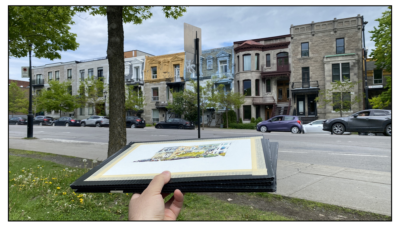
#30×30, 2025, Day 15: Day Off for Urban Sketching
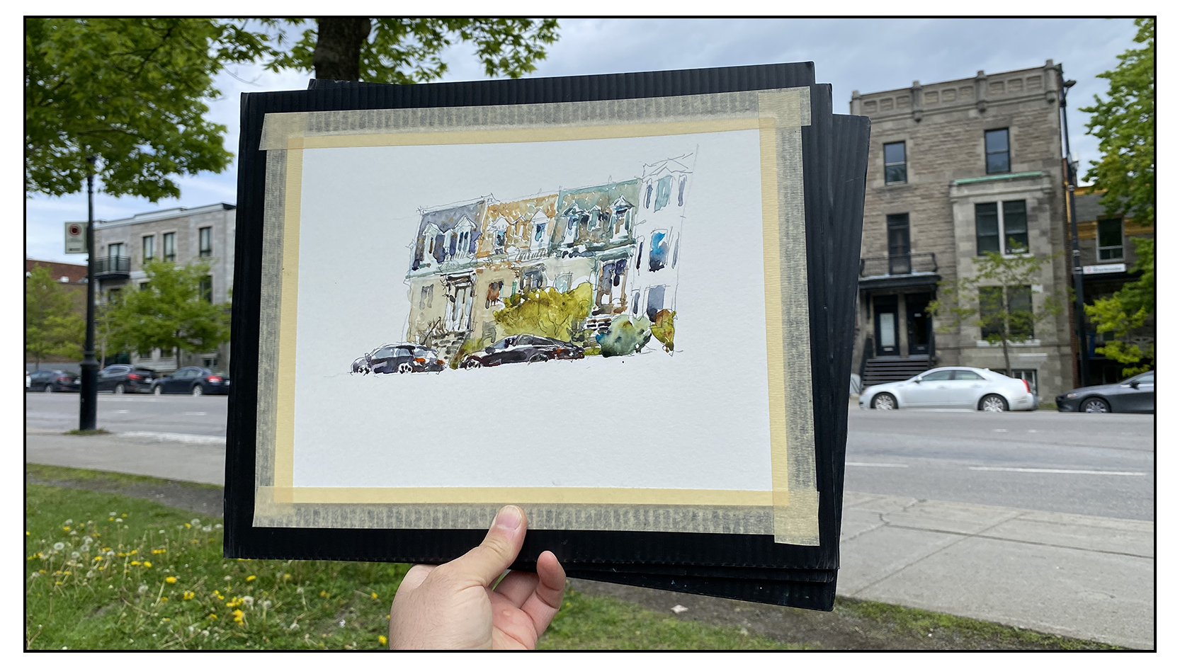
Out and about on the Montreal Plateau with some friends. Just sketching for fun. Something is happening to me – as I get older, a really nice day is almost euphoric! It’s not worth it to be inside!

Have to say – I kind of love these cars I’ve drawn :)
I don’t usually put the cars in – but lately I’m feeling they add some urban-ness, some signs of life.

But look at all the line drawing in this sketch! Really lazy today! Hah!
This isn’t really a direct watercolor painting to be honest. Can I call it ‘Crazy Person Adult Coloring Book?
Take this advice if any of you are planning to become art-bloggers! Never go around talking about RULES when it comes to art. You open your big mouth too many times and you’re just going to get into trouble later on :) Nobody forgets the things you say!
But I feel like those were the ground rules for event so I am a little stuck:)
What would you guys think if we changed it next year to be all-media? Would all the water-painters who participate go on strike in protest?
Really – it’s the same value for everyone right? The encouragement to paint every day is more the point, it’s never been about HOW you paint.
Let me know what you guys think in the comments.
~m
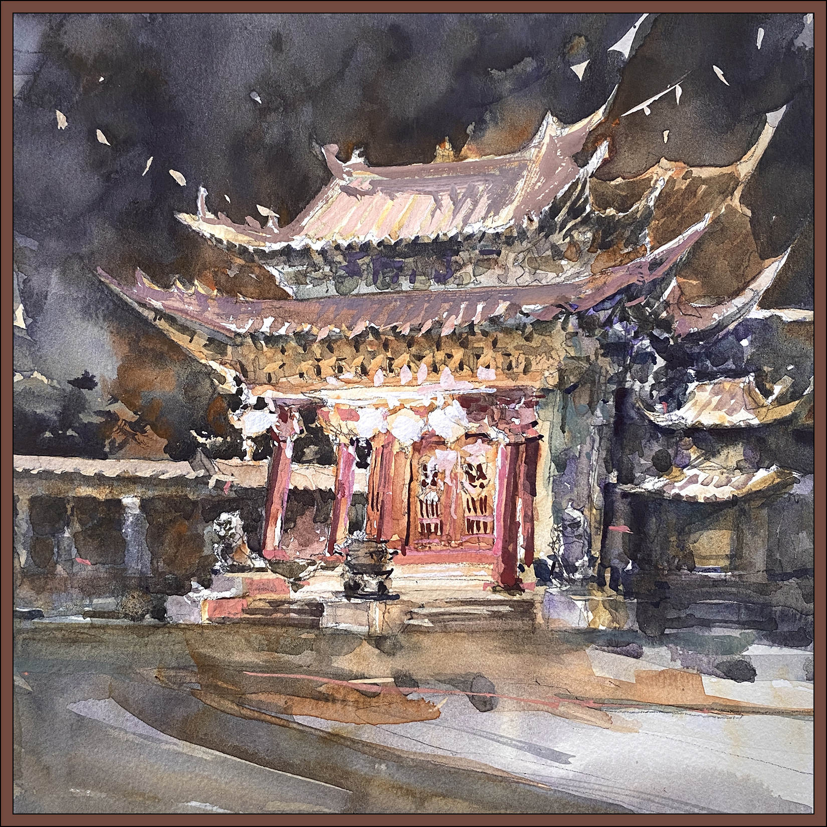
#30×30, 2025, Day 14: Like a Phoenix From the Ashes

Today was an epic battle! It took forever to finish a small 10×10″ sketch – and there were multiple points where I though the day would end in disaster.
I think it’s normal for me – around the midpoint of the thirty day marathon I’ve done some warming up, things are starting to flow, and then I think; I should do a really good one!
That’s always a huge mistake :)
Putting pressure on yourself to do a good one? In the middle of a public event? On a deadline?
Huge mistake!
Whenever you’re afraid you’re going to ruin a painting, you’re in big trouble.

So yes; here’s the piece at the first moment of crisis. The halfway point. This is the finished underpainting in watercolor.
I had been going very carefully – much too carefully – making little wet areas and charging them in with color. This often happens with detailed subjects. I get lost in the details – treating them all with the same importance.
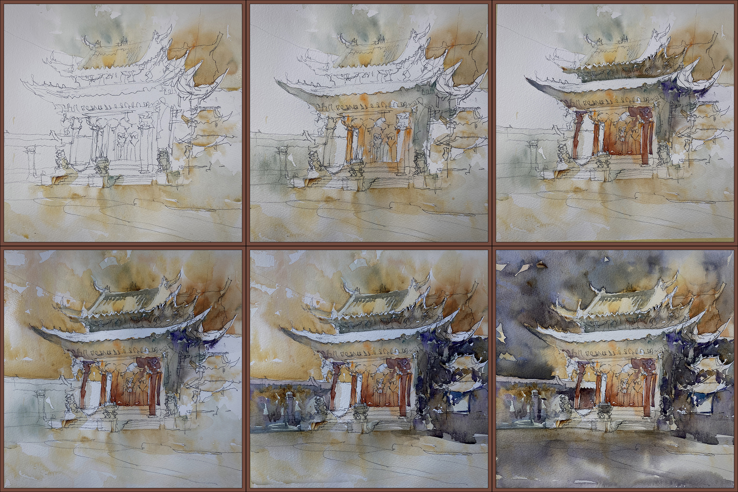
When I put in the sky I had thought I was done!
But then you step back and realize – wow. This whole thing is FAR too light! There’s nowhere near enough contrast!
I really dislike going over a wash twice. The goal is to get the color right the first time. It’s very easy to just muddy what you have if you go over again. And – there’s no way you can cut around a complex shape twice. You’ll end up with a messy complicated silhouette if you try to do it twice.
I felt stuck!
That sky was NOT dark enough. And why did I leave the roof white? It’s not daytime with the noontime sun shining down!
I’ve really messed this up!
So – I had an ice cream. Laid about the studio for a while. Fussed about.
And finally decided; I have to do something right?
So I did cut in AGAIN, against my better judgement.
And then, in a cascading series of problems – as soon as I had a darker sky, it was clear that the darks in the temple were far too pale – including that white rooftop I had left for no good reason – so maybe (in desperation) it was time to bring out the gouache!
Oh My God!
Here it is with some very heavy handed retouching in gouache.
Now I’m REALLY thinking I ruined it!
I’ve been having such great luck with painting-over in gouache. It’s supposed to be a simple way to fix anything! How did this one get so overworked?
Well – because of course, trying to paint this fantastically detailed Chinese temple is completely different from slashing out a sky on a 4″ abstract landscape. Truth is – nothing I’ve done for first two weeks has been anywhere near this difficult.
So; I fussed about some more, seriously considered tearing it up – which of course broke the spell.
Once you decide you hate it – you can do anything :)
So I laid in a dark orange/sepia wash over the whole thing – soaking the entire image with wet paint. I had the board tilted practically vertical – you can see color running down the image in the middle there.
Miraculously – this melted all the overworked gouache. It reduced all of the contrast, neutralized all the color, and served to unify all the distraction in the background.
In the moment, I wasn’t sure if I’d ruined it for good, so went and ate some chocolate chip cookies, then came back and realized – – all I had to do was re-state the lanterns and pillars with white, and lo’ and behold – it suddenly works.
That’s the kind of retouch that works. Minimal touches! Not a complete paint-over :)
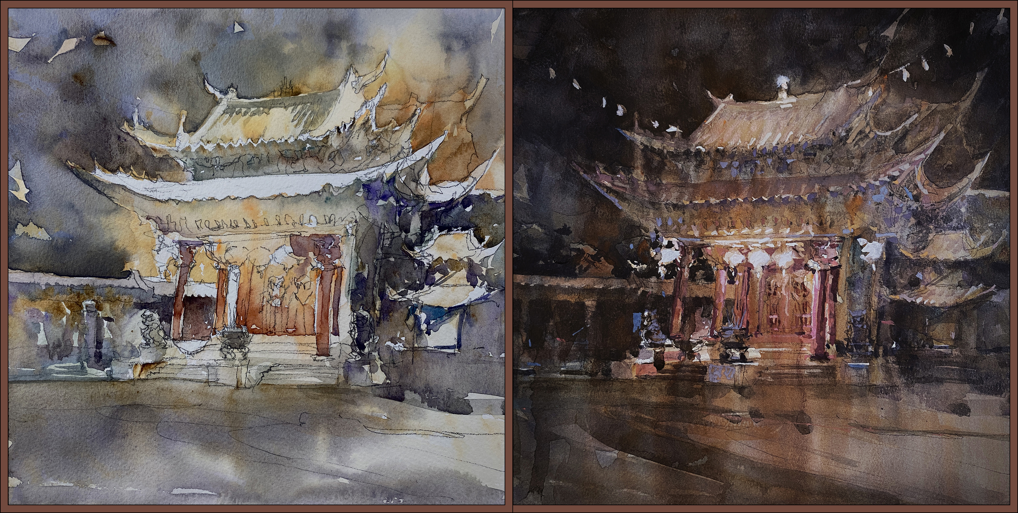
So – watercolor midpoint vs gouache-wash over top.
That’s how you spend an entire afternoon on a 10″ painting, almost give up three times, eat lot of junk food, and in the end, like a Phoenix from the ashes – you can only save a painting by deciding to burn it to the ground :)


~m

