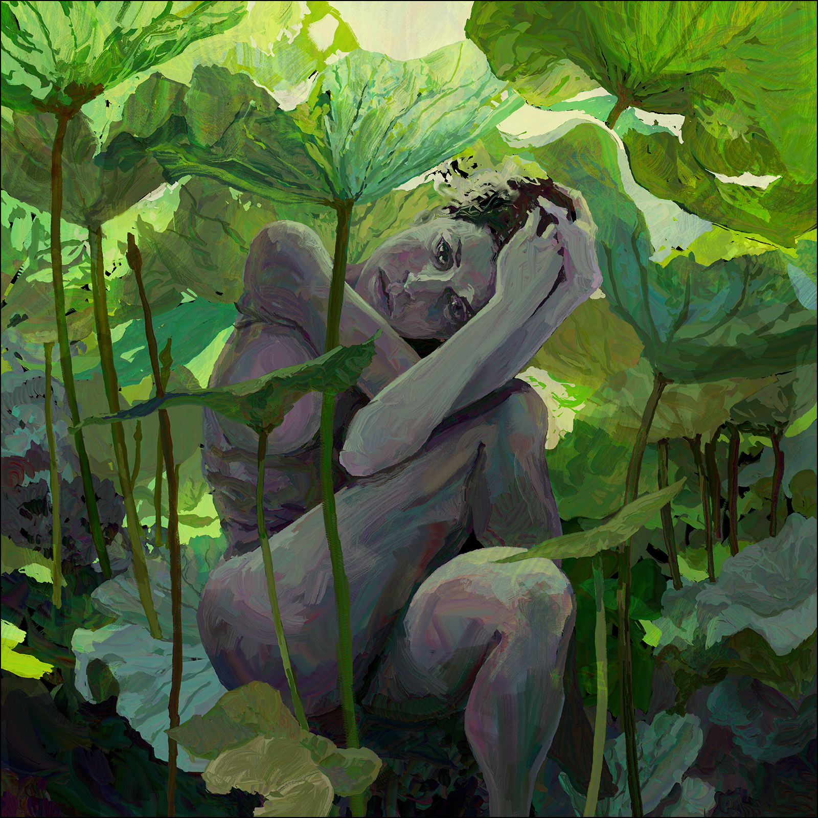
#30×30 2026 : Dream of the Lotus Eater
Ok! I think this will be my last experiment with HEAVYPAINT on iPad.
This one was a solid all-day project, probably around 8-10 hours of painting. Not what I would normally do for a #30×30 :) But I wanted to push my playtest with this app to the limit.
I have this theory that the more complex the image, the more ‘return on investment’ you get for doing it as digital art.
Digital painting is slower than traditional media, and absolutely slower than watercolor; but on the other hand, the longer you spend on a digital work, the better it gets – as you can just keep making corrections and revisions – whereas in a watercolor especially – there is a point where you’re simply done.
I mean – I’m sure I could paint this image traditionally – but I know I would end up deciding to go more abstract somewhere along the line. Which may or may not make it better? I don’t know – we’ll see one day (probably)!
In any case – I quite enjoyed doing this in HP – the ability to instantly revise shapes made doing that complex puzzle in the background kind of fun actually.
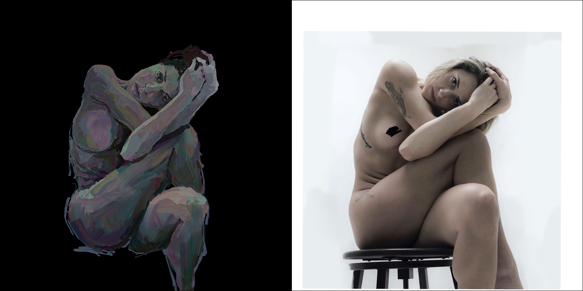
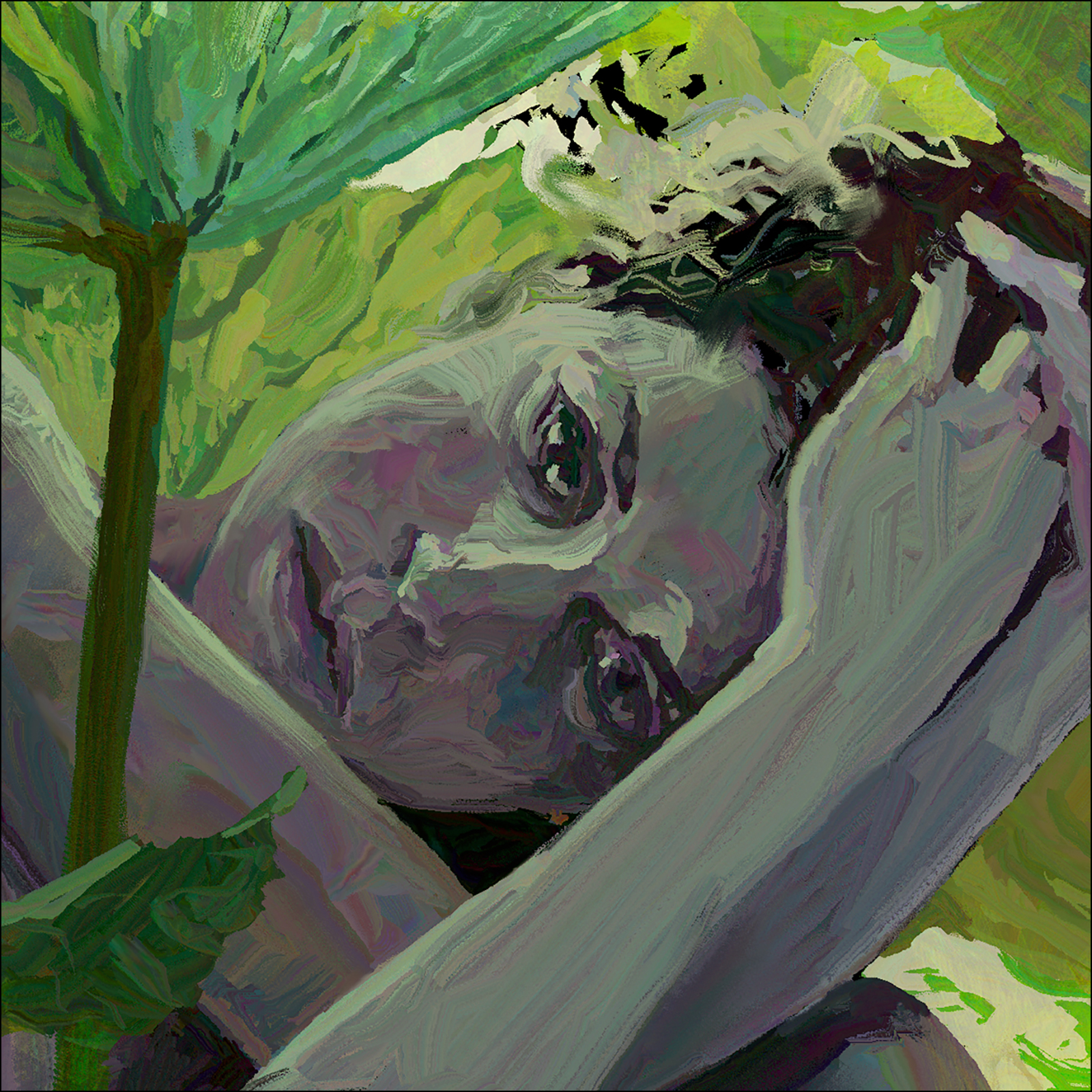
Again, I am working from reference, though in this case there is an extra step.
I’ve had this painting idea floating around for long enough to have lost track of the original model’s credit – but I’m pretty sure it is from @lovero.art, who has a Patreon offering professionally shot and scanned reference images for artists.
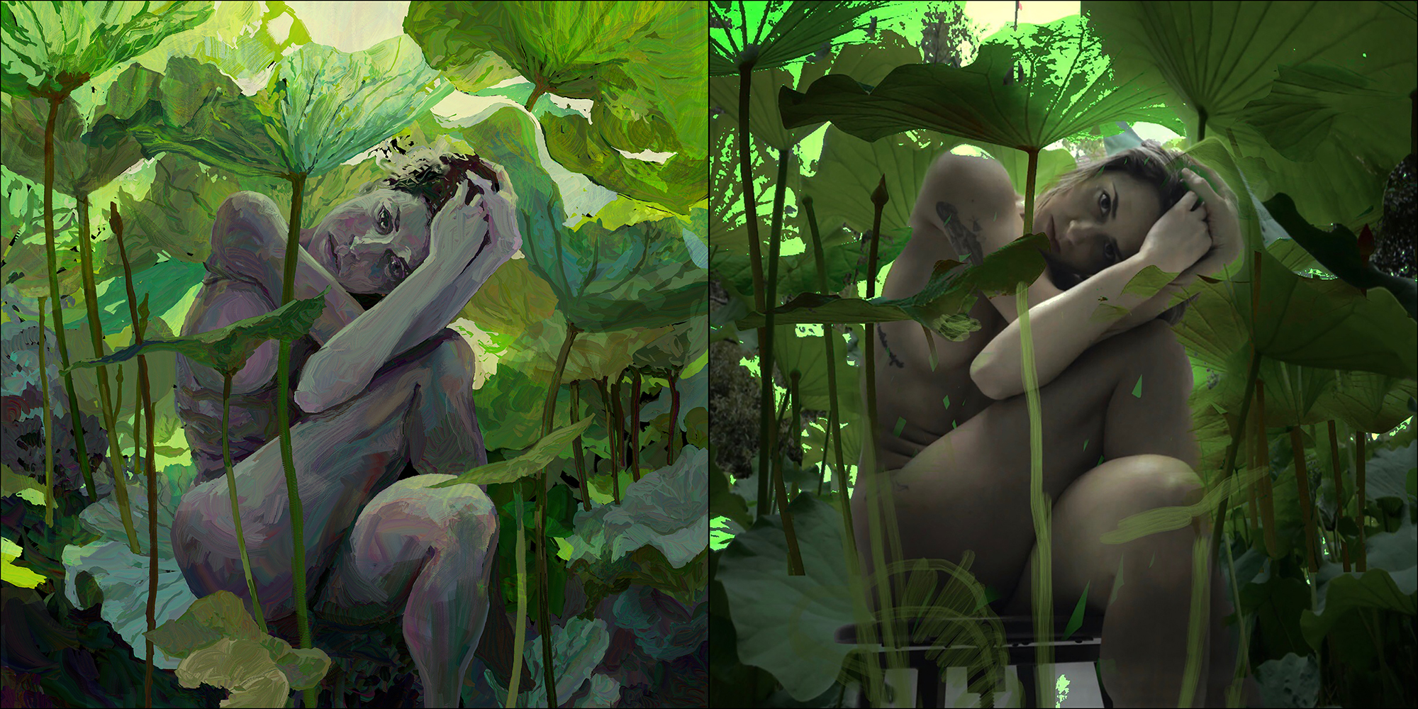
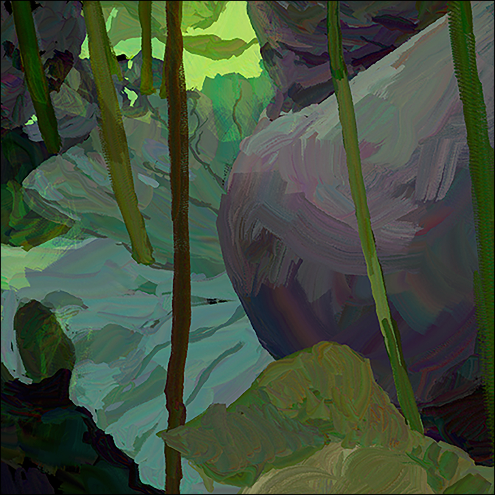
But! When I was originally thinking of doing this image as an oil painting, I had made a digital collage in Procreate – seen on the right hand side here, as part of my pre-planning.
While I’m enjoying playing in HEAVYPAINT – it is a bare bones operation, and doesn’t have the layer masking tools you would want to use for doing a collage. Plus you’re limited to three total layers for larger images – so it’s not the software of choice for collage artists.
Anyway!
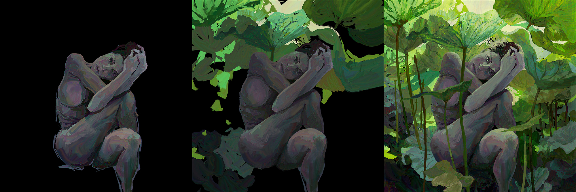
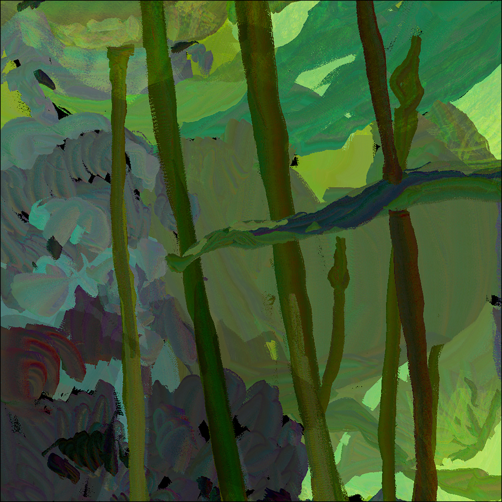
Here’s a barebones WIP showing my approach to puzzling together all the giant lotus leaves. I used three layers – Background, Figure, and a top layer which only has few stems, and the smaller leaves in front of the figure.
As I mentioned, the limit is three layers, so I did actually import the (flattened) finished painting into a *second* file, so I could add what would be the fourth layer, and do a glow-y lighting effect using a layer set to Color Dodge, at 50% opacity.
This is a common digital trick that brightens and warms the image without changing the drawing – it’s similar to glazing in oil, but you can magically brighten, as well as darken.
Digital artist’s get paranoid about ever losing their original files, so I don’t like to flatten and then find out later I wished I hadn’t :)
So!
That was a long day!
I know I’ve reached a new threshold of skill – because suddenly I’m annoyed at the way the web browser here renders colors.
Usually I don’t care, but this image looks better in photoshop, and of course the original Apple color space on the iPad. Everything you do on an Apple device looks too dark, and too ‘acidy/vibrant’ – when you move to a PC. It’s always been that way.
When you suddenly become aware of the different color space on different devices – you know you’re getting somewhere with your color perceptions!