#30×30, 2025, Day 09: Bold and Bolder. Is that like Dumb and Dumber? :)
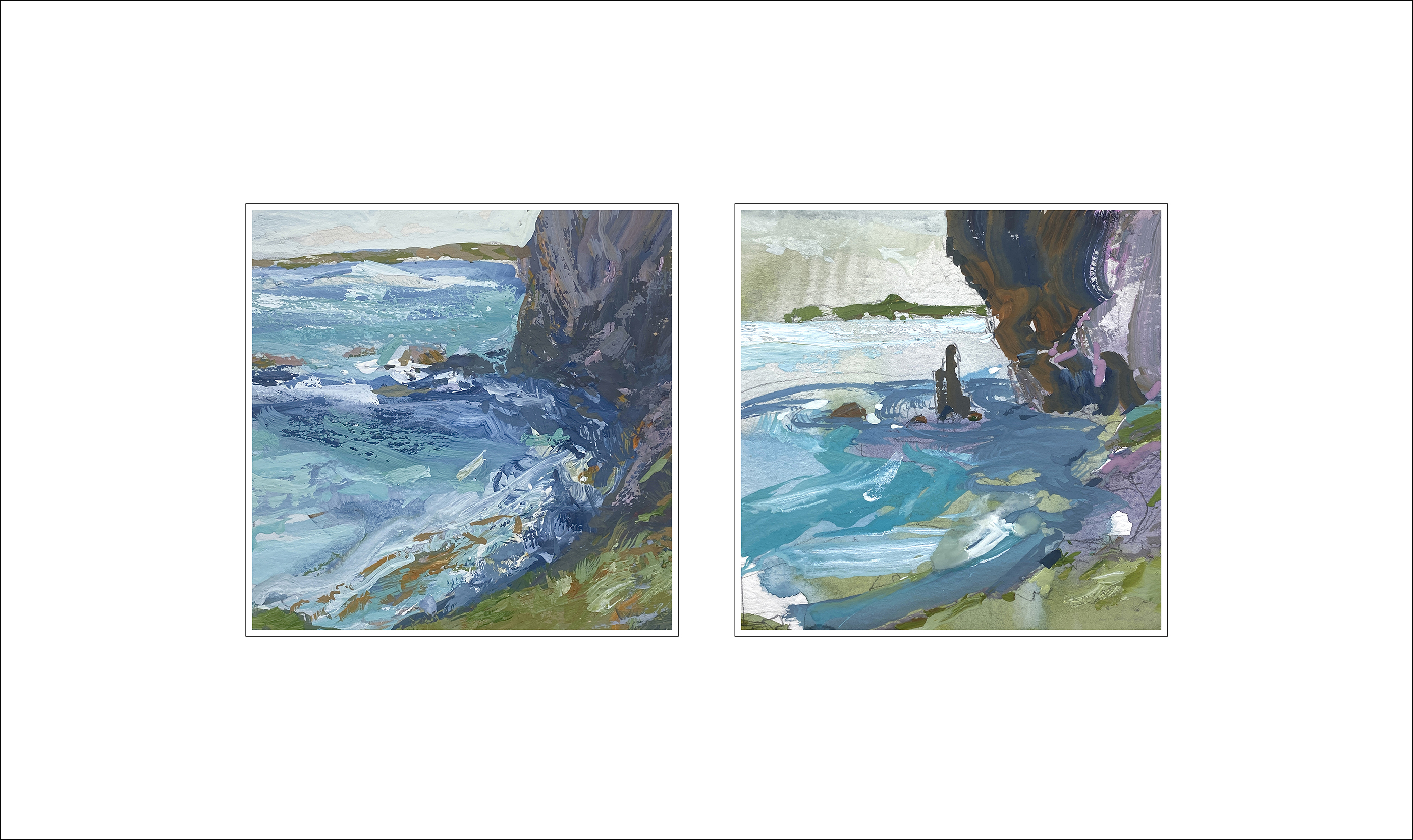
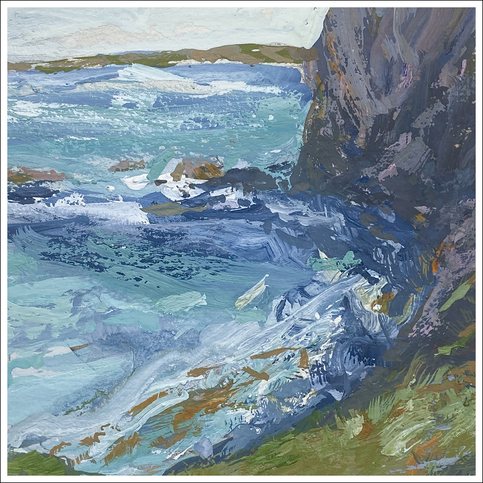
Two versions of; ‘Cliff over Tropical Water’.
First version on the left. It’s based on something I saw in a video. There’s a girl in a bikini in the foreground, she’s doing a hair flip, or dives off a boat, I can’t remember. We’ve all seen that video. I’m just here for the views of New Zealand – or wherever this was.
My first try felt overworked to me. Didn’t like the depth planes. Felt the water was too much of the same draggy texture.
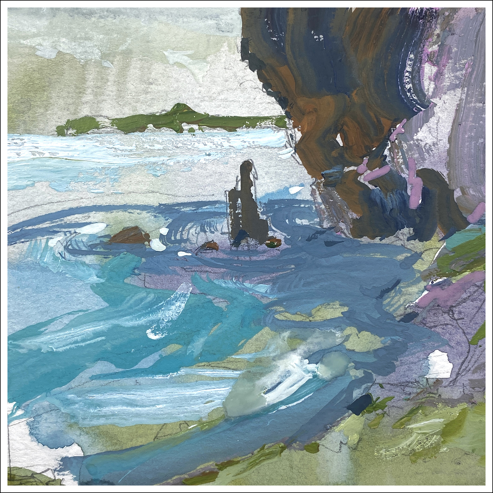
Second version on the right – drastically simplified shapes.
Which would work better on the wall?
Maybe try not to think – “Which is the better painting?”
“Better” often means “Has more detail” or “Looks like a photo.”
Me, I prefer the second try. It has cleaner shapes that I can read across the room.
I suppose thinking out loud; I began my artistic life as a sketch artist and illustrator. Everything was about telling a specific story, documenting a time or place with my sketchbook. And; the final goal was the book itself. Seeing the art from arm’s length. The more I think about painting as the final goal, (being seen on the wall), my taste is changing to be more about composition and color; not so much about drawing.
I suppose it’s also a mode you go in and out of. If I’m in sketching-mode in a museum for instance, I draw completely differently. But when I look at my sketchbook drawings, they often seem like comic-book artwork these days? I don’t think of them as finished pieces anymore.
Ok ok! Rambling now!
So that’s Day Nine! So now I have to go get ready for the Video call we’re recording! Take care and keep painting! We’re just grinding up the hill, only 1/3 of the way!
~m


I would choose 2nd because it has stronger values and better shapes.
I’m liking bigger, cleaner shapes and marks more too: in your work Marc and my own!
Hi Marc. Like you, I like the 2nd painting the best. The addition of your ‘purple color,’ more texture in both the rock formation on the right, and the movements in the water (more circular swirls), the addition of the rock (or driftwood?) offset in “the middle/right,” a few more whites, and bringing the horizon line down a bit added to the composition. Your colors are marvelous!