#30×30 Day 16 : #NoMakeup

So I’ve just finished a little digital tweaking on this one.

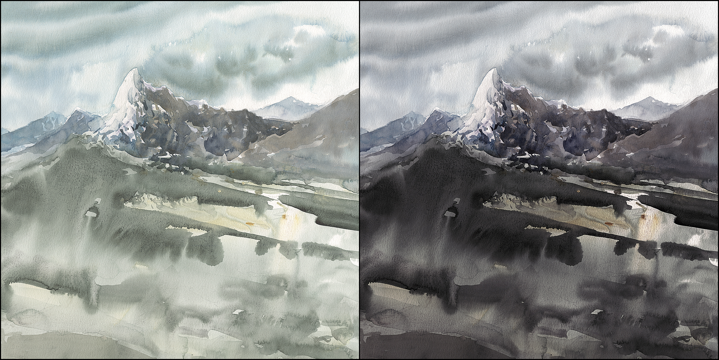
Ok – maybe more than a little :) This is what the original painting looks like.
This is the result of a complete miscalculation on my part. Mixing with far too much water, and completely the wrong pigments.
When I first started in watercolor. this used to happen all the time. Things turning out significantly lighter than I wanted. Turns out this was just inexperience. Too much water, not enough pigment. It’s a classic error.
After all, you are told these are water paints, so you put in a lot of water!
That’s what I did today, because I was premixing, and – I don’t know, I wasn’t paying attention, so there you go.
Back in the day, even though I was quite frustrated, I said to myself – I know it’s possible to fix this. I’ve seen all the old master’s watercolors – Sargent, Homer, etc. They can get the deep, rich color that I want. I just have to get over this problem.
Which, in the end, was eventually solved by only using fresh tube paint, keeping it misted with an atomizer bottle – and most importantly – making an agreement with myself that I’d use enough pigment, no matter what the perceived cost!
You can’t be afraid of using up a tube of paint! Otherwise, you might as well not play this game.
Well, that – and I also added a whole range of darker pigments to my paint box. I use five shades of black these days, depending how you count it. (Here’s my list of pigments).

But – there was a time in between when I still trying to figure out what I didn’t like about those pale paintings.
I was a professional digital artist long before taking up watercolor. so it was second nature to turn to the computer to diagnose the problem.
I would take the paintings, like this one above, and start building up contrast adjustments, hue-shifts and saturation changes.
You can do some of this on your phone these days – all phones have some basic controls for manual editing color and contrast by value range. Change just the shadows, or only the highlights. You might use an iPad app like ProCreate, or – I use Photoshop on my PC, because I’m used to it from my old day job.
Either way, this kind of image editing is a great way to see exactly what you want out of your painting. And, gf course, the same thing goes for cropping, or cutting and pasting and creating a new composition via collage.
Once you can see what you want, it’s much easier to redo the piece – and maybe break away from any problems with your original reference.


Thanks a lot for all these great pictures. I really enjoy this years mood and style and I’m always happy when I see new watercolor pictures from you :).
Are you considering to make a book out of them (like the Apocalypse Variations) or is this too much work for not enough return? I’m just curious and I would definitely be interested.
Have a nice second half of July,
René
I don’t think I will make a book this year. I had a very clear goal last time, with a nice concept. This year it’s more just rambling around and making paintings :) I think if I was to make a book, yes, you’d have to do it right! And I have some other goals in mind with my writing, (secret fiction projects :) so that is taking up all of that side of my mind!
When someone says…”… I use five shades of black these days,….” you know you are talking to a pro..
I agree, image editing is a great self-education exercise.
I love the dark one.
I never thought to do this! Always learning…thanks for the heads up.
Hey Marc. Thanks a lot for your posts and commentary on your journey. Your thoughts are always interesting,different and very stimulating.
Thank you too, for sharing your advice on pigments and the palette shot – very informative….nice to know a master like you makes the same stingy mistakes like me on too much water – not enough pigment. I will try to do better!
Have a great week
Stefan