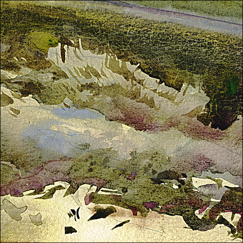
#30×30 Day 09 : Dry Brush, Arizona
June 9, 2021
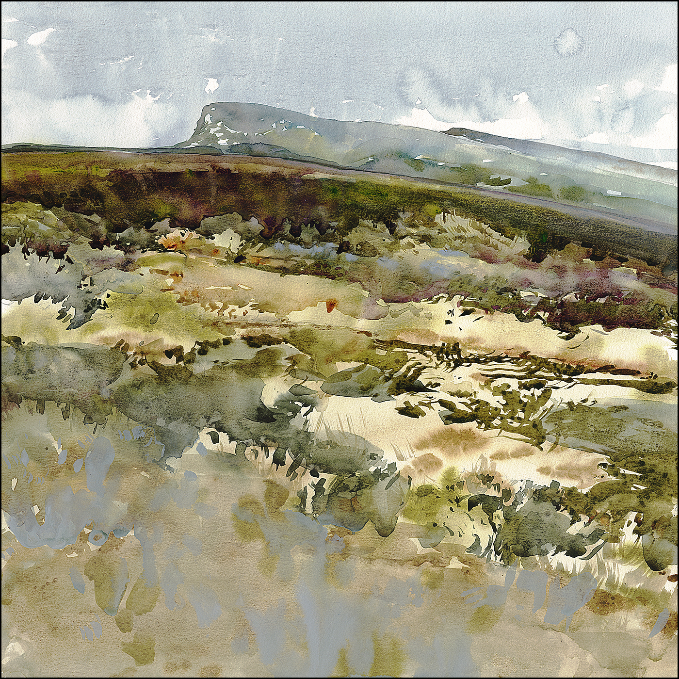
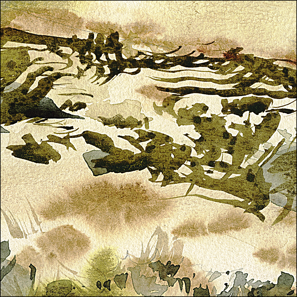
Today ends up being a study in making vegetation out of wet-on-dry brush marks. And also, ways to use color and value to break up shapes and revise lighting.
I’ve often said, you need to change color, temperature or value – at least one, sometimes all three, when you bring two shape edges together. So it makes a puzzle of interlocking shapes – even when an area looks uniform in real life – it doesn’t need to be boring in the painting.
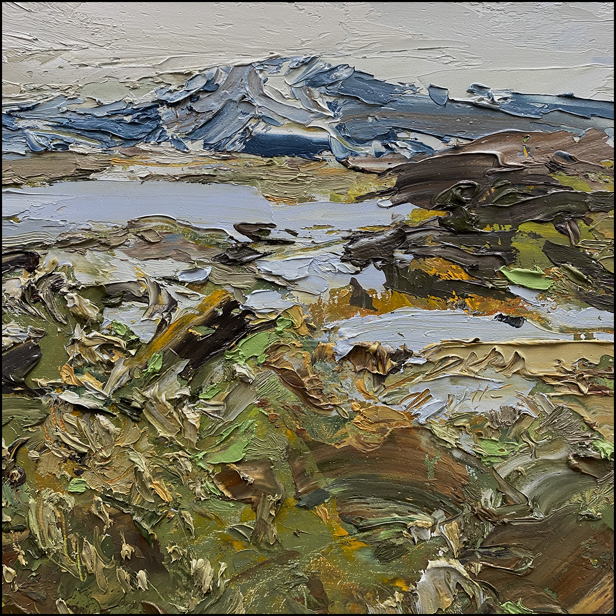
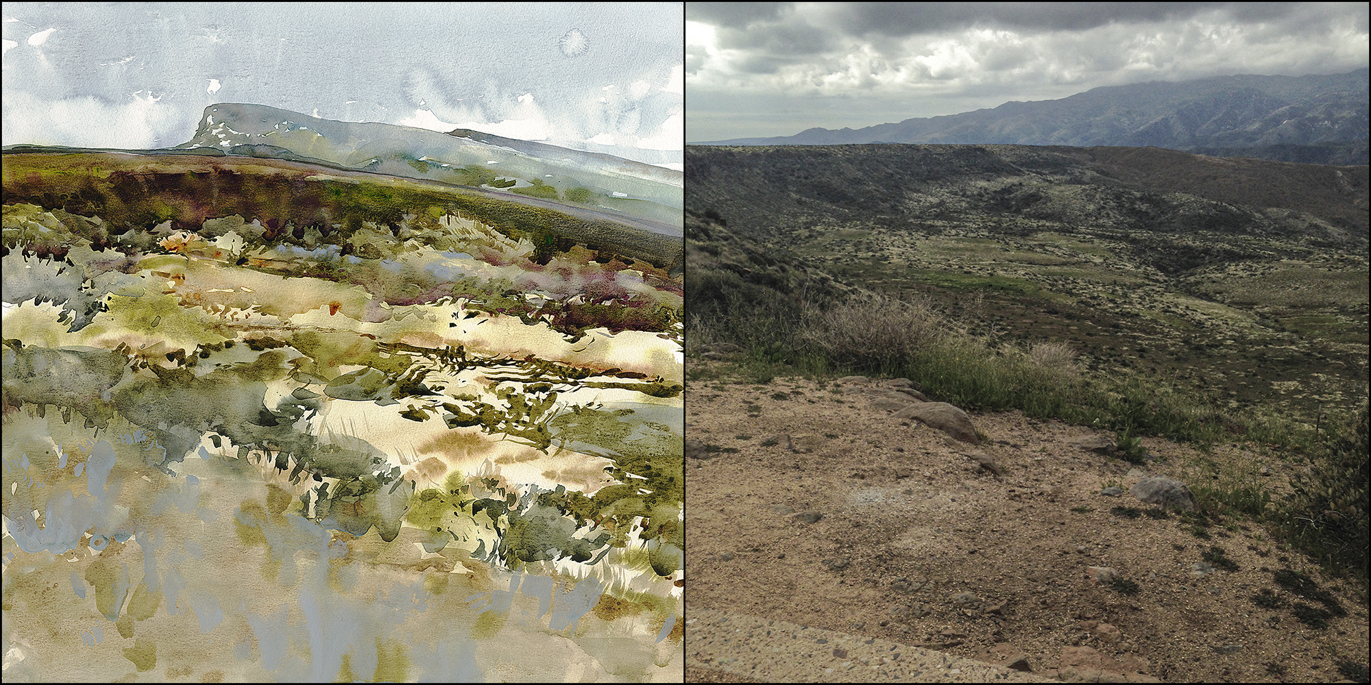
This is my 10×10″ oil, “If You Look Really Close, It’s Just Paint“. It’s not really a direct inspiration for today, but it does share the spirt of turning reality into broken brushwork.

8 Comments
leave one →


Beautiful!
Really beautiful! In this last close up frame, how did you get that green. mossy looking texture. That is amazing! Is it a granulating paint or a granulating medium…or just your awesome skill….? I live in the mountain forest in Oregon and there is moss literally everywwhere. I’ve never been able to make it look like that!
Hey Maureen! Great question! Well, that is very likely a color called Olive Green – with a something granulating mixed in – might be Lunar Black or Bloodstone Genuine? Or even Graphite Grey. But I also like adding transparent colors like Green Gold that float – and ‘bleed out’ of granulation so that’s likely too. With the way I’m mixing these days (pre mixing small batches in 30ml medicine cups), it becomes hard to say for certain! But those are likely the colors involved? Here’s my palette : https://citizensketcher.files.wordpress.com/2018/05/direct-watercolor-palette1.jpg
Thanks, Marc. Such an interesting palette. I see an expenditure for some exciting new colors in my future. Do love moody grays and blacks.
Marc,
Please forgive the very tactical question…
I live in Northern California and have been working on some landscapes with our local oak trees and golden (dead) :-) grass. The glowing cream color you’ve created in the patch near the middle of the Dry Brush Arizona painting has the color and glow I’m looking for. What colors did you use for the light area and the darker wet in wet section within it?
I appreciate your guiding those of us on the steep part of the learning curve.
Cheers,
Paul
Sorry…just seeing the previous question about color and your palette in response. Guessing it’s some combination of the buff, Naples yellow and brown ochre.
If I’m off the mark, please set me straight…otherwise no need to respond.
Cheers,
Paul
Sounds about right! If you want it a bit orange-er also a touch of Quin. Gold Deep. Though I heard some rumours that color may be discontinued soon.
Sorry…just seeing the previous question about color and your palette in response. Guessing it’s some combination of the buff, Naples yellow and brown ochre.
If I’m off the mark, please set me straight…otherwise no need to respond.
Cheers,
Paul