Day One : #30x30DirectWatercolor : False Starts are Normal!

Finally we’re here! Day one of #30x30DirectWatercolor!
I had great plans for this year’s event. I was going to dive back into street-sketching. Immerse myself in the challenge of plein-air painting. Make more dark and dramatic paintings full of the night-life and vibrancy of Montreal!
But of course, the universe has its own plans.
So – – – plan B eh? Hmmmmmm.

Luckily, Laurel has a large archive of photos from all the years we’ve spent travelling and painting at Urban Sketchers workshops.
I’ve gone back in time, and selected views from past sketching trips. I’ve tried to focus on places I’ve already drawn, so I have at lease some touchstone to the place. Even if it’s been years since I sketched there.
So today, we’re back in Lisbon. This is just a typical street, somewhere near where we had the workshop, nothing important about this view – other than the light and zooming perspective.
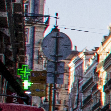
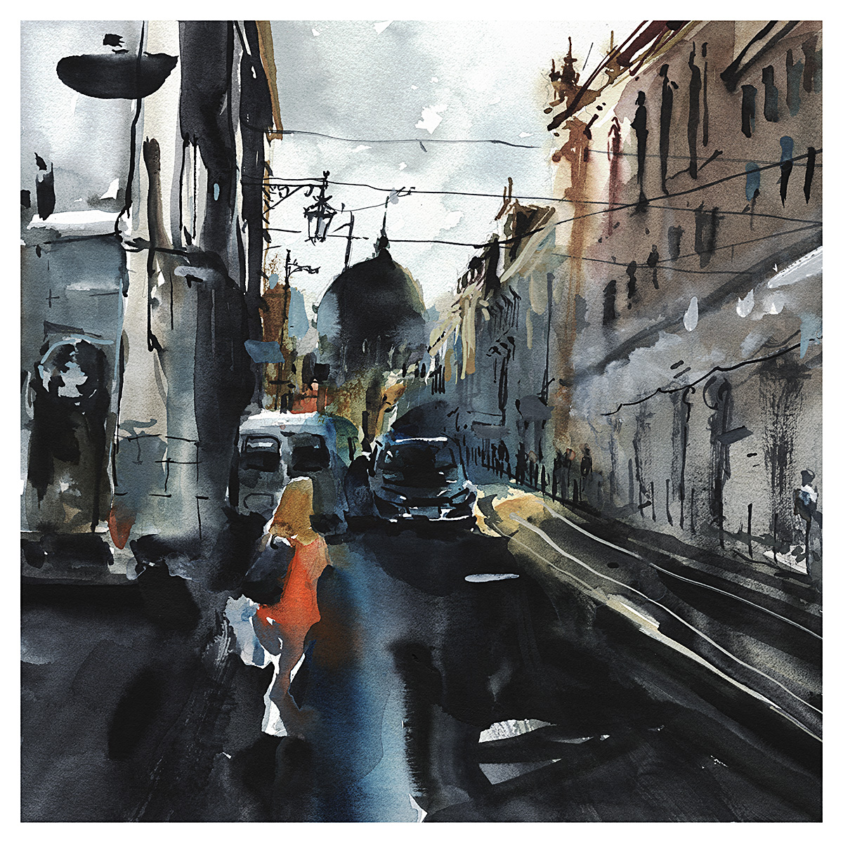
This is just a funny bit here. I painted a huge dome in the distance – just for fun – but the shape I saw is just a traffic sign in real life.
Hah. You see what you want to see I guess :)
Speaking of which – I’ve been painting squares for the last couple years (and I’m still in love with that format) – so I think somehow I can’t “see” any other way. This is the crop I prefer (today).
I chose the set of photos I’ll be working with a few principles in mind.
I wanted as much contrast as possible. Some dramatic darks to sink my teeth into. And – people in the shot. As many as possible. I sort of thought I might even add in more people to make the scene more lively – but in fact I didn’t.
When push comes to shove, I can’t make up people that have convincing, true-to-life gestures. Even when it’s just people walking, they have a life-like posture you can’t invent.
I’ve always been a happy, colorful watercolorist – but I want to capture a darker, grittier mood. Which I managed last year in a series of abstract landscapes.
In my plein air work, it’s usually been about looking for sunny days and good times. – more about having a nice day out I suppose, than creating a work to hang on the wall.

Oddly – despite my stated goal of depth and drama – I didn’t feel right with my first version. It felt kind of shouty? Perhaps it’s the lone figure stepping tentatively out into the road. But something made me immediately feel – I should tone it down.
At the time I was much happier with this second version – but now, a couple days later I’m not sure what the big deal was. It was kind of ok before.
Sure – I like the subtle grey palette below – and a better sense of the perspective – but at the same time, it lacks the drama.
Which do you prefer? The Dark Street or the Grey City?


(selinaadams731@gmail.com) i am in knowing you much more. you my pictures
I like the darker version …. Drama is created by light and shadow. I would loosen the figure a little so that it melts somewhat with the surrounding colors. the lighter version has too few values for my personal taste. but these are just my personal preferences. I’m looking forward to the next work.👍👏
Hi Marc
I think the second greyer version has it -or is perhaps on the way. Maybe some selective /more defined darker areas in this and you might have the best of both worlds – but then that is just a guess and what do I know anyway!
Liked the interpretation of the dome in the background – perhaps more like Istanbul than Lisbon? I also agree on the figures and made-up posture thing.
Anyway good luck and good hunting with your photos search
Bryan
First one. I can see the perspective better in the buildings and I like the hint of ornamentation at the windows. I don’t think it’s too “shouty”. Lol
Love the artistic license, Marc!
I like the first one, Marc, and the horizontal format which gives me a better sense of the overall perspective. Although I also love a square format every now and then!
Here I go! First time attempting this challenge. Looking forward to pushing the boundaries and experiencing plenty of happy accidents and I’m sure dodgy fails too. My two cents worth? The dark road wins🖤
Marc, the dark street is the one I choose. Grey city is boring.
Hah! Tell it like it is Rene! :)
I like both, different atmospheres…but the dark one is great! It is my first time doing 30×30 and I am going to Play & Learn. Thank you so much for organizing it, Marc!
Bonjour Marc J’aime beaucoup la version avec du noir. L’aspect dramatique et les contrastes très prononcés me plaisent particulièrement.
Envoyé de mon iPad Denise Benoit
>
Love them both! Please share your palette colors!
I haven’t changed my palette in a while – still this : https://citizensketcher.files.wordpress.com/2018/05/direct-watercolor-palette1.jpg
Actually, I think I like the gray one best. Very reminiscent of scenes I’ve tried to paint but failed to capture.
Marc, I love the dark one. It makes me want to be there.
I like the first better because figure is very close to cars in the 2nd.
Love your style!
I guess I M going to be the loner. I like both but I prefer the grey version.
Do you have any videos of you painting in this style? Would love to see how you build your piece. Something to help an artist using wet on wet for the first real time? Or another source.
I prefer the dark street and the tentative walker. but both are lovely. I love your work.
________________________________