Getting Meta : Copying Your own Paintings
The other day I had occasion to do a demonstration painting at the Dorval Artists’ Association. When I do this sort of thing, I’ll usually try out my demo painting the night before. A little test run to get a bit of practice before attempting it in front of a live audience.
This year I felt this was even more necessary, as it’s been a long winter of not painting outdoors as much as I’d like!
It’s good to see the reflexes are still there (I really do fear the skills will vanish. It’s an irrational thought, but I think everyone feels that). I suppose I’ve done enough figure drawing, museum sketching, and illustration work to stay in tune over the winter.
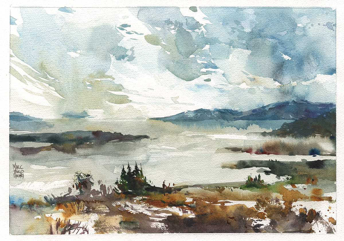
What I usually do for these demos is bring an original painting along with me and make a little forgery in front of the audience. For whatever reason, this time I went one step further and made a watercolor painting by copying from this plein air oil study.
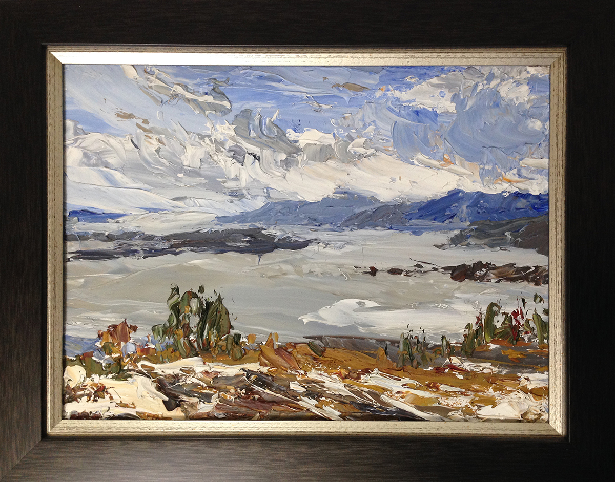
Last year – around this time – I was up in Charlevoix painting outdoors. It’s still winter at this point, so it was far too cold for watercolors (Watercolor will not dry below a certain temperature. Your paper just stays soggy). So that weekend I’d made a series of very rapid oil paintings.
So, I though, why not try this! Make a watercolor, copied from my own oil painting. This was kind of a fun experiment.
When I’m looking at the painting for reference I’m seeing color and composition choices I made out in the field, rather than the more factual representation of a photo. In particular, the intense cold forced me to be ultra-efficient. The oil sketch is done very rapidly, using only a palette knife, so I’ve been ruthless at eliminating detail. Simplifying the scene to the basic shapes.
This is something I’m always striving to do. Capture the essence of a place with calligraphic brushwork. Not become a slave to detail. When I’m painting from a photo, I’m always tempted to pile in too much information. You just have too much reality available to you with great reference material. Plus it’s too relaxing in the studio, working in the comfort of home, taking as much time as you like.
So this seemed to work out well! I don’t know exactly what it means for my work. I might try a few more studio copies from field word. But I’m always saying this – and it’s hard to find the time between wanting to get out to new locations:)


What a great idea. It did work out very well. I like it. :)
Very nice, Marc. Interesting how you went from an ultramarine sky in oils to a cerulean blue in watercolor. Very moody piece.
Great post, Mark. Thank you. I love your artwork and your videos are so helpful.
Interesting idea! I really love the colors in the watercolor painting, and the texture of the original is nice as well.
Marc, I always enjoy and learn something from your posts! Thank you! Keep posting!
Good work, Marc.
I really like what you say about avoiding too much detail in favour of capturing the essence of a place. I’ve just started your on-line travel sketching course and am experimenting with your principles of the one-line sketch as well as the 5 à 7…. you along with Shari Blaukopf are great sources of information and inspiration to novice artists like me!
Welcome to the class Lisa!
This is a really helpful post, thank you! What color palette did you use on the watercolor demo?
Hey Elena – I’m going to guess I was using mostly M Graham Turqouise, and DS Buff Titanium for the sky and water and Quinn Gold Deep, Perlyne Green, and Raw Umber Violet for the snowy field.
My full set of colors is listed on this page here : https://citizensketcher.com/class-notes/
Thanks!
I am a NewBe artist and I really like your work. Also i find your experiences in the art world interesting and Inspiring . Thanks for taking the time to share them with us.
AL