Good Question of the Week : Why is there no Paper Texture in your Scans?
Oddly, two people just asked back to back, “why it is there is no paper texture in your scans? You can see what they mean in this one (windmill). When you click to enlarge you can see texture in the wash, but not in the white paper.

When you scan watercolor paper, the bumpy surface of the paper will show up as an undesirable grainy texture in the white areas. Or, simply have a grey or yellowish cast.
When you take a snapshot (especially a cellphone photo) the white of the paper can be quite dark – giving the whole thing a lifeless feeling. So yes, I do some color correction in photoshop to get it the way I like it. It’s not a big task – a few minutes on each image.
And you can in fact make some improvements to your painting. When I started painting, my work lacked for color – and I used these kinds of photoshop color corrections to teach myself what I wanted in a real painting.
Keep in mind – scans will never look exactly like an original. A lot of complexity is lost – especially in the lightest tones. And further, you never really know what people are seeing. Everyone’s monitor is different. I know my iPad looks desaturated compared to my desktop, and many of my things look neon to when seen on expensive iMac monitors. (I’m PC by nature – being a video gamer).
SO! Here’s how I get rid of any left over paper texture in a scan.

The untouched scan, as it comes in with paper texture. Scanner is an Epson Perfection V500 Photo.
If the paper is rippled from water, this causes shadows, and you may have to be more heavy handed with the following adjustments. Or resort to some manual erasing.
I use a stack of books to press the paper during the scan. Sometimes I leave the book-weighted painting under a sheet of plexy for a few days prior to scanning. See – expensive art books are good for something!
Also, if the painting is larger than the scanner bed – scan it in overlapping pieces and used File>Automate>Photomerge to join up the pieces.

A CURVES adjustment layer (the blue row in the layers palette – shown in the adjustments panel below) – to keep the mid tones stable, but bring back some of the darks and the lights. Each piece is slightly different – but you will see it’s a matter of clicking points on the curve (line graph) and pulling them down towards the histogram (bar graph). You can just twiddle those little points around, and see how you like the changes. Nothing is permanent, so just play with it, watch what it does.
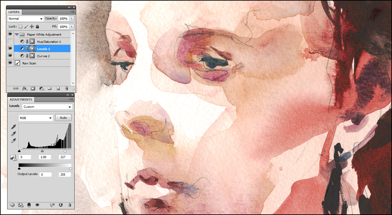
A LEVELS adjustment layer to bring the white point in considerably. Everything in the graph to the right of the white ‘carrot’ on the slider will be pushed to pure white. Values to the left of the ‘black carrot’ will be turned 100% black. This is, I do believe, called ‘clipping’.
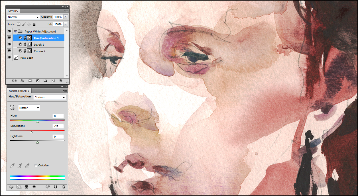
The last adjustment SATURATION ( in this case, taking it DOWN -22) – because the previous process exaggerates the colors.
If you open the first and last images in two different tabs, and flip back and forth, the effect is more visible.
This is not a perfect color match to the actual painting, but it’s within the 80% rule.You can go out to a photo printing service and get better resolution and color quality – but even then results vary. For most uses, this process should work fine.
I have been known to use this effect to desaturate intentionally on occasion. Sometimes quite a bit. Sometimes, for reasons of mood, I prefer the look of a less colorful painting.
You can use this general approach to boost up the strength of pale drawings, or shift the color drastically to create artistic effects. As an illustrator, it’s tremendously useful. I do feel however, you shouldn’t make unrealistic changes to the image of a painting you intend to sell – it might be misleading to a potential customer. I try to use the heady power of photoshop only on illustrations – where the finished art is the printed page, or a fine art print.


Thanks, Marc. In this excellent explanation, you affirm that what I have been doing in Photoshop is on target.
Very helpful Marc. I’ll put to use with my next scanning session.
Sometimes you can end up going down the photoshop rabbit hole when you start correcting. I actually like the unretouched image best!
cemeryposh@aol.com http://www.corneliaemery.com
>
It’s true, one can easily end up over-doing this sort of thing. And wasting a lot of time. I do a lot of digital art, so it’s second nature to me – but yes, I think it’s something to watch out for. Image-editing power corrupts!
Thank you for this clear and helpful explanation, Marc. I always feel like the adjustments I make with Photoshop to images of my paintings are an experiment. Are you happy with your Epson V500 Perfection Scanner? (I need to invest in a new scanner). Thank you!
Yup, that scanner has done nearly every image on my blog. It works great. It’s a bit older now, so I’m sure it can be beat for smaller size and such, but on the other hand, I’m sure they’re not as expensive now either.
I really appreciate your feedback on the scanner, Marc!
Thanks for sharing~ I was cracking my brain to figure out how to fix that problem. I will try that again with my scans!
Thanks for this thorough explanation, Marc! I’ve been wondering about this for a while. Is the scanner bed totally flat? Or how do you scan a work in pieces if you need to weigh it down? My scanner has a little lip to ‘help’ align the paper and it would make dents in the work if I were to scan it in pieces (it also can’t tolerate much weight to flatten anything, which is another issue altogether… looking to replace it soon). Thanks!
Yes the scanner has a lip its true. I let The paper just hang out over the edge. The first book in the stack is smaller than the glass surface, so there’s a little triangular gap of air all the way around the scanning bed – so I don’t get a crease from the lip of the scanner. You can’t get the maximum surface area of each scan – you do get gray discoloration around the outside – but it doesn’t matter actually as photoshop eliminates all those distorted areas and only keeps the pixels that match. Automerge is impressive!
I like the look of the textured paper actually :) I think it looks great from a natural point of view (as opposed to extreme close up). There is just something about the texture combined with the looseness of watercolor that is so appealing. I can often see that you’re using Fabriano when the texture is present. Nice.
Do you have advice for people travelling light with a ipad or iPhone wanting to take images of their sketches. Thanks for above information and will certainly use it later.
Well, I can’t think of a time I’ve done a sketch from iphone – other than a portrait – but if you want to try it – first thing is the iPad camera is not as good (in terms of resolution and autofocus) as the phone. So, stick with the phone, even though the image looks smaller, it’s bigger on your PC. Next, use the Panorama Mode! You can get much better compositions versus trying to get it in one shot. But I honestly don’t have much advice – what I did for reference shots is marry a photographer!
Miscommunication here. While travelling I sketch and want minimum equipment.The sketches are done the old fashion way, watercolour in a Venezia Sketchbook. I use the Ipad to photo my sketches and use the edit available. What about Apps available free or at cost for this purpose.
oh I see ;) Double ignorance there – I’ve only done it a few times to give a ‘teaser’ – just to post a few things that I’m going to replace/expand when I get home. I know there are a lot of editing aps, but I’ve never explored the options. Sry!
Thank you for sharing your technique on scanning watercolors, Marc. In addition to the Photoshop work, it is important to calibrate the scanner and the computer display to get a better approximation of the colors. I finally did this and the results are better than without calibration. I owe an Epson Perfection 600 bought recently because it was the best model for a moderate price. Thanks again!