Working with a Limited Color Palette at the 2014 Urban Sketchers Brazil Workshop
We are just back from the 2014 Urban Sketchers symposium in Paraty Brazil. I can’t begin to explain how great it was without waxing philosophical.
When you’re traveling, every view is fresh. The excitement of exploration gets into your sketches. Your work is tuned up by the heightened perception and the opportunity to sketch without interruption, working one day into the next, without life to get in the way.
Add to this, a group of like-minded artists, who are equally driven to be up early and out late, always on the move, sketching constantly. There’s nothing more motivating, more fun, or more useful for an artist.

At the same time, the big challenge with travel sketching, is that it can’t last. You’re only there for a short time. Every decision to stop and draw something is of course preventing you from seeing another view. You can only be in one place at a time. Eventually you’ve made all the choices time allowed, and in doing that given up infinite other possibilities.
This can drive you crazy if you let it. Can lead to a mentality of rushing around with your hair on fire, sketching madly. Trust me, this is only made worse if your wife is a great photographer. You see so many amazing things you wished you’d noticed at the time.
I did this running-around-like-mad thing last year in Barcelona, and came home with 200 pages of pencil drawings, but not a single painting to show for it. I had plans for what I’d do with all those drawings once I got home – but life being the way it is, I haven’t really gone back to revisit them.
My strategy this year was to pack light and work smaller than usual, so I’d be as flexible as possible – but to paint in color the whole time, even for the quickest of sketches.

The first few days in Sao Paulo were a high speed tour with my friend Liz Steel of Australia and her friend Claudia, who is a Paulista currently living in Sydney. We took advantage of Claudia, having her drive us all over the city, from sketching spot to spot.
I’ve toured with Liz before, and I’m well aware that she’s much faster than I am. When you’re working with someone else, I find you naturally gravitate to a similar pace. Nobody wants to be holding up the others, or wandering around subtly pressuring them to wrap it up. So your either led by the fastest or the slowest person, depending on who’s more accommodating that day :)

I’d planned ahead, bringing a new watercolor travel set with a limited palette selected for Sao Paulo.
My colors consisted of a set of warm grayed darks (all from Daniel Smith) chosen for the urban tropical setting (bloodstone genuine, piemonite genuine and hematite burnt scarlet).
These were tied into a powerful yellow orange pigment (quinacridone deep gold) that represented the sandstone color of the local architecture, and a minty blue-green (fuchsite genuine) the exact color of copper roofs.
Besides this, a cool-yet-strong sky blue (mayan blue) which I hardly used at all due to overcast winter skies, and my new favorite cold-green dark (perylene green) for the palms and tropical trees.
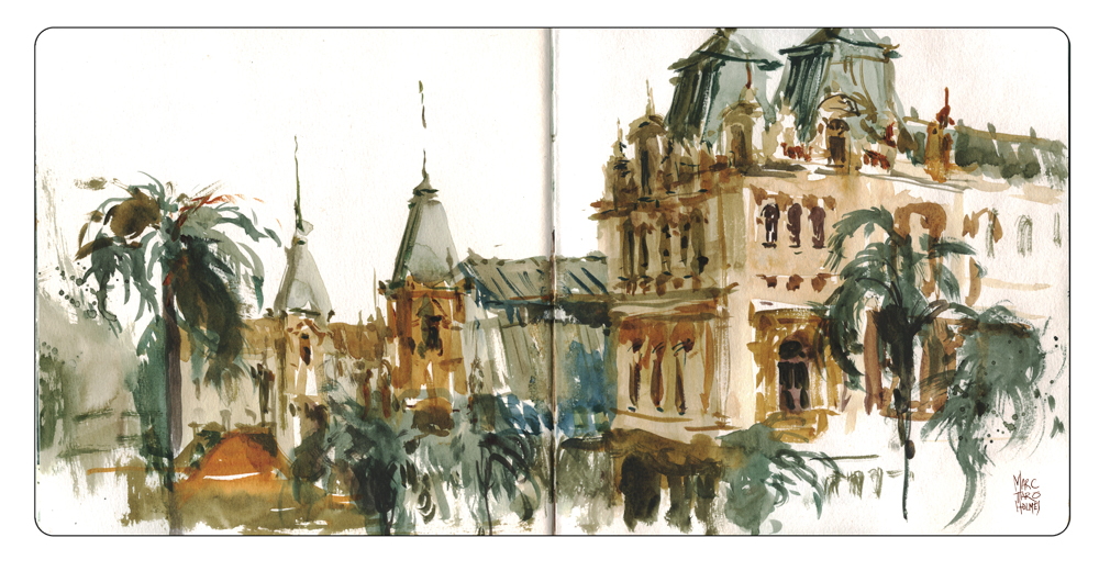
This very minimal set of 7 pigments, were all brand new to me (excepting the perylene green). I pulled them off the rack in a last minute impulse buy a few days before leaving. Colors turned out to be bang-on (to my eye). It was a bit of a gamble, might have ended up on the street with entirely the wrong shades, but my instincts turned out fine.
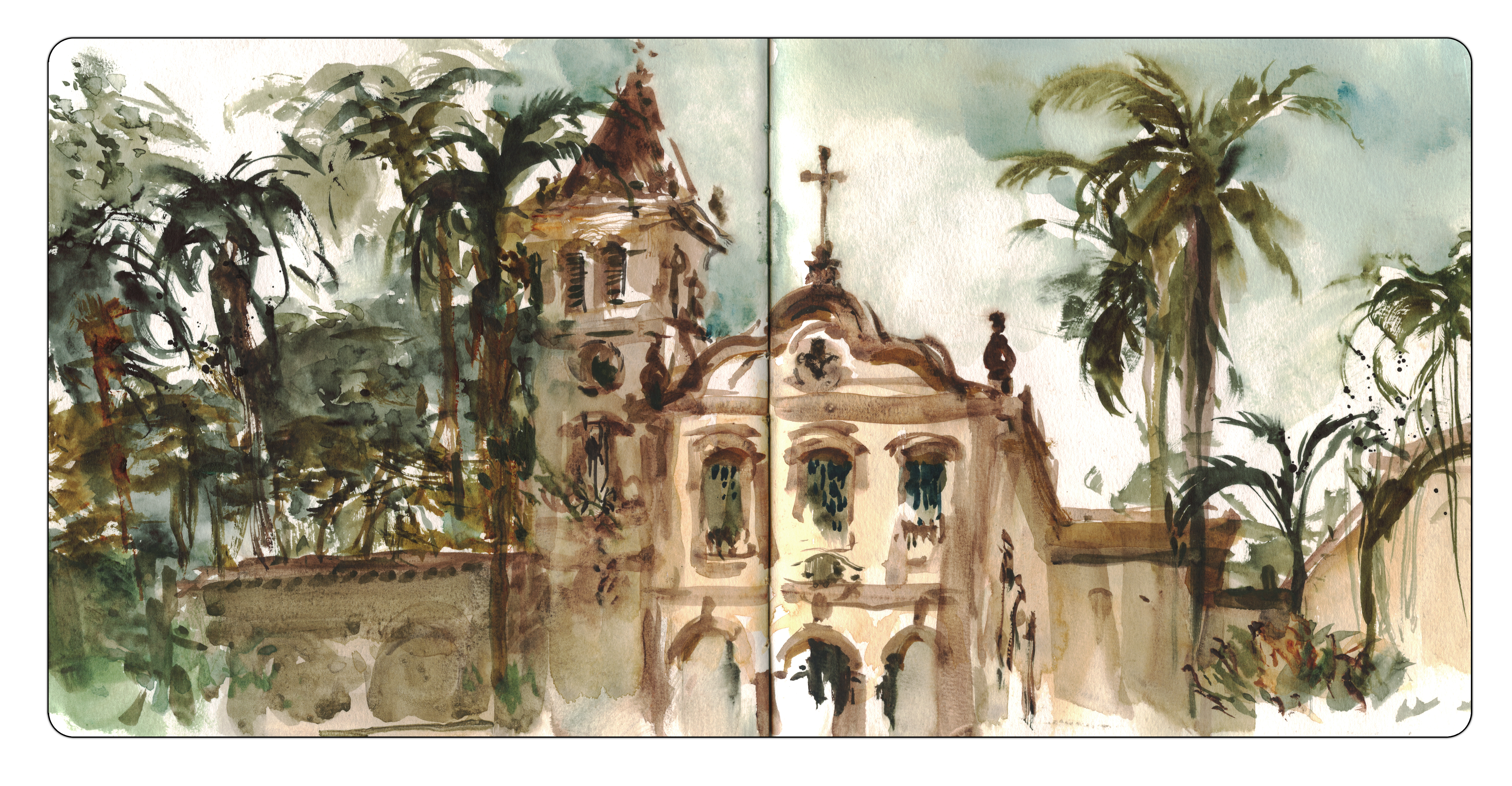
There’s one case where this palette let me down, this mission style church was in fact a coral pink.Well, to be less flattering I’d have to say pepto-bismol is what came to mind. Having only the limited palette actually improved things in this case.

The result of my experiment is this small sketchbook of Sao Paulo, with a consistent matching mood from page to page. It’s another example of less is more. Having fewer pigments to mix made for faster sketching, and the overall color scheme sets a shared tone for the sketchbook that I quite enjoy looking back on.
")
")
")
")
")
")
")
")
")
")
")
")
")
")
")
")
")
")
")


I always paint with a limited palette, more likely than not with four pigments. I don’t think there is a better way to reach a harmonious color arrangement.
I really enjoyed these sketches, and never thought that using a limited palette would create harmony throughout the journal. Would you use a limited palette more often now after your experience?
I would – now that I’ve tried it. If you have something you want to be a set, like a trip, or just a series of work, you can customize a set of pigments to match the mood you want, and it will all come together nicely! ~m
Your watercolor sketches are wonderful. I was surprised to see in the final photo that your brush is proportionately quite large given the small scale you are working on. The fact you capture and convey so much detail is made even more impressive, therefore, in my mind.
Thanks! That is an example right there of why natural sable hair brushes are worth the price. And then some practice using the tip delicately :)
I wish I was that dexterous with a brush. I know it’s nowhere near as easy as you make it look.
The beauty is this is easily solved by keeping at it :). Just keep working with the brush (I started with using a brush pen over ballpoint sketches). The more you practice, the easier it gets. It will only take you six months to a year to see a tremendous improvement.
Thanks for the encouragement.
I noticed you not painting the blue of the sky in several of these sketches. Reason for this?
Hey Mike – honestly it was simply that it was overcast with high sun behind, so really the sky was light grey.
The colour theming through limited palette and your brushwork have made for such a beautiful series of sketches. Its a limited combination of colours I haven’t seen use before – your instincts have served you so well! Fantastic choice. Stunning result.
Wonderful WC sketches and I love the strategy of selecting a color palette for a particular location. The resulting sketches all belong together and the pigment choices certainly help make that happen. Thank you for sharing this idea. Your direct painting just keeps getting better and better.
I love all your paintings!
what a beautiful nice and easy look like but is the artist ,thanks I enjoy very much.
Wonderful representation of the richness of the architecture. Did you really do these with no pencil contour drawings , and btw where did you get square format hard bound sketch book?
Hey Larry :) Yes, I’ve just started this summer, sketching right in with the brush without much planning. If you go back and check out my posts on ‘the dot plot method’ – (https://citizensketcher.wordpress.com/2014/07/23/step-by-step-drawing-example-davis-house-dot-plot/) that’s all I’m doing, just using the brush tip.
Oh and the square sketchbook is a Hand Book Travelogue watercolor book. They’re quite nice. Good size, and not too many pages so you can fill one in a reasonable time. (Good for a one or two week trip).
Marc, Will your forthcoming book elaborate this process in the exercises?
Hey Larry, I don’t get into this in the first book (The Urban Sketcher). This book starts at the beginning with a pencil, and teaches a drawing approach that leads you right into the proper thinking for painting. But – I had a fairly tight word count limit, so it doesn’t go to far into color. I hope to do a second book that takes up right where I left off, to get more advanced with water-media. All depends on how this first one sells :)
I’ve pre-oredered the book on Amazon! I’m looking forward to it!
I can’t imagine working on so tidy a space but your paintings are beautiful. How I aspire to be able to do this.
Hey Monica – well, the 8×8″ Hand Book isn’t too bad actually – that’s currently my minimum practical size I think. I have to admit – this particular one here: https://citizensketcher.files.wordpress.com/2014/09/2014_sao-paulo_slideshow-3.jpg?w=343&h=522 – this one was kind of a wild theory. I gave it a try, but it’s really too small. That’s the moleskine mini-watercolor book and the winsor and newton bijiou box. I’d say you could use this for small portraits at a party or something? but I can’t see myself actually using this setup much :)
I always admire your work, and this is no exception…and I was amazed that you selected all these DS Primatek colours.
I really love that palette. Just reading the colors in your description , it was hard to im them working together, but seeing them together in youe sketches they are really very lovely.
is that an altoids tin? What pan colors did you buy that fit so perfectly in there?
hey Emily – that is a Bijoux Box – a small tin box made for about 14 half pans. This one is Windsor Newton, but you can get other manufacturers if you look around. I actualy went up a size though – I was feeling limited for mixing space. Now I have a 24 half pan size.
hi, nice to meet you in this blog. I love your sketches. visite my blog http://sketsananangrusmana.blogspot.com I love live sketch.
I was very intrigued with your color selection and ordered some of the same to try. I’ve used a couple of Daniel Smith’s Primatek colors before and found them to quite wonderful. The effects when used in a single color graduated wash are stunning. I’d actually forgotten about them until I read this post. Can’t wait to take these new ones for a spin. Some of the historical Spanish architecture around Southern California will be my first subjects.
I’ve read that if you put the Primatek colors into pans and let them dry, they are the devil to re-wet. Did you use yours in pans or did you take the tubes with you? You said you were packing light, so I am thinking it was pans, so I’d like to know your take on how these performed when re-wetted. I’d like to know before I waste time using pans.
Hey Imna – I don’t find that a problem with primateks. They re-wet fine for me. Not like a M.Graham paint of course (which are very wet) – but still, not a problem. I refill my pans each night before I paint (if necessary) so they skin over a bit before carrying them – and I try to carry the paint box horizontal in my bag (as much as possible) because the Grahams do ooze around. I have a spray mist bottle to soften any dry pans before painting. So with that routine I’ve never had primatek’s dry out to un-usable. But I don’t often leave them for weeks untouched so can’t say for sure. I do bring the tubes when I travel but leave them in the car/hotel. Typically I refill most colors every 2-3 days when painting daily. I never use it all, but end up ‘filling holes’ when I can see the bottom of the pan in the middle :)
Excellent information–thank you very kindly for the indulgence of your reply. I’m just getting into watercolor again after a misguided foray into oils (I didn’t like them as much as I thought). I appreciate your comments and your blog has been most excellent help. Watercolor has been and still is my favorite medium–I won’t give it up again!
Great post and so happy to share it! :)
Have you selected your palette for Chicago symposium this year? I will be in your workshop I’m excited to have the opportunity to attend my first symposium!
I’ll be bringing “my usual” : have a look over here at the colors > https://citizensketcher.com/class-notes/
And looking forward to meeting in Chicago!
Where did you buy your palet? And are there other color options? I am travelling to Sweden this summer and I really want to try to make a travel journal :)
I bought a winsor and newton tin box (empty), plus a bag of empty half-pans, and filled them with tube colors.
You can find out all about my current colors and tools over here: https://citizensketcher.com/class-notes/
If that’s all too much to assemble before you go, then I would drop in to an arts store and look for something of these: https://www.amazon.ca/Holbein-Watercolour-Set-Palm-Half/dp/B007765RIU
A ready-made kit is easier, but I prefer to pick my own colors personally :)
Some stores sell the pans individually, so you can do some half-way customization too.
Either way is fine – and have a great trip! ~m
Thanks a lot!