Compostion: The Gradient of Interest
I’m starting to think about upcoming workshops – warming up for teaching this summer – so I wanted to refresh my memory on how I actually paint.
Whenever I’m trying to consciously think about painting, I take progress snapshots. Maybe some of you want to try this yourself? Just phone pics of the work is fine. Shoot a snapshot whenever you take a break. It helps to go back later and see what you were thinking. Allows you to install the steps in your memory, so you’re just a little more likely to be organized the next time. And it can help you find the point when you over-work something.
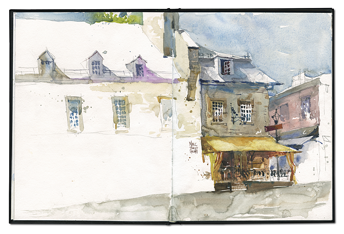
Looking back, I thought this page from the other week was a good example in a few ways.
Here’s what I was actually looking at.

Kind of a good example what they mean by ‘simplification’ hey? They keep telling you to do that – simplify. But what does it really mean? Creating Focus. Leaving out whatever is in the way of that single thing that drew your eye.
Clearly, I don’t want the truck in my sketch :) that’s easy. But also I see immediately that the yellow awning and cafe below it is the interesting part of this view. Not the people setting up their booth. Not the larger building, but the smaller one.
So even in the drawing, you can see the focus being created with composition. Leaving out most of the blue building, but using it to be a big directional arrow pointing to the subject. Clustering all the detail – all the little active shapes – under the awning. Leaving out distractions – even tho’ I love lamp-posts and foreground trees! It was hard to force myself to leave that stuff out.
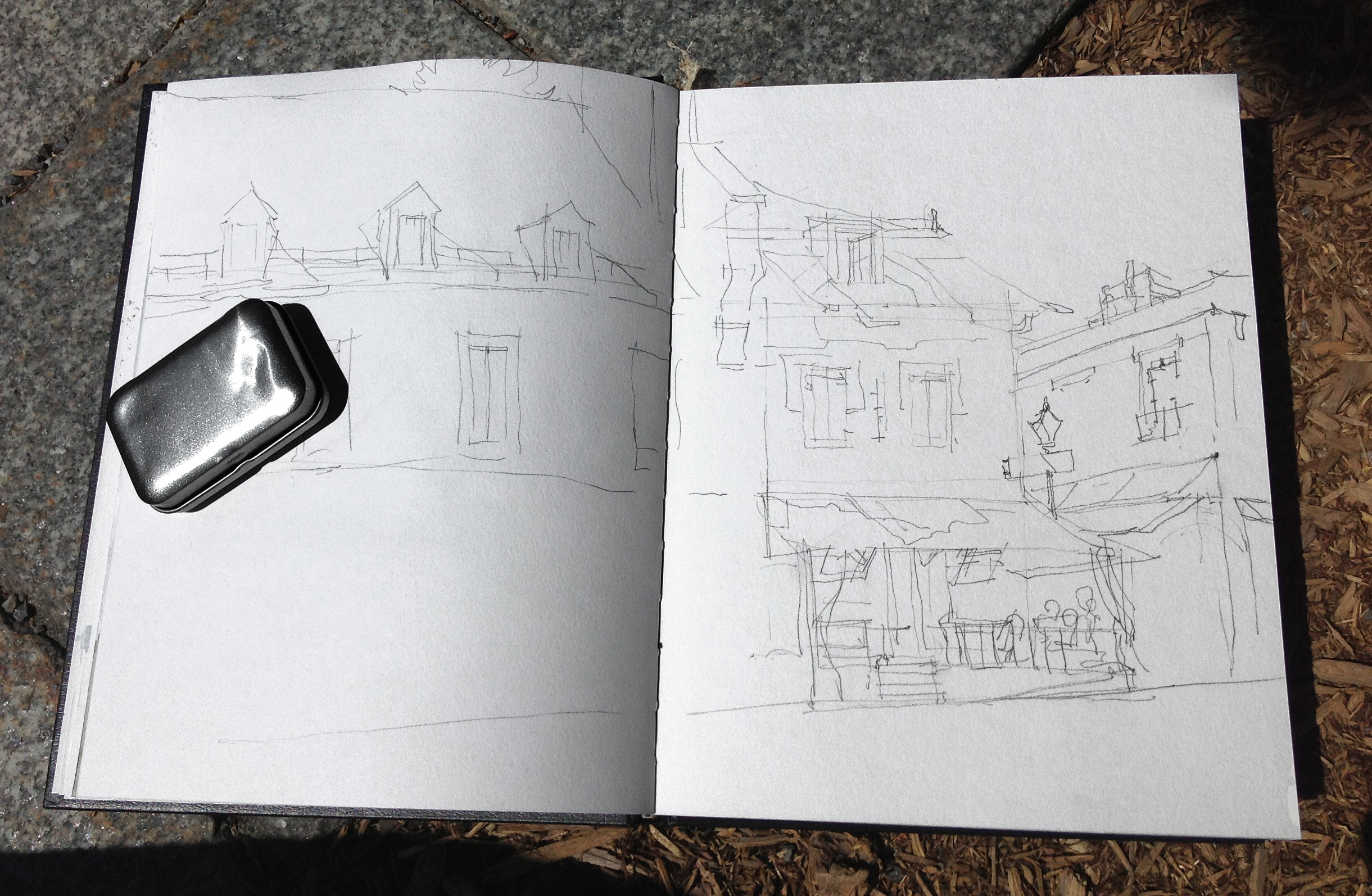
I like to say to students – “spend half the time on the drawing and half on the paint”. People never want to do that. They want to get right to the color! But if you delay your gratification, you’ll be much happier. See how the shadow shapes in the roof-line are sketched in the drawing? The design is solved before I go to color. It’s great to be able to put aside the design thinking – so when you’re painting, you can just paint. The work is done, so you can play with the color.
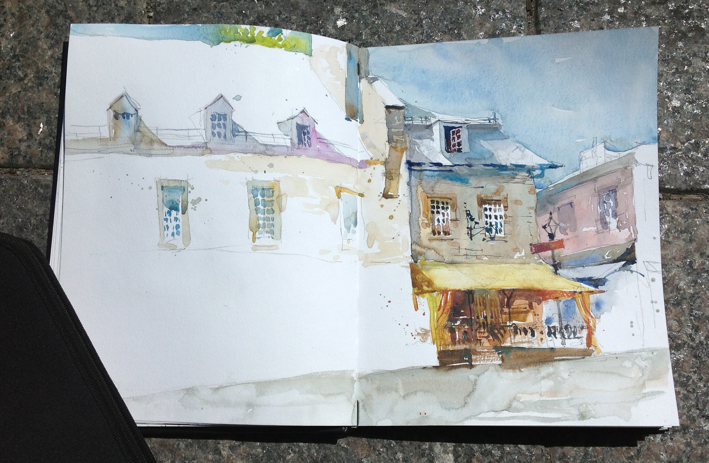
So, this is the first pass – the wet-in-wet wash. This is what they mean, ‘work larger to smaller’. Only the big blocks of color. This also is when you let the watercolor mingle naturally. This is why you’re not oil painting. Watercolor should be allowed to do it’s magic thing. Take advantage of the physics of water.

Then finally, after an hour or more of delaying gratification – you get to draw the details! Maybe it’s just me – but it’s the detail that I love. I really want to just start noodling immediately with tiny tiny shapes. But if you do that, you’ll lose the ‘life’ – the freshness that make a sketch appealing.
These smaller shadows, and dark darks are when I start painting wet-on-dry – so I can get a sharp edge when I want it. (Window panes!) And I’m using less water, more paint, so my shadows have solidity.
The eye loves three things – contrast, chroma (intense color) and detail. If they are not kept in the same place – the eye will wander – seeking information and entertainment. A tight composition keeps the darkest darks, the smallest details, and the brightens colors in the same place. The focal point.
See how each window gets progressively more interesting as you work left to right, then down to the bright awning, until suddenly you’re walking into a nice cafe! Looks like a great place for lunch :)
I like to call this the “Gradient of Interest”. All the elements working together to lead the eye.
Trackbacks
- …and the demos from the weekend | Citizen Sketcher
- …and my demos from the weekend | Urban Sketchers Montreal
- Bringing People and Places to Life: Fluid Travel Sketches by Marc Holmes | Wanderarti
- Renew your Artistic Licence, or: “Don’t Just Document – Design”. | Citizen Sketcher
- Direct to Watercolor Part 3 of 4 : Step By Step Process | Citizen Sketcher
- The Urban Sketching Handbook, by Gabriel Campanario | Citizen Sketcher
- Sketching Algarve : the Coastal Towns | Citizen Sketcher


What a wonderful lesson!� Thank you. Joan
________________________________
TY very much for this inspiring lesson.
Fab post Marco. This really really great teaching. Thanks so much.
Tim
I love this drawing – I am hoping you will not do any more to the left hand side, I like the questions it leaves. In some ways I am sorry to have seen the photo, your drawing has quite a different character, but I do understand (and appreciate!) what you are doing here. Thank you!
But, gosh. by seeing the photo as well, it gives us all the courage to look beyond a mediocre photo to see the real potential waiting to be let loose. It’s good to be reminded that the PHOTOS don’t need to be the work of art.
Greats sketch! Thanks for the w i p along with the photo – I always want to know how and why elements are included or eliminated in the final sketch! I am curious to find out why you thought of the three-lamp post was a distraction and not a character quality that makes the street and the spot unique….
I love lamp posts – it was hard to leave it out – ultimately it would have been too much visual interest outside of my goal- which was leading you to the cafe under the awning. Plus, would have drawn attention to the very edge of the frame, which is never great.
Thank you ! That makes sense now – your intent was to sketch the building and not record the place. I guess the intent is an important consideration.
Wondering, if you could not have exchanged the not very interesting tree for the lamp-post – that would have solved two problems:
the naked building on the left would have had a “fig-leaf” and the lamp-post would have added to the cosy atmosphere along with those lime-stone buildings. It would have complemented the lantern to the right and thus framed the café. This way your lovely sketch frizzles out the left.
Not, that I EVER could sketch like you do (I would have to practice LONG and HARD to get something on paper that’s even worth watching).
Thanks Marc! I appreciate the comments about your stages. I will try to keep your strategies in mind when I do my own sketches.
Interesting. I have memorized a few images in my head of my recent trip to a nice place. I’ll play with these techniques. Cheers
Hi Marc :: this is a wonderful post. The information that you have shared is inspiring Marc and I will try to integrate this into my sketching painting in the future… Thank you!
Great post, Marc. I’m just learning to draw and these compositional elements are completely lacking in my thought processes. This helps a lot.
Cheers — Larry
Beautiful sketch, and great post. Part of art is the process itself, and the passion of a piece is, to a degree, and extension of the labor of love in creating these piece in the first place. And to add to this, the unfinished look is what really gives this sketch life. It would be a great piece in itself it you completely filled up the page with color and detail, but it’s what’s not their that allows the viewer to finish it up in their minds, in a sense, extending the art and the art experience to them.
Excellent. I wish I had a solid question to ask you apart from a rave review but I don’t. How about, what colors do you carry with you in your personal travel-size kit?
Hey Alex, thanks for the good words :)
Re colors – I am starting to think I use too many :) I use a full range of color, based around Primaries plus Dirt. So I have two of of each color, one warm, one cool – so Cad Red and Alizarin – Cerulean and Ultramarine – Cad Yellow and Cad Orange. This way I can mess around with temperature. Then I dirty those with Van Dyke Brown, Burnt Sienna and Yellow Ocher. Also, I use a couple “specials” – Prussian blue and Shadow green are very dark darks, so they help make blacks (mixed with Lamp Black – which I rarely use straight). Oh and one Violet called “Lilac” or some such, which I use to make skies. See? Too many. I’m going to cut down this year!
Excellent! Thank you for your informative response. I’ve always read that we should have a warm and cool version of every primary but it was never laid out so simply as you just did. Thank you!
For my warm and cool yellows I find Indian yellow a little warmer than Cadmium, and I think there is a Chrome (?) yellow that I dig out when I want to go cooler than Cad. Any comment on those?
There’s also a yellow, Gamobge – that’s quite nice – warm, and not overpowering. I do need to experiment with more colors – but I tend to stick to my same set – I have 12 color folding palette – so there’s not much room to re-calibrate. I’ve seen a a nice 16 slot metal one Charles Reid used to recommend – someday I’ll get around to ordering one.
When I was a young artist showing my work in out door art fairs I overheard a judge mutter under his breath bemoaning my unsophisticated use of color. Ouch!! I was so humiliated that I only used earth colors for years while I studied and experimented. Eventually I had so much information that it took up three chapters in my recent book.
Hi Marc, wonderful to see your process, good idea re progress shots as you go…..great info and sketches, many thanks!
Totally beautiful!!
I’m so glad I found your blog site. I enjoyed every single word and will be following you now that I’ve found you. I teach art in a middle school and appreciated your suggestion to take photos of the steps. So often, when I have been creating projects for my students, I work out the project and then have to go back through it again over and over again to develop it to the various steps. So much easier to use the camera and the new cameras in our phones make it all so do-able.
Watercolor is my medium and I know about spending time on the drawing first. I got some wonderful tips from your article about drawing in the details to enjoy the coloring later. Thanks for a very helpful lesson. I love your sketch and what you pulled from the photo.
I loved hearing how you work through the sketching process. I really like your art work. Do you mind if I put this on Tumblr?
No problem – tumble away, thanks
A great metaphor for life: focus on what interests you and leads your eye pleasantly. So many travel through life complaining about the parts of it that ticked them off the most. The most powerful people on earth have mastered the ability to remove their focus from what does not feel good and place it squarely on the things that do. Then, no matter what has transpired, they’ve had a good day, and a great life.
Great reply. I like the way you think and will have to check out your blog site.
Now after about five years I want to get out my paints again! Thanks!
So beautiful.
I haven’t done any art since I’ve had my sweet MelMel.
This makes me want to paint again.
The worst thing that would-be artists think is that art is about toiling away. It requires work, and practice, but it can’t be forced. If you’ve let your paint box in your closet for years, that’s a very bad sign. Another problem is that too many urban sketches look completely alike. Just providing some observation. It will take time to truly loosen up and find one’s voice. It needs to be a pleasure every step of the way. People keep looking for secrets to “becoming” an artist. Well, there’s some insight: You just do it. It needs to come naturally to you…and the good news is that, if you don’t think about too much or try too hard, it will just happen as you develop and let yourself draw, draw, draw.
Good words Henry. I’m seeing people jump out of their professional lives to be an ‘artist’ in the urban sketching world. Whilst their talent in their profession lent itself to sketching the opposite is not necessarily the case. Their sketching art needs their profession as their ‘centre’. Colours become greys … that’s the give away.
I have just done a little uni module as an intro to Art. sort of a primer to a BFA. I thought I new a little bit and now have so much respect for true artists like Marco and Shari. So much history is needed, so much appreciation is needed of all the possibilities in art and colour and …etc etc. I am now back in my learning cave studying studying … right back to basics. The stuff Marco offers here is excellent and we all need to respect these talents more and more. I’m sure most of us do.
Thanks for your thoughtful reply. It’s a “labor” of love. The art that we create speaks for itself in so many ways. I look forward to checking back on your work.
Beautiful sketch ! It’s must be difficult to draw buildings that have many lines without using ruler. I remembered when I was in school. My drawing of a line without ruler can not be straight. It’s very difficult
Nicely said
Best Regards
Sunil Patel
http://www.hardwarebajaar.com
Online hardware store
Those are some awesome drawings! And very good lesson.
http://utruthkn.wordpress.com/
This looks wonderful! Now I want to take out my paint too and get started :)
A fantastic lesson and a beautiful piece of art! Wish I had it hanging in my living room.
pratic and real…
Love your drawings. I find painting so relaxing myself and so playful. http://www.segmation.com
Fab definition (literally and figuratively), work and post ! (I studied art myself and have a small port. on my blog)…so I appreciate.
imagination most of the time is nicer than real ….
Thank you for the awesome lesson! Although I love the effect it makes, I always fail with watercolors. I just can’t control it. Again, Thank you!
Beautiful
Your an amazing artist. Thanks for posting this blog!
That was a wonderful lesson and a beautiful result…totally made my last hour at work..thanks!!
Excellent lesson up here. Time divided to 2 -half for drawing and other half for paint.
Awesome post!
Thank you for the lesson! I VERY much like the qualities of your work…..beautifull interpretation.
Amazing!
Working very slowly on a mural right now and and someone had asked me to give their children art lessons… Not having the slightest clue how to do that since I don’t have a formula for painting I did start taking pictures. You are very right that its helpful for referencing the past thought processes ;) love the watercolor, by the way!
Very helpful! Thank you, Marc.
great lesson
Thank you for that tip!
I really like water painting. In my opinion, this is one of the hardest techniques. It is keeping the vitality of the colours, while buiding a composition a la prima what makes a good artist. Congrats for the good work and thanx for this post!
Beautiful watercolour and great painting tips – thanks!
that’s what I want to do~
This is a very helpful article. I struggle with this issue a lot. I tend to include too much and then the painting ends up flat and boring. I love being able to look at the two images and see what you chose. I have a photo of the exact same image that I took last summer in Montreal thinking I might want to paint it. Only difference is there are pots of flowers everywhere.