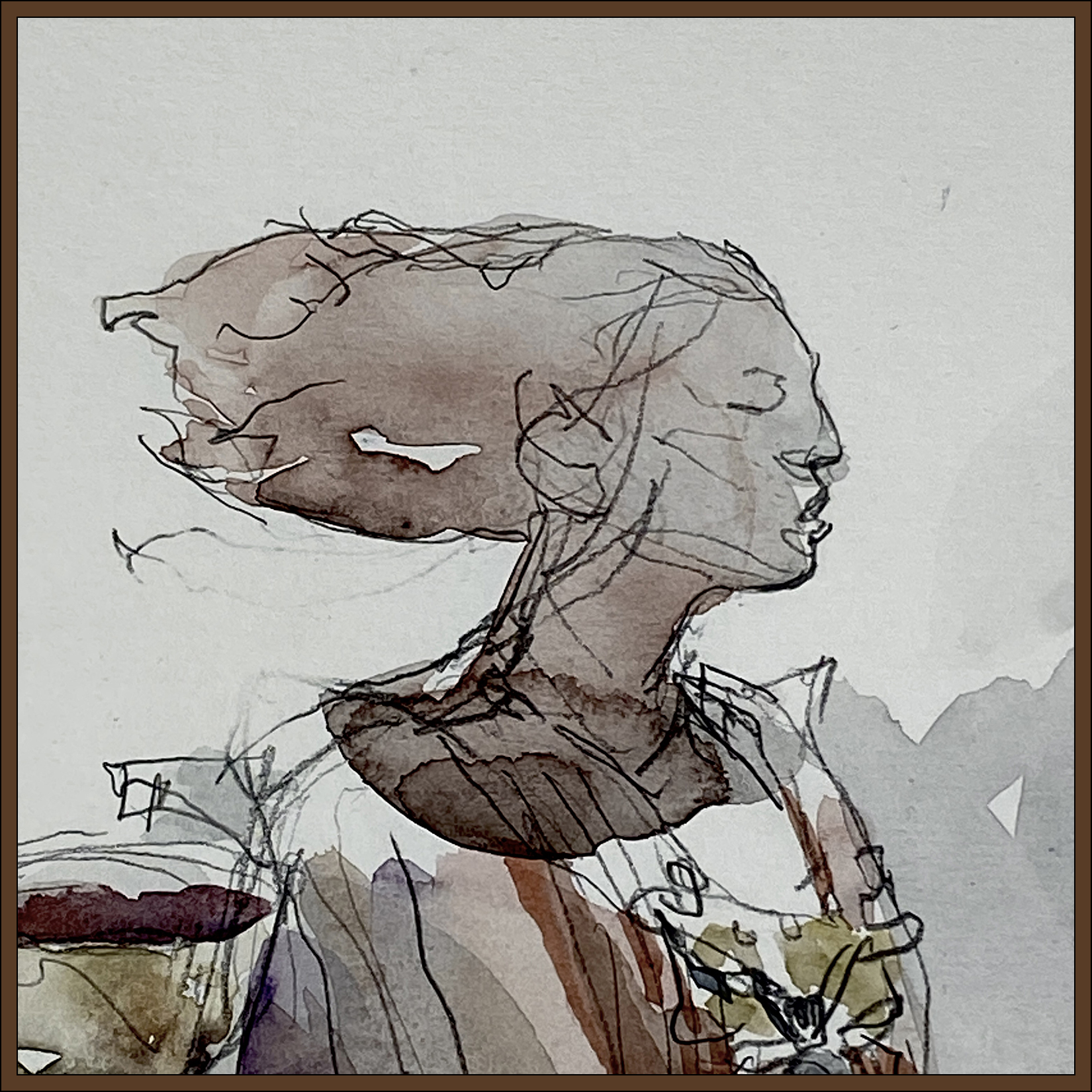
#30×30, 2025, Day 20: Look! Another Cheat Day!

One more delaying tactic to buy time for more serious painting :)
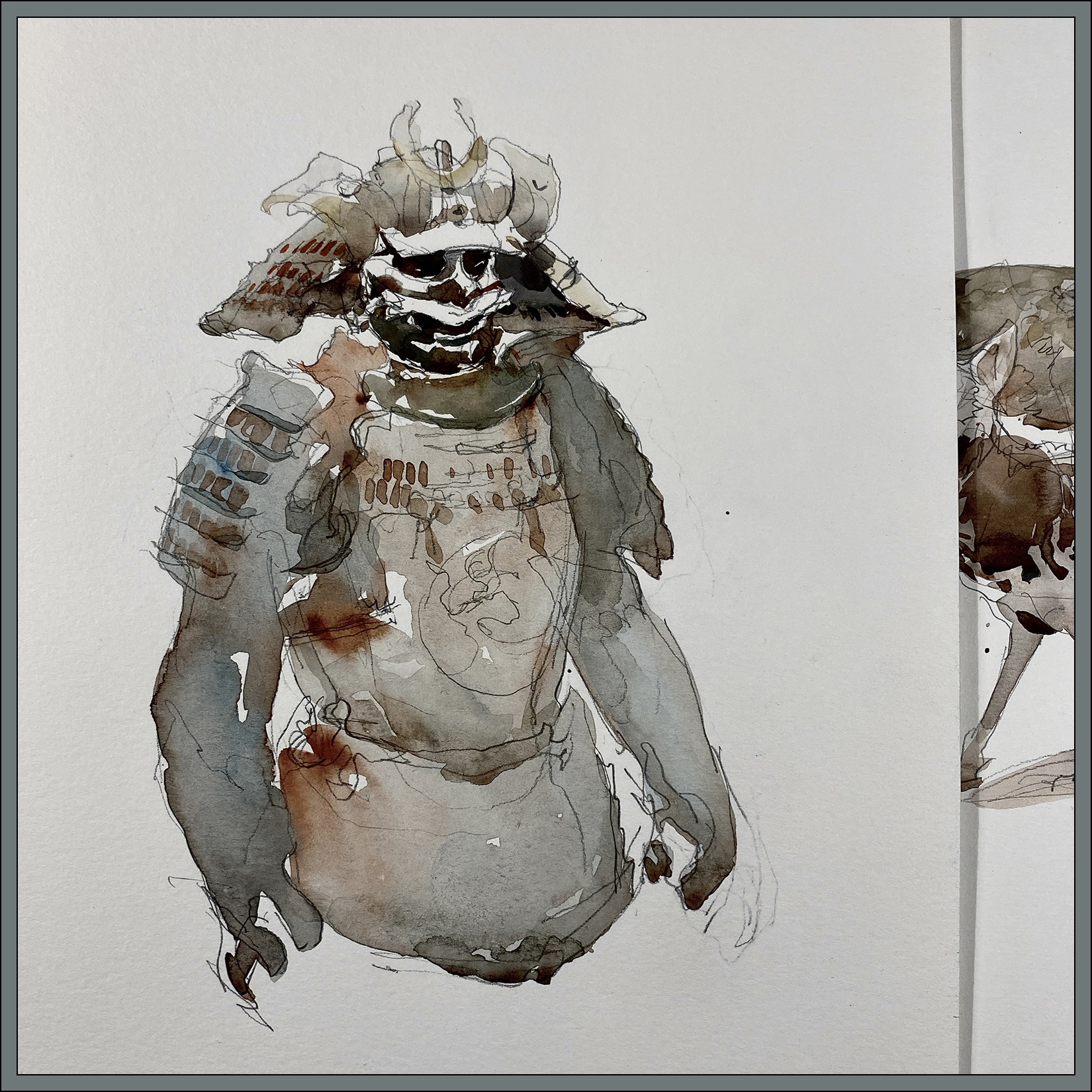
I’ve drawn everything in the cute little Redpath museum multiple times – but I keep going back because I love the quaint Victorian atmosphere. This recent visit, it was actually quite busy – so that’s a great sign. I hope McGill never finds it necessary to close this gem.

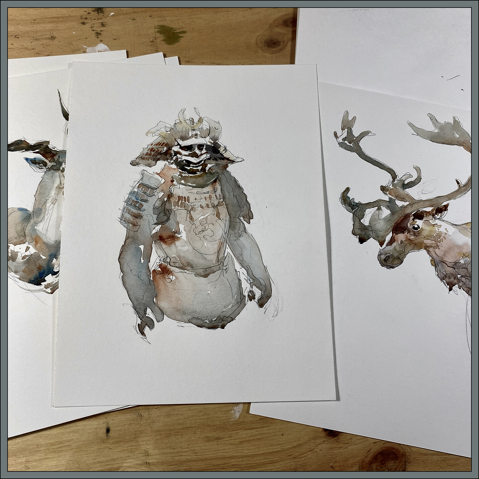
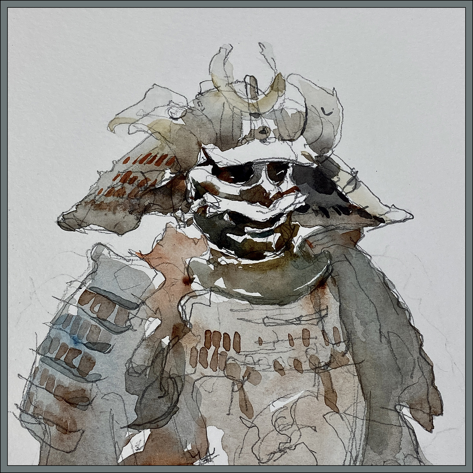
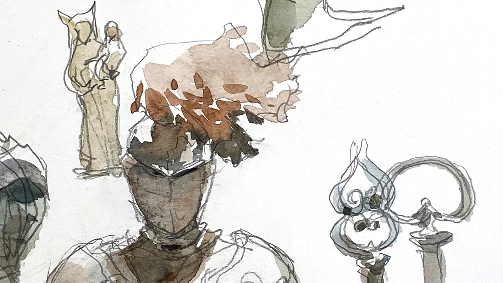
Interesting to look back at some other times I’ve painted this suit of armor :) Here it is 2015 and 2018.
So much more color! Am I becoming boring in my old age – or more sensitive to color? or it is just random :) Just a mood and nothing more :) Hard to say!
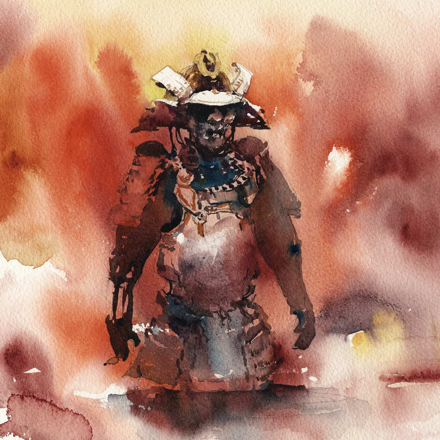

But also; Here’s a sketchbook page from 2012; thirteen years ago. Looking back, I’m not sure why I didn’t start with watercolor from day one? (This one has a little digital color on it). I know I’d been using watercolor in school, and at life drawing. Probably I was just travelling light. I do believe this one was in winter. I also did a sketch unit on ‘montage pages’ at some point and this might have been the start of that. I know I taught that a few times at various urban sketchers thingys.
Anyway! I’m sure I could go back three days in a row and it would come out different each time. I’m going to call it a mood thing, not a sign of losing my touch :)
~m
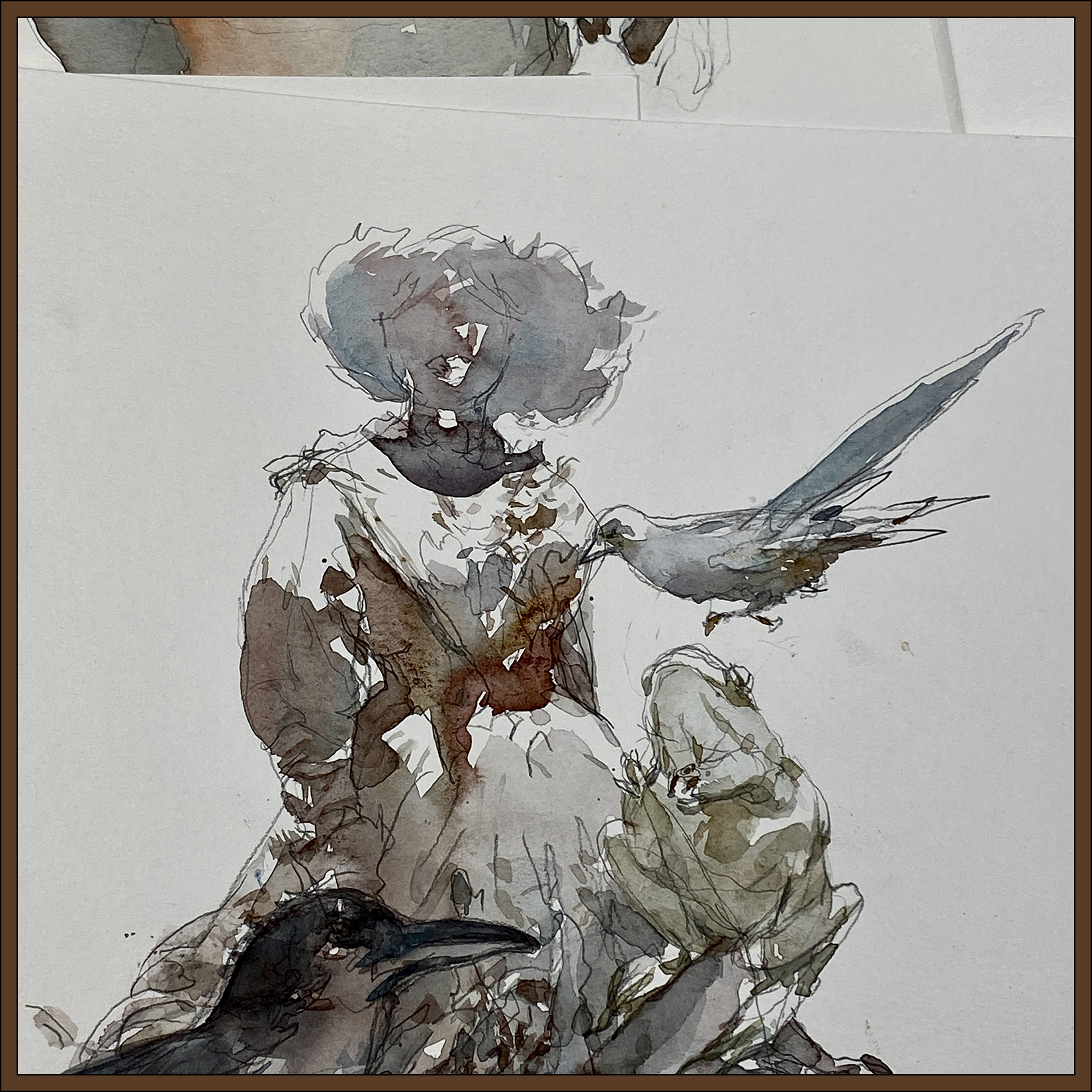
#30×30, 2025, Day 19: Cheat Day!

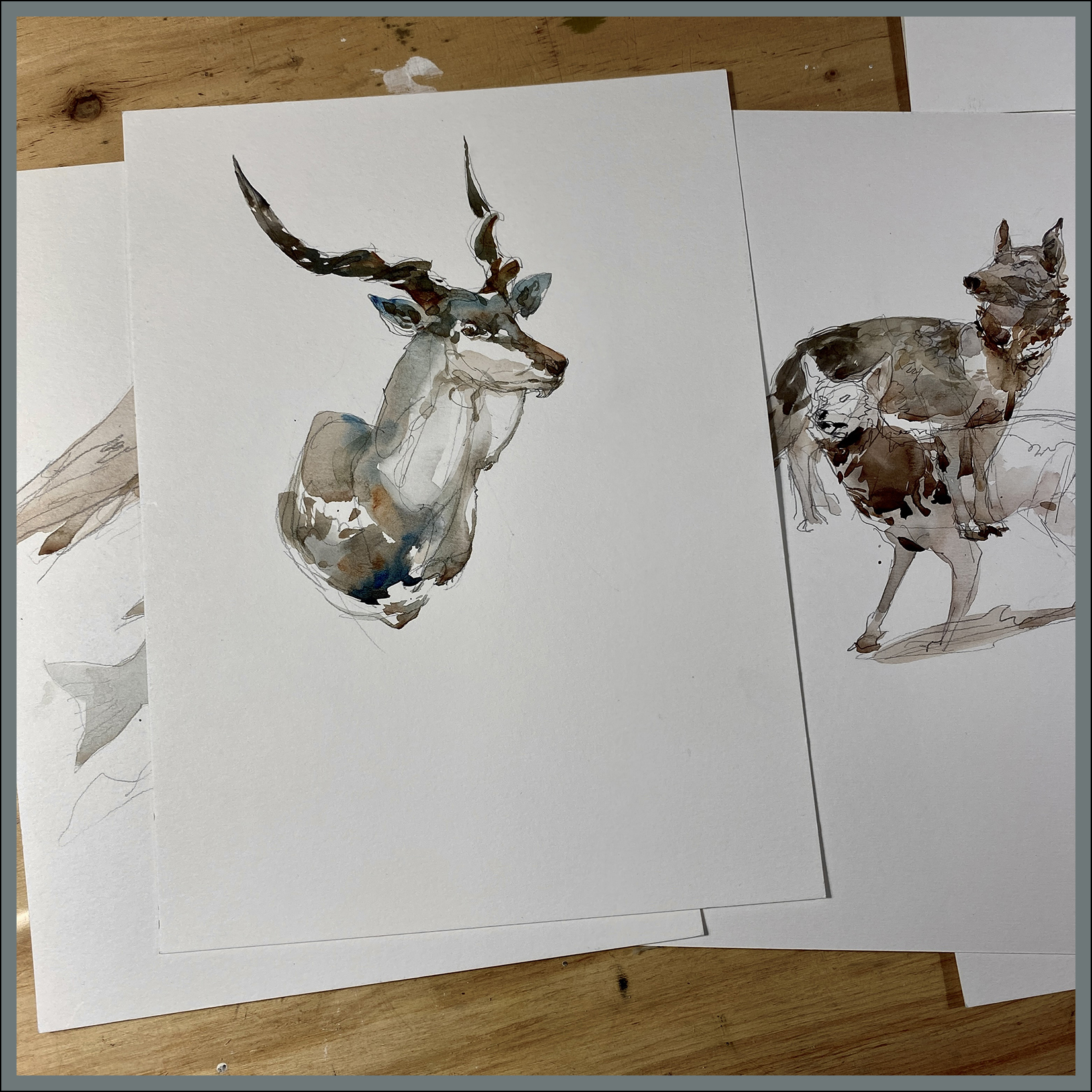
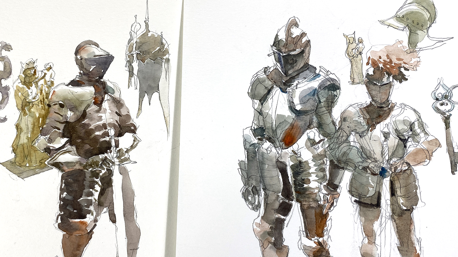
I’ve been out sketching at the Pointe-à-Callière museum’s current show; Les Chevaliers – Knights in armor.
I predict this show will be a hit for them – I’ve never seen so many men excited to be at a museum. I don’t mean to be sexist, but you don’t usually see a lot of retired guys or middle aged dads going to the museum by themselves – never mind their obvious delight at this well stocked show of arms and armor.
Of course there’s plenty of families, and I did see a couple of young girls trying on the reproduction armor pieces and lifting the swords. So there is something for the whole family at this one.
Either way, it’s a terrific show for sketching!


~m
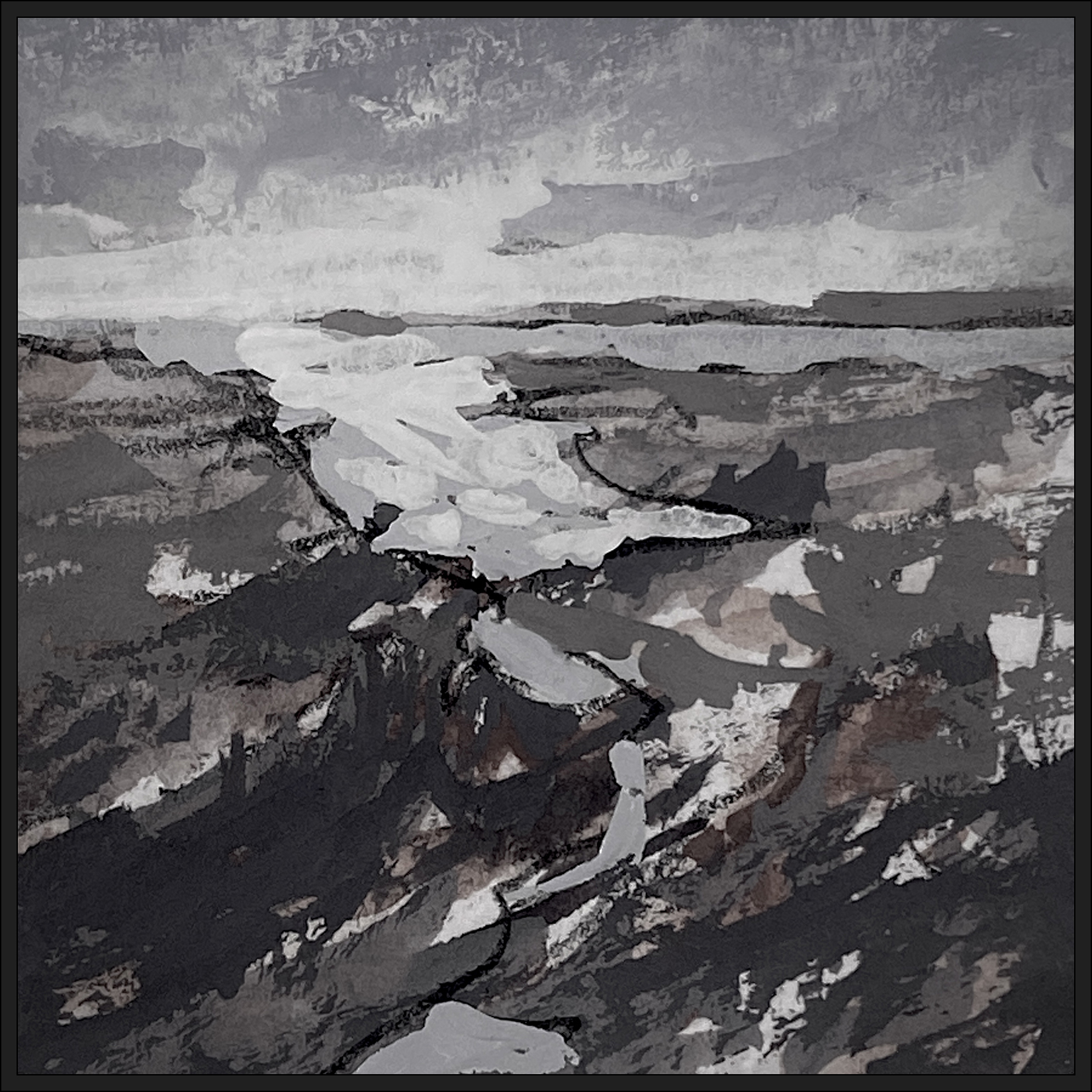
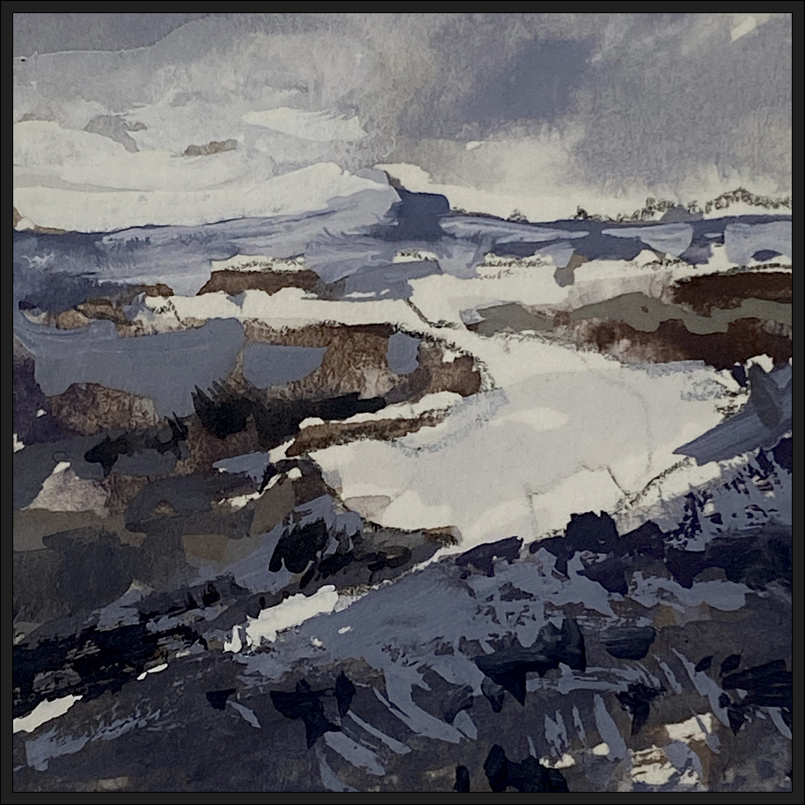
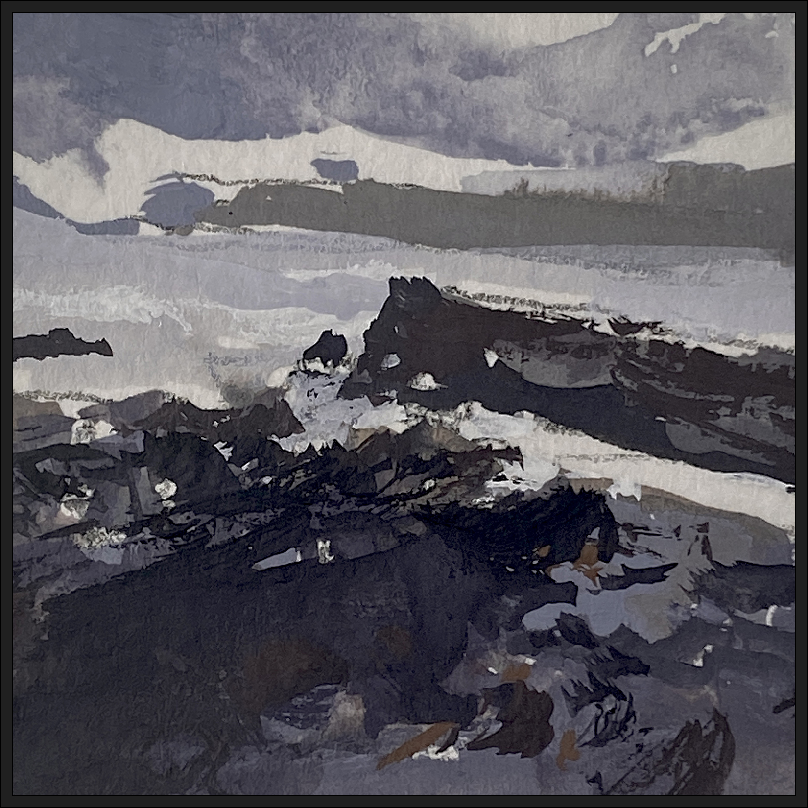
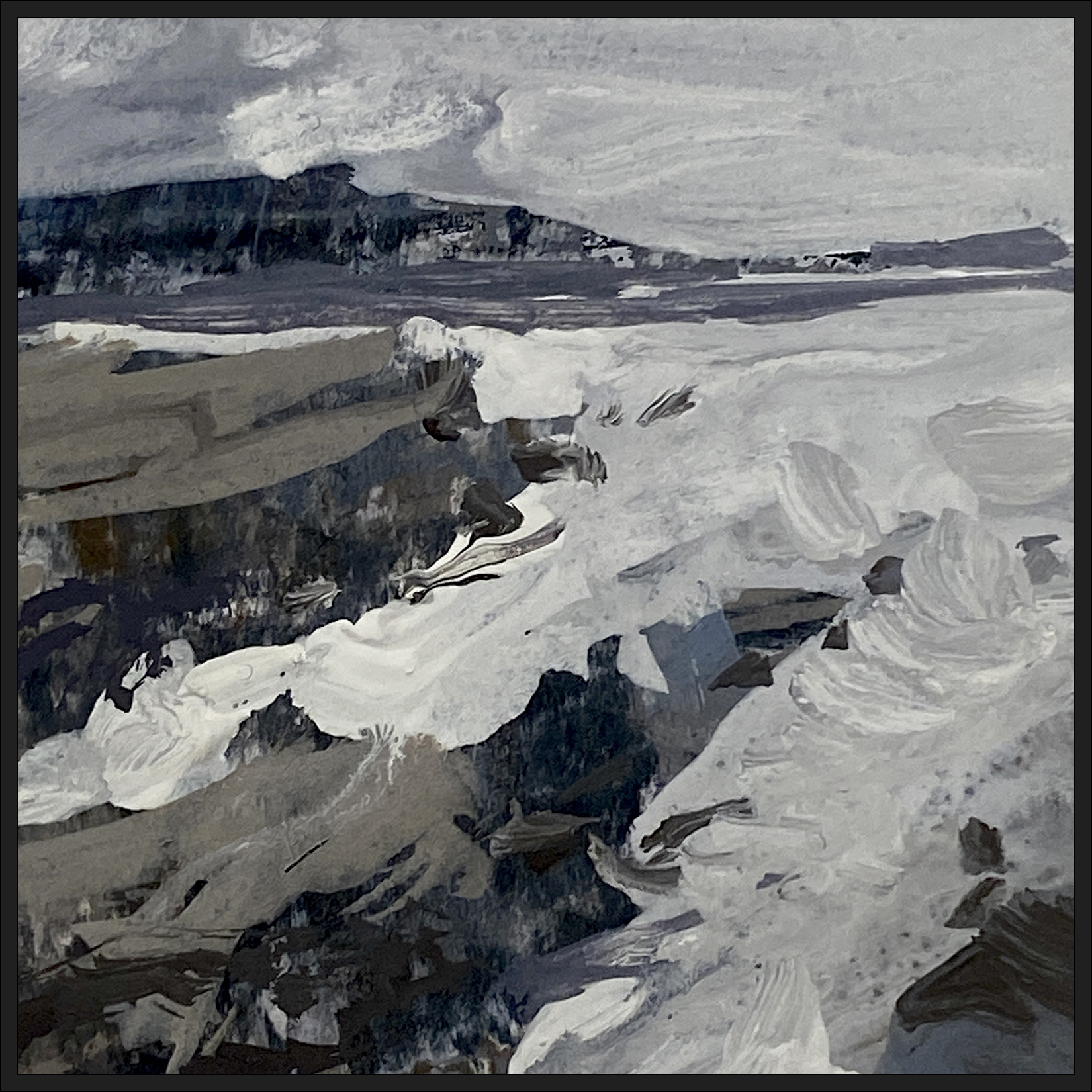
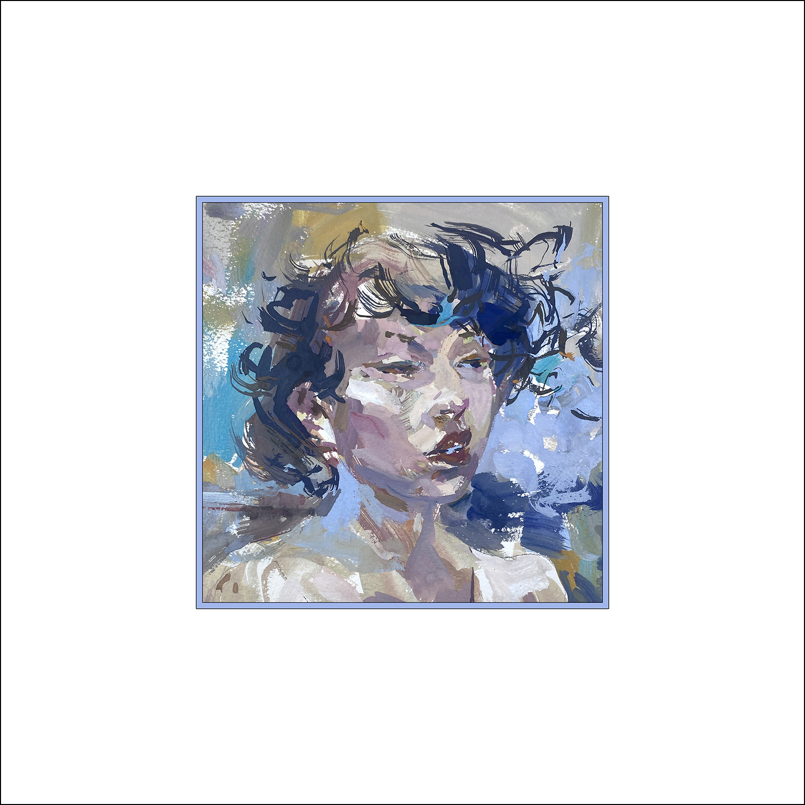
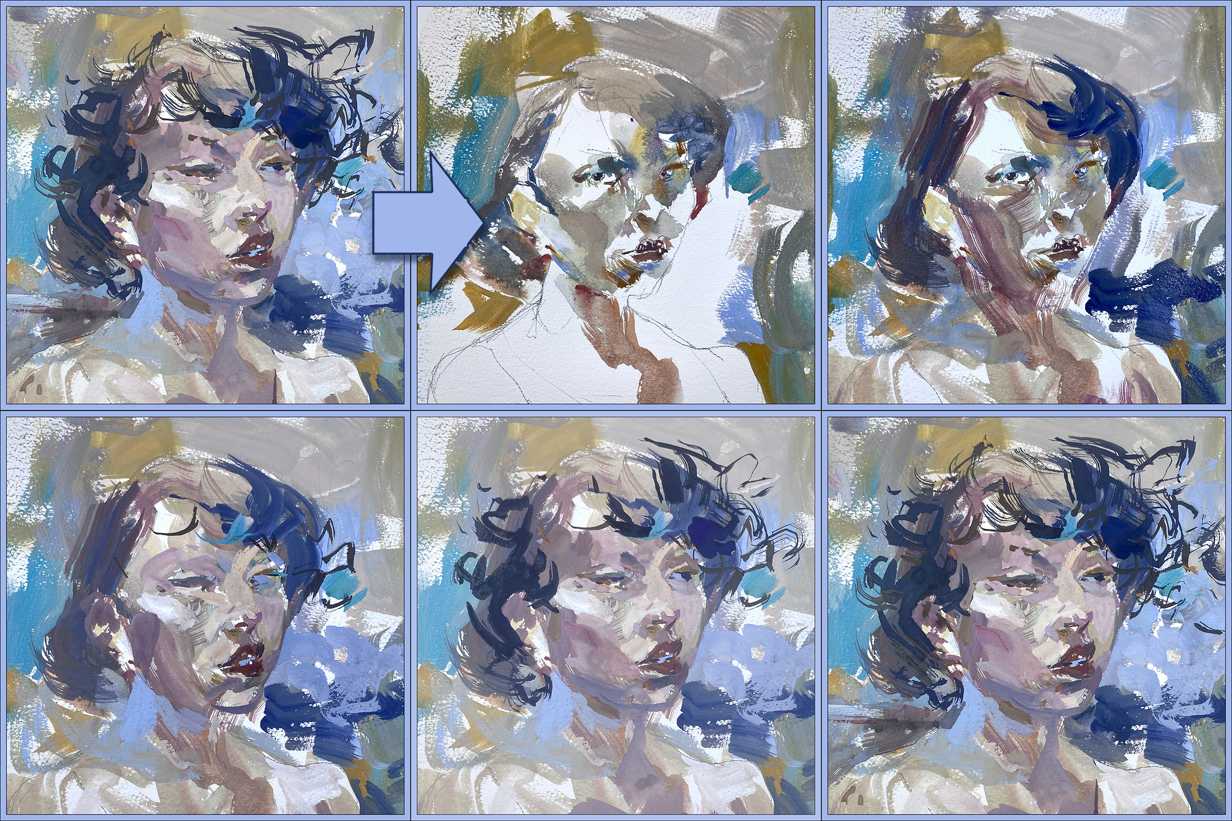
#30×30, 2025, Day 17: Mo’Gouache, Mo’Trouble!
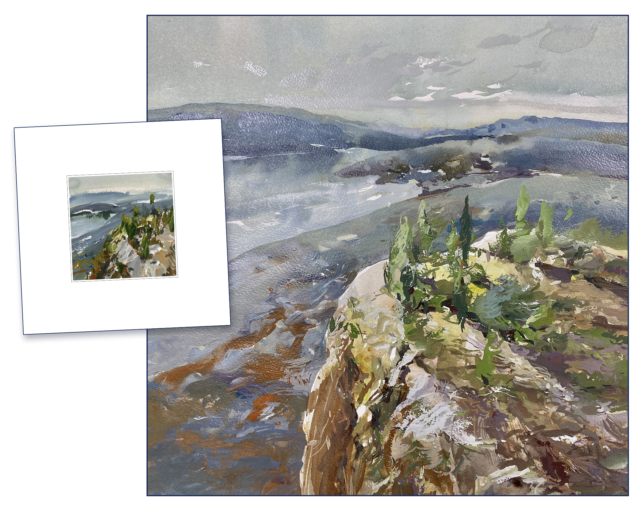
On the left is my ‘target’ – my 4×4″ miniature, on the right is a 15×15″ enragement< sorry *enlargement*. Hilarious typo. Both are, of course, gouache over watercolor.
Soooooo.
I have to say; I’m not impressed with this attempt.
This is actually my second try at enlarging this miniature. I’d painted this same image the day before and it was soooo bad I didn’t keep it. I won’t keep this one either to be honest.
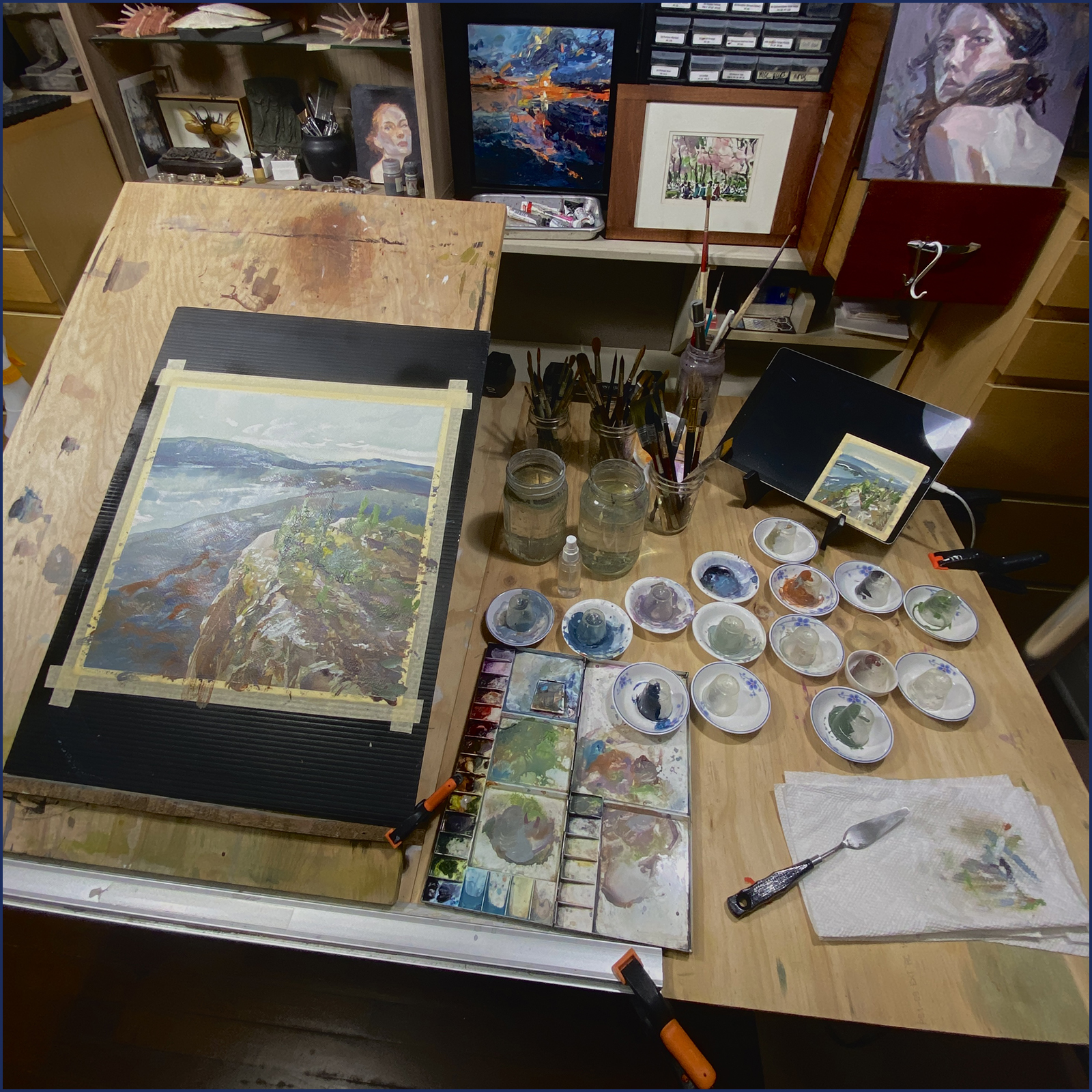
My goal all along has been to create these miniatures, select my favorites, and enlarge them to ‘full size’ without losing their abstract composition. This one is only 15×15″. I hope to go significantly larger, but it’s a good thing I did this test!
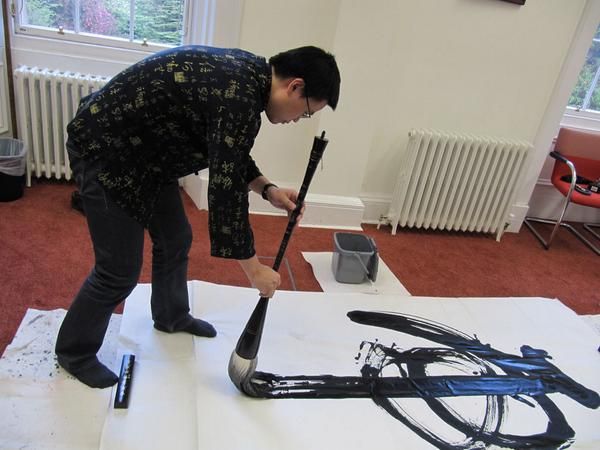
Probably there is a skill issue here, but it’s also to do with Brush size vs. Scale, if you think about it. (Random google image here, thanks to this artist whoever they are).
I *did* use much larger brushes! And I mixed up my little cups of paint! (20ml-ish).
But it’s simply not the same. In the miniature size, you can paint each passage in (almost) a single stroke. I’d need one of these Chinese calligraphy brooms to go up the size I’m imagining – and then you’d need actual BUCKETS of paint – you’d need an entire frying pan of gouache!
Soooo – yes.
Clearly – even with a 2″ flat, I can’t compete with a broom like that.
Brush size vs. Image scale! Right???
I’m also going to somewhat blame the basic nature of my home-made paint.
It simply dries to fast!
The problem with gouache – or acrylic. It leads to a panic-loop where often I don’t have exactly the colors I want, in exactly the right amounts, but I don’t want to be wasting time mixing more color while the existing paint dries.

Of course with oils you can just doodle around with your paint piles all day without worrying about your supplies going bad. And with watercolor, you can mix washes in cups, mugs, rice bowls, teapots, whatever you need.
Plus, as you work, you’re having to remember to mist your paints every so often – or maybe you’ve got your wet towels under your paint – (which I did not try I admit) – but if you’re using huge quantities of paint (in my imaginary wall-sized paintings) – it’s all looking somewhat impractical.
With this particular painting, I end up working faster and faster, and trying to make do with the colors I originally mixed instead of fixing the basic issues. Which leads to a kind of ‘out of the tube’ cartoony color.
It’s just not a great situation.
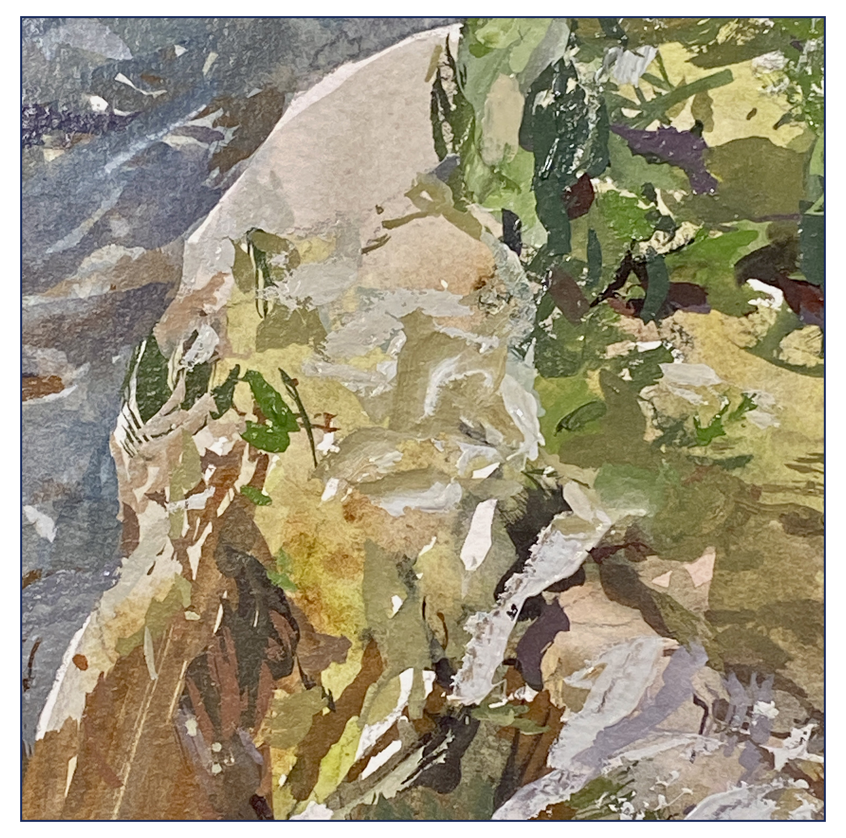
Too many hard edges! No natural blending!
I have to say – it’s all too stressful :)
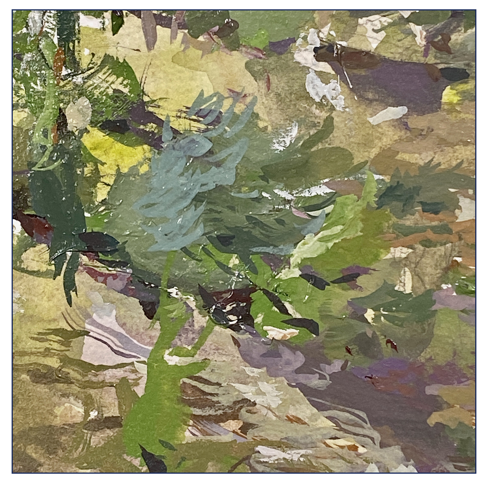
Ultimately, in a desperate attempt to resolve the image, I resorted to adding all these detail strokes – to make optical blending – since I wasn’t getting wet-into-wet; and that’s exaclty what I was trying to avoid!
This has happened to me before in acrylics. I end up getting more and more detailed, and ultimately drawing with a little brush in the manner of a colored-pencil drawing. Not the way I like to paint at all. At least with acrylics you can glaze to get blending. Which I wasn’t getting with the gouache. This seems to always leave marks on the surface, very visible edges to any wet pools.
Not sure if this is avoidable, I don’t have enough experience to say for sure.
Probably I am painting too dry and too starved of paint.
In the end; I wanted to preserve the boldness of the miniature – and instead I’ve made a flatter, fussier, busy-er copy, that might be bigger, but sure isn’t better!
So; that’s my day 17.
Actually a few days combined to get this done, what with an afternoon for mixing paint, and then tearing up my first try.
Clearly, this is going to take a lot more practice!
~Marc
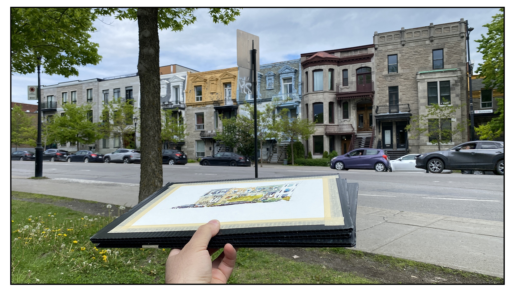
#30×30, 2025, Day 15: Day Off for Urban Sketching
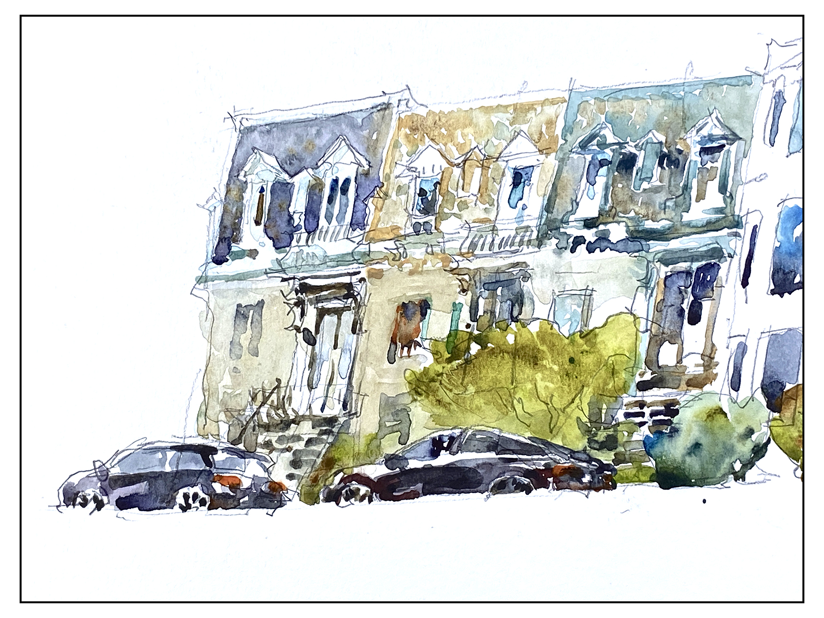
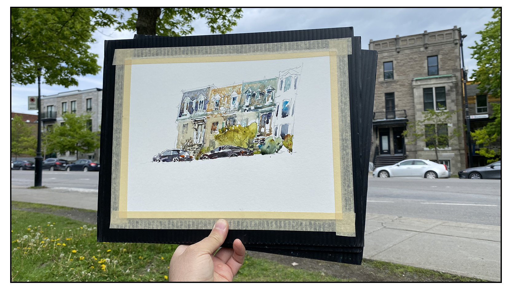
Out and about on the Montreal Plateau with some friends. Just sketching for fun. Something is happening to me – as I get older, a really nice day is almost euphoric! It’s not worth it to be inside!

Have to say – I kind of love these cars I’ve drawn :)
I don’t usually put the cars in – but lately I’m feeling they add some urban-ness, some signs of life.

But look at all the line drawing in this sketch! Really lazy today! Hah!
This isn’t really a direct watercolor painting to be honest. Can I call it ‘Crazy Person Adult Coloring Book?
Take this advice if any of you are planning to become art-bloggers! Never go around talking about RULES when it comes to art. You open your big mouth too many times and you’re just going to get into trouble later on :) Nobody forgets the things you say!
But I feel like those were the ground rules for event so I am a little stuck:)
What would you guys think if we changed it next year to be all-media? Would all the water-painters who participate go on strike in protest?
Really – it’s the same value for everyone right? The encouragement to paint every day is more the point, it’s never been about HOW you paint.
Let me know what you guys think in the comments.
~m
#30×30, 2025, Day 14: Like a Phoenix From the Ashes

Today was an epic battle! It took forever to finish a small 10×10″ sketch – and there were multiple points where I though the day would end in disaster.
I think it’s normal for me – around the midpoint of the thirty day marathon I’ve done some warming up, things are starting to flow, and then I think; I should do a really good one!
That’s always a huge mistake :)
Putting pressure on yourself to do a good one? In the middle of a public event? On a deadline?
Huge mistake!
Whenever you’re afraid you’re going to ruin a painting, you’re in big trouble.

So yes; here’s the piece at the first moment of crisis. The halfway point. This is the finished underpainting in watercolor.
I had been going very carefully – much too carefully – making little wet areas and charging them in with color. This often happens with detailed subjects. I get lost in the details – treating them all with the same importance.
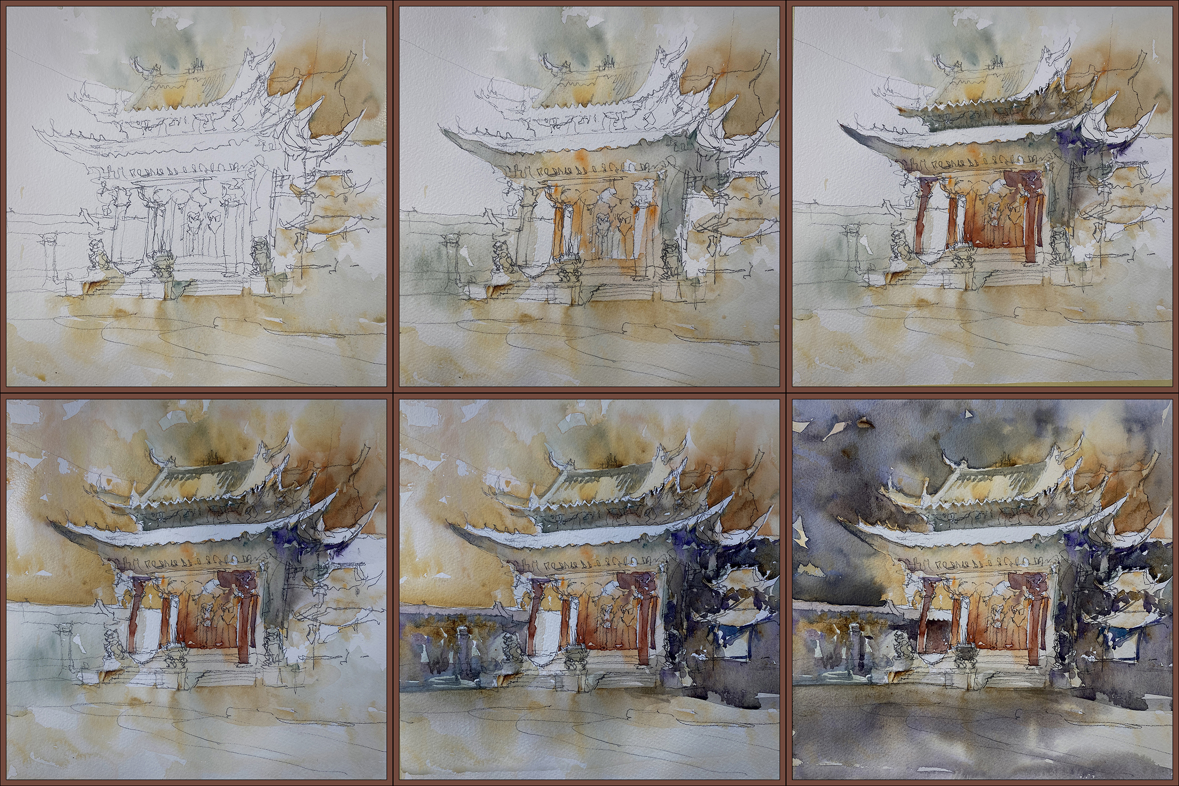
When I put in the sky I had thought I was done!
But then you step back and realize – wow. This whole thing is FAR too light! There’s nowhere near enough contrast!
I really dislike going over a wash twice. The goal is to get the color right the first time. It’s very easy to just muddy what you have if you go over again. And – there’s no way you can cut around a complex shape twice. You’ll end up with a messy complicated silhouette if you try to do it twice.
I felt stuck!
That sky was NOT dark enough. And why did I leave the roof white? It’s not daytime with the noontime sun shining down!
I’ve really messed this up!
So – I had an ice cream. Laid about the studio for a while. Fussed about.
And finally decided; I have to do something right?
So I did cut in AGAIN, against my better judgement.
And then, in a cascading series of problems – as soon as I had a darker sky, it was clear that the darks in the temple were far too pale – including that white rooftop I had left for no good reason – so maybe (in desperation) it was time to bring out the gouache!
Oh My God!
Here it is with some very heavy handed retouching in gouache.
Now I’m REALLY thinking I ruined it!
I’ve been having such great luck with painting-over in gouache. It’s supposed to be a simple way to fix anything! How did this one get so overworked?
Well – because of course, trying to paint this fantastically detailed Chinese temple is completely different from slashing out a sky on a 4″ abstract landscape. Truth is – nothing I’ve done for first two weeks has been anywhere near this difficult.
So; I fussed about some more, seriously considered tearing it up – which of course broke the spell.
Once you decide you hate it – you can do anything :)
So I laid in a dark orange/sepia wash over the whole thing – soaking the entire image with wet paint. I had the board tilted practically vertical – you can see color running down the image in the middle there.
Miraculously – this melted all the overworked gouache. It reduced all of the contrast, neutralized all the color, and served to unify all the distraction in the background.
In the moment, I wasn’t sure if I’d ruined it for good, so went and ate some chocolate chip cookies, then came back and realized – – all I had to do was re-state the lanterns and pillars with white, and lo’ and behold – it suddenly works.
That’s the kind of retouch that works. Minimal touches! Not a complete paint-over :)
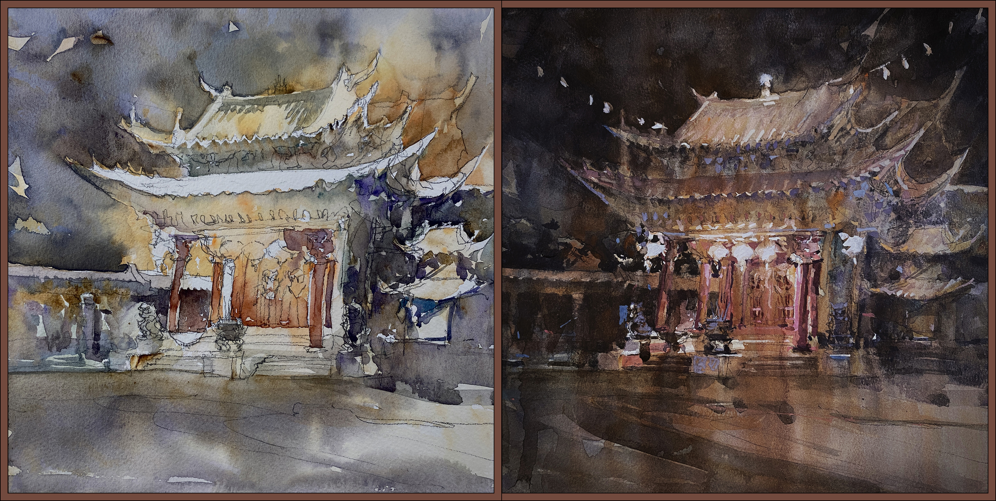
So – watercolor midpoint vs gouache-wash over top.
That’s how you spend an entire afternoon on a 10″ painting, almost give up three times, eat lot of junk food, and in the end, like a Phoenix from the ashes – you can only save a painting by deciding to burn it to the ground :)


~m
#30×30, 2025, Day 13: Cheat Day!
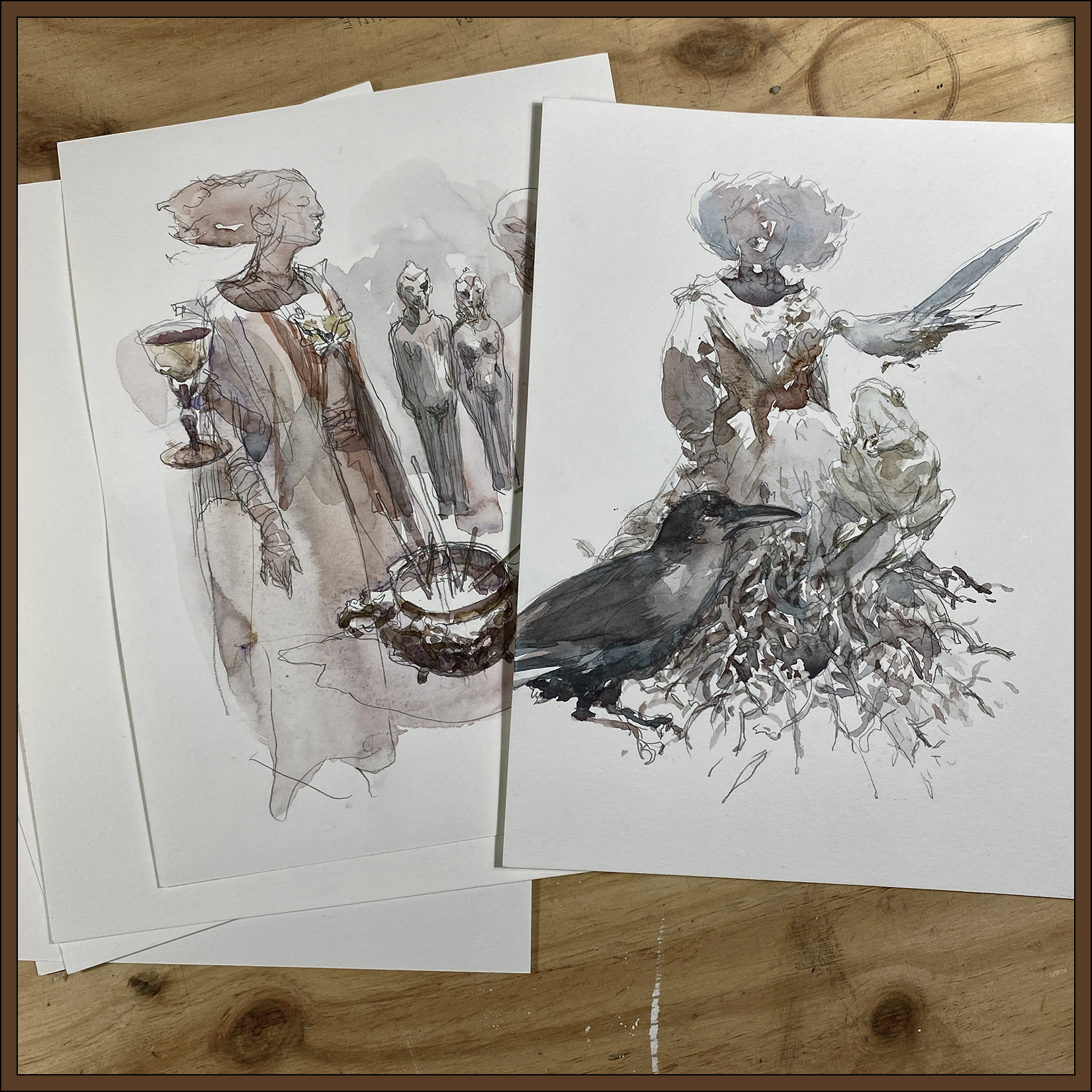
Every so often you need a Cheat Day.
This is a *significant* cheat! These are not from the 30 day marathon window. We’re not supposed to post older art, otherwise it turns into a portfolio showcase – so don’t do what I’m doing :)
In any case: here’s a couple of sketches from the Pointe-à-Callière Museum’s unfortunately disappointing exhibition on witchcraft.
What can I say about these drawings? It’s not really direct watercolor is it? But I feel like the wash is handled in a direct manner. I know I keep saying that – and I’m not sure why I can’t bring myself to just paint purely directly anymore. I have mentioned before that it’s a kind of performance anxiety. The act of showing your work to the public, as we do in this marathon, often creates a significant mental pressure that it has to be perfect. To the point where some people can’t even do it. Too much anxiety! So I know it’s related to that. (Even though I know nobody will criticize me :) Just my own brain).
I know I could get back to it (pure directness) – especially if I publicly shamed myself about it – and perhaps that is what I’ll do next year. I kind of put myself in weird position this year, going in with the plan of ‘Miniatures to Masterworks’ – that is far far too much focus on results.
Anyway, that’s why; here are some museum sketches :)
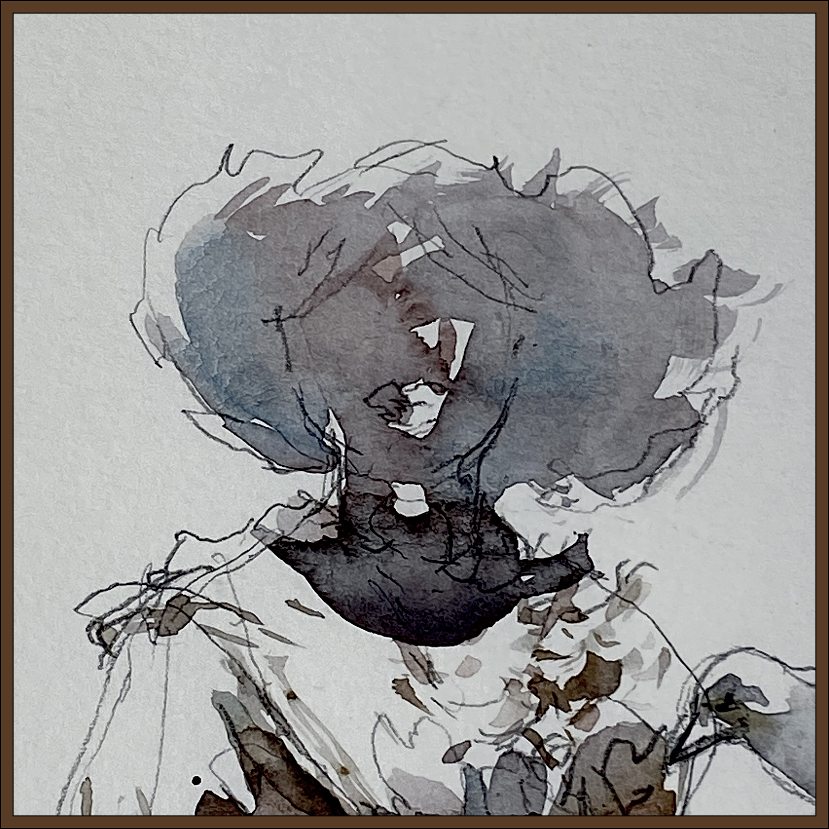

The best thing in the exhibit was a display of movie-costumes from various cinematic witches. They were just dresses on body, forms, so I added the heads. I believe the one with the skirt of twigs is from The Princess Bride. She was a very short person! The other robe is from the Netflix series, The Witcher, worn by Meng’er Zhang playing the character of Milva.
I can’t say there was much else of interest. A few preserved animals, some Halloween-y looking props, and some random pop-culture items and toys. I am very sure they will do better for the upcoming exhibition on Knights Chevalier!
~m
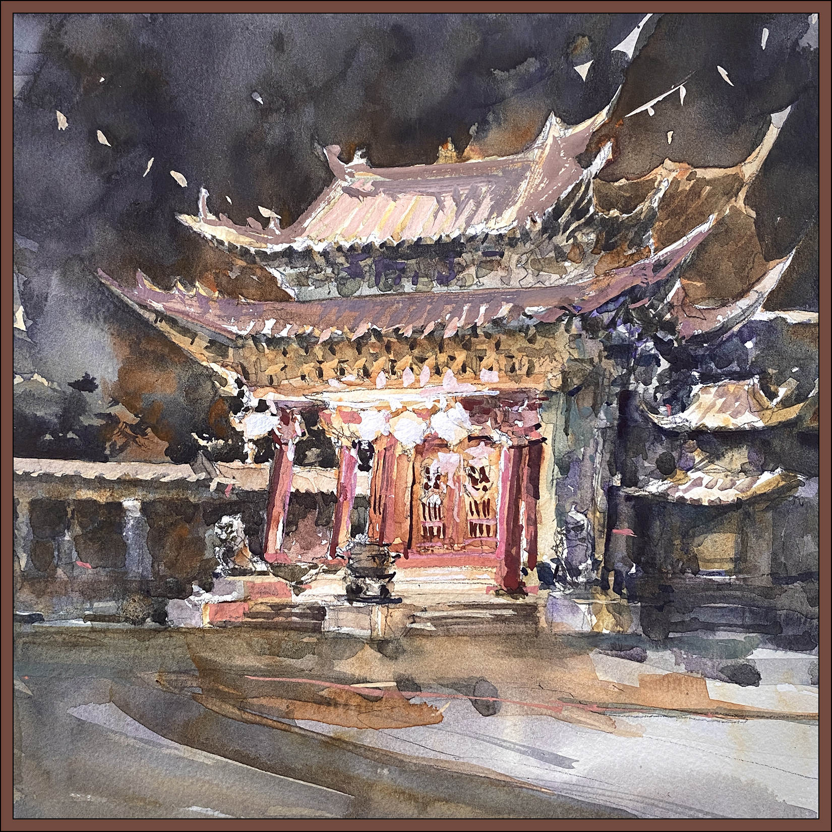
#30×30, 2025, Day 12: Chinese Gate
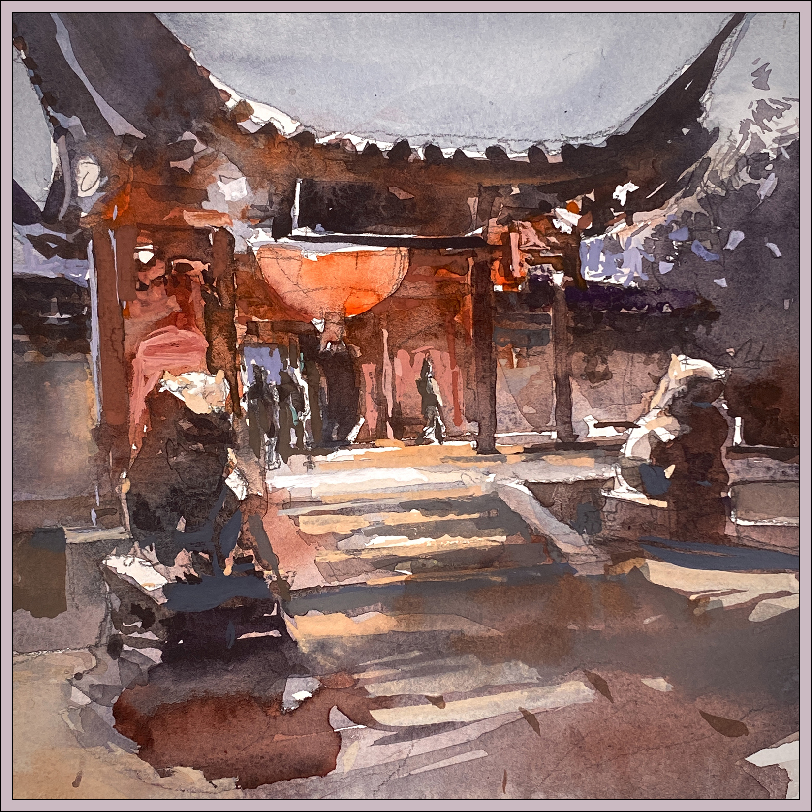
Here’s a speedy 8×8″, of the Chinese pavilion in our Montreal botanical garden, during the festival of lights last October.
My goal was to see if I could do it mostly in watercolor – not holding myself back in any way. You know, not concerning myself about accuracy or detail :) Because this time, I know I can fix any issues that arise with gouache. (Hah! That’s some confidence :) But I think it worked out in the end!

So; here’s the Before/After. The ‘pure’ watercolor on the left, and the gouache ‘retouch’ on the right. You might notice a color-cast in the sky – that’s just some kind of iPhone camera thing – the sky is actually untouched from A to B.
So let’s see; looks like these are all the opaque touches:
- The red light bouncing off the doorway – especially where it backlights the stone lion.
- The orange light on the steps, helping to re-draw that geometry. (Steps are such a pain!)
- The hot-whites in the spotlights under the eaves. I reserved some of them, but had to re-state a few.
- Some corrections on the pillars helping define the structure.
- Cutting around the confusing figures coming though the gate. (Still confusing, but hey).
- Poking a few sky-holes in the tree mass on the far right.
- Tiny but important tweaks to indicate the shape of the lions’ heads. (Ears in particular).
- Some work in the shadow on the ground, that ultimately I wish I’d left alone.

So; what do I want to say about this? I guess it’s this: The ability to make corrections lends a great deal of confidence! < Go figure, right?
I am seeking a kind of bold, ‘effortless’ painting that conveys a scene without too much reliance on detail. I want the work to look ‘direct’; in the moment; impressionist – but also to be abstract.

And of course – I love contrast! Bold color and dark darks. I don’t think I’m a very subtle person :)
So – given those goals, I’m pretty exited about this one! I wish now (of course) that I’d painted it larger.

Side note: Because of the ‘silhouette-y’ nature of this image, I was thinking very consciously of the way the French artist Marc Folly paints shadows. Here’s a video of him at work. It’s in French, but he’s hilarious in any language, (you’ll see what I mean) and you can easily follow what he’s doing.

And here, just for your curiosity, is the cellphone snap. So you can see how bad I am at perspective.
~m
#30×30, 2025, Day 11: How to do 20 Paintings in a Day!
So I did 20 paintings today!
(I don’t know why I didn’t do 30. That would have made more sense considering the name of this marathon :)
That brings my grand total to 58 – and it’s only Day 11 :) Not that anyone’s counting, that would be silly :)
Now – these ‘paintings’ are only 2×2″ square; so some people would say they shouldn’t count.
It would be kind of hilarious to put them in a gallery :) In a giant gold frame! :)
But really – if you blow them up to full screen would you really say they’re not finished? I don’t see why not? They have all the complexity you’d want in a wall painting. There’s nothing fundamentally wrong with the composition. They happen to be a bit dark; a bit contrast-y; but that’s ok – sometimes I like that.
So this is round two in my side-project to make ‘black and white’ Notan, with the intention to pull from these later on to create wall paintings. The challenge to future me is redoing these, presumably improving them, but not losing what I like about the composition.
I have no evidence this will work :) but I like to dream big :)


~m
#30×30, 2025, Day 10: A Head of the Game!
I just want to say; that’s 38 paintings today! :) So I’m well ahead of the game. :) :)
Now, most of them are only 4 or 5 inches, though this one is 10×10″. Sooooooo – I can’t *really* say that’s totally playing fair. But why not! Working super-small is certainly a strategy for working daily.
My goal of course, is to use these miniatures to I can re-recreate the best ones in full-size. Or just use what I’ve learned and apply it to scaling up. Which is something I’ve always had problems with – I’m pretty comfortable small, but I have a hard time scaling up my brushwork to larger work.
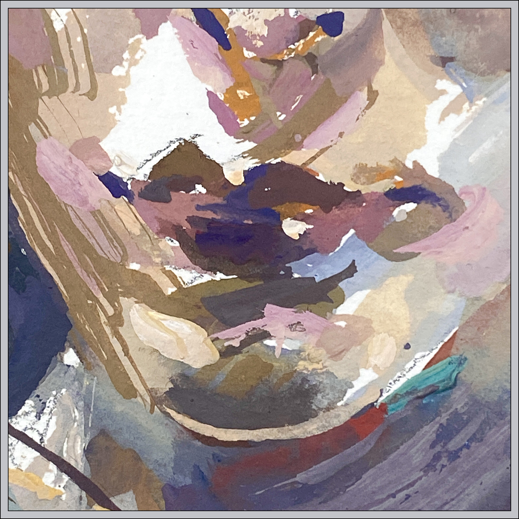
But I’m still mulling all this over; so here’s a little portrait in Gouache; done from a random Instgrammer:)
The beauty of the opaque watercolor; you really and truly can do *anything* in the first layers. It really doesn’t matter. Just keep layering on top and it eventually comes together :)

So this is what – seven or eight days playtesting the gouache?
This one is pretty much identical to how I’d approach it with oil. I didn’t really use any watercolor concepts. SOOOOO – not sure if that’s good or bad.
Possibly; the problem is, this paint-box I’m using.
It’s certainly convenient for plein air – but maybe for studio work, it’s just not enough mixing area? Maybe I should work from fresh-mixed paint every time? In the week or so I’ve had this, the box is drying out. Even though I keep it in a plastic storage box with a wet sponge.
Perhaps I could be more flexible with how wet the mixes are. I have a pile of little Chinese sauce dishes for more saucy mixes, so probably I need to work with those next.
—

This sketch was actually the first one of the night, I’m less happy with it – overworked I think! And the face is a bit crooked.
But there are some nice chunks of color.
~m
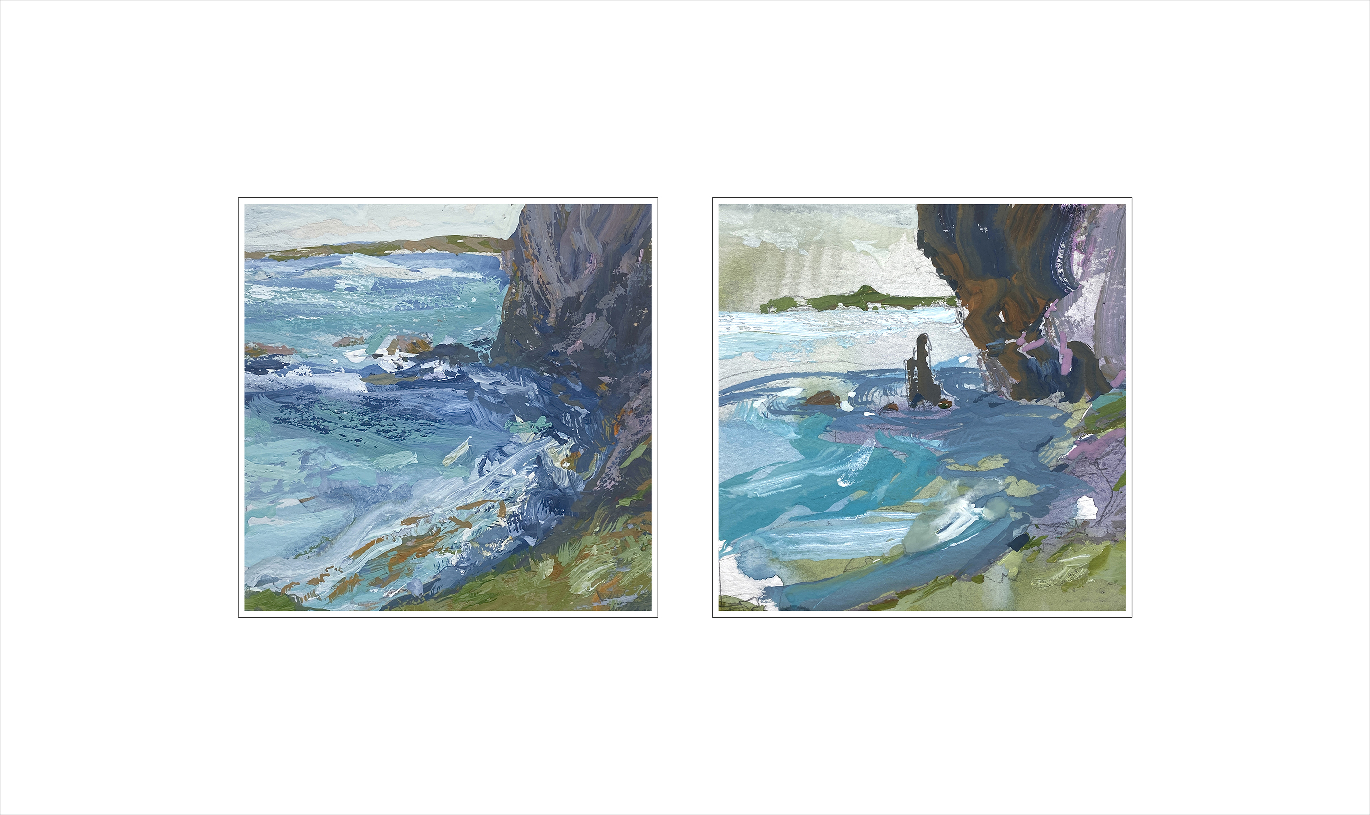
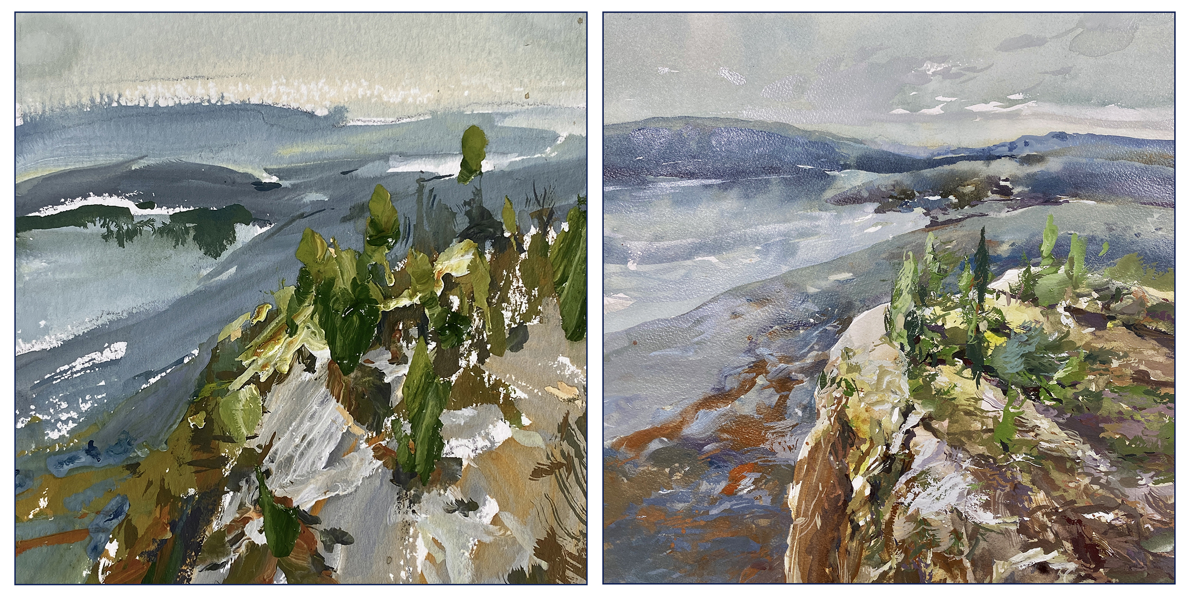
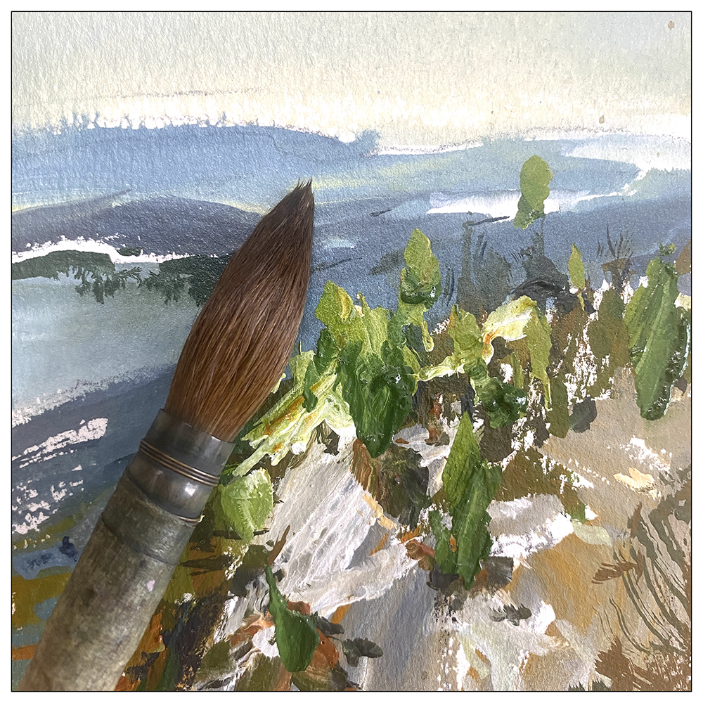
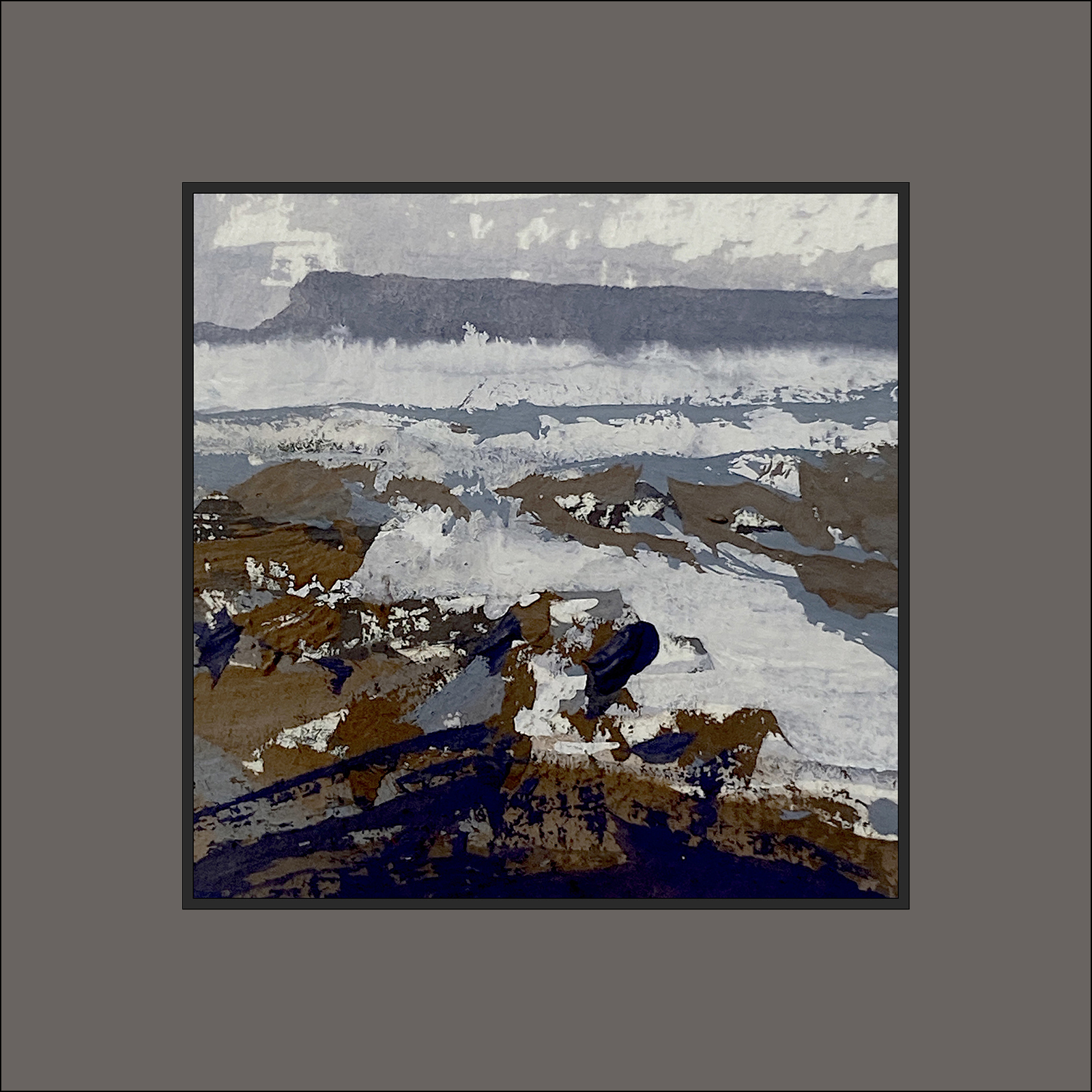
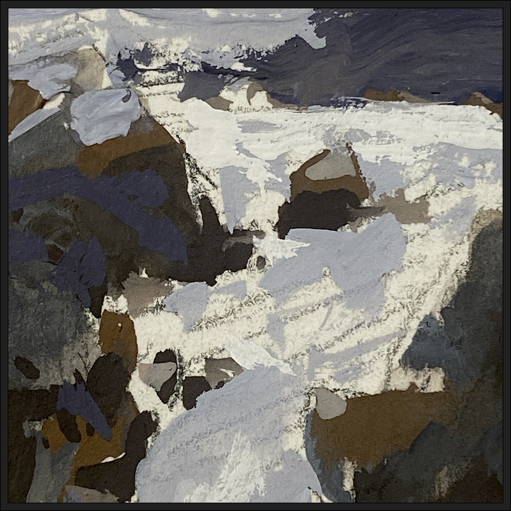
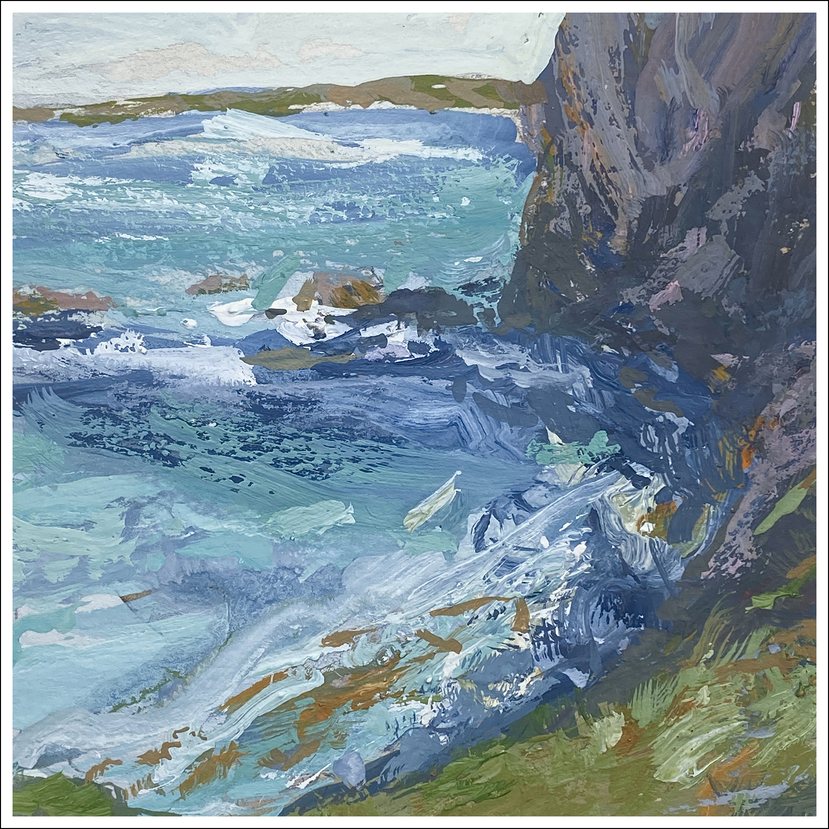
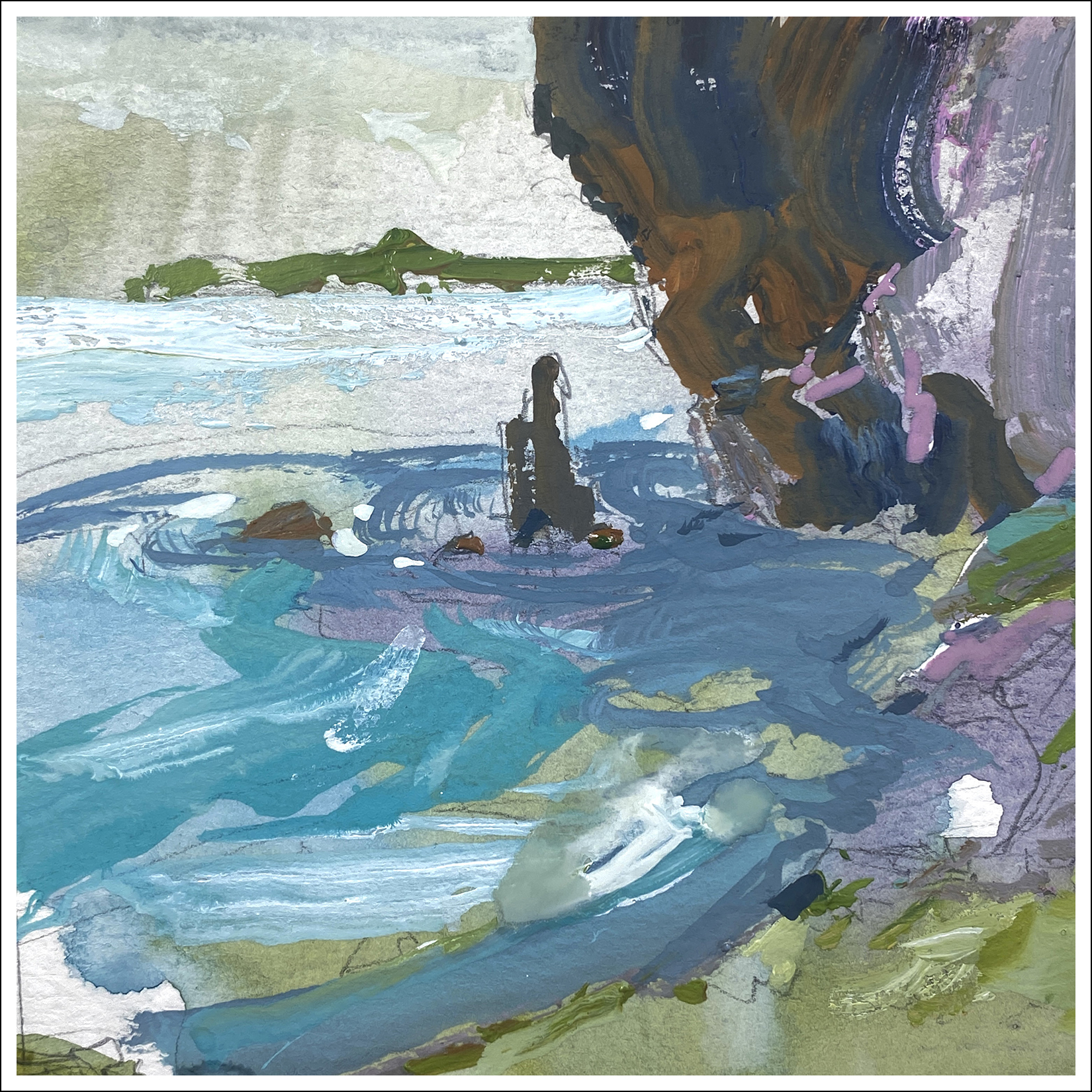
Two versions of; ‘Cliff over Tropical Water’.
First version on the left. It’s based on something I saw in a video. There’s a girl in a bikini in the foreground, she’s doing a hair flip, or dives off a boat, I can’t remember. We’ve all seen that video. I’m just here for the views of New Zealand – or wherever this was.
My first try felt overworked to me. Didn’t like the depth planes. Felt the water was too much of the same draggy texture.
Second version on the right – drastically simplified shapes.
Which would work better on the wall?
Maybe try not to think – “Which is the better painting?”
“Better” often means “Has more detail” or “Looks like a photo.”
Me, I prefer the second try. It has cleaner shapes that I can read across the room.
I suppose thinking out loud; I began my artistic life as a sketch artist and illustrator. Everything was about telling a specific story, documenting a time or place with my sketchbook. And; the final goal was the book itself. Seeing the art from arm’s length. The more I think about painting as the final goal, (being seen on the wall), my taste is changing to be more about composition and color; not so much about drawing.
I suppose it’s also a mode you go in and out of. If I’m in sketching-mode in a museum for instance, I draw completely differently. But when I look at my sketchbook drawings, they often seem like comic-book artwork these days? I don’t think of them as finished pieces anymore.
Ok ok! Rambling now!
So that’s Day Nine! So now I have to go get ready for the Video call we’re recording! Take care and keep painting! We’re just grinding up the hill, only 1/3 of the way!
~m

