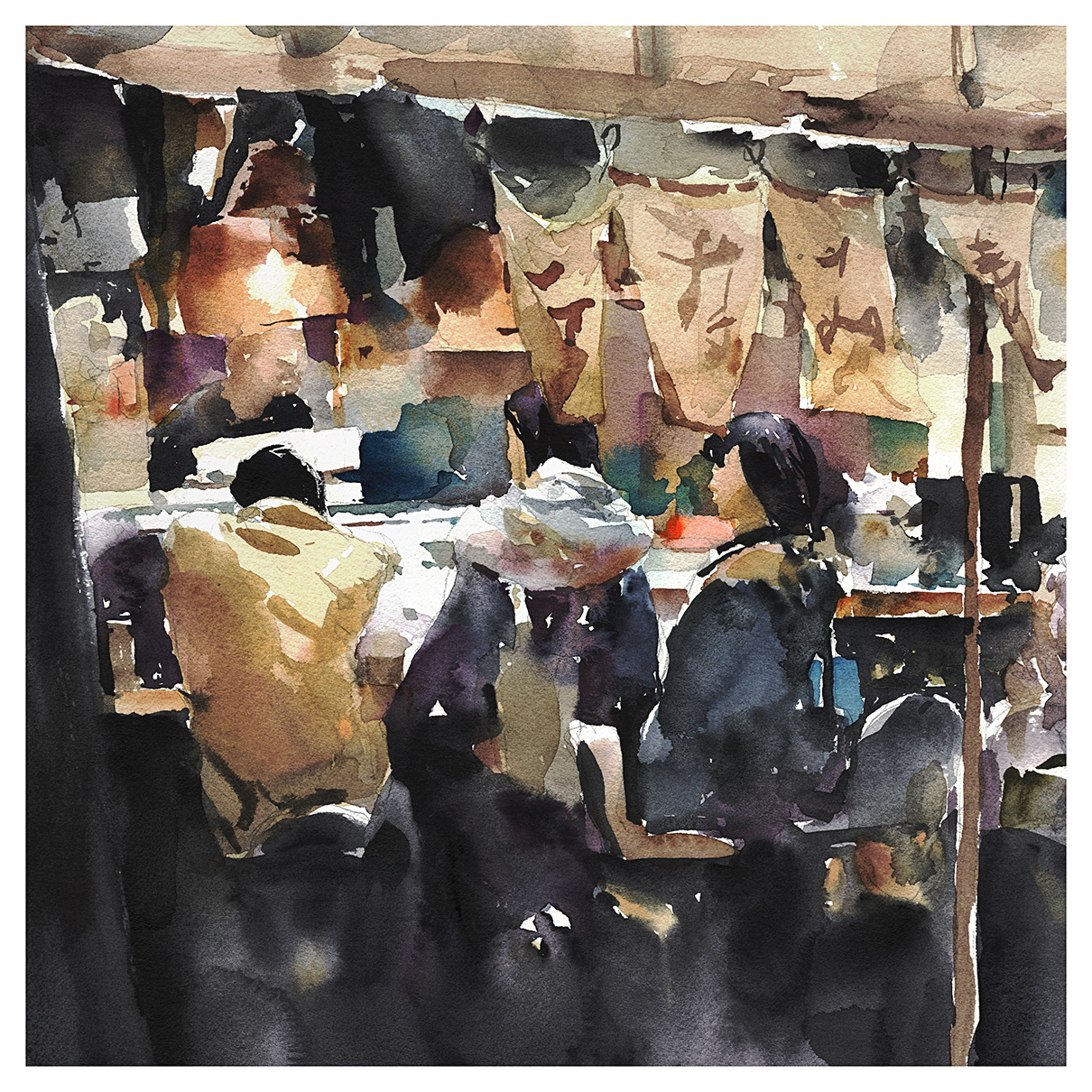
Day 23: Another exercise in abstraction.
I’ve turned the people into the simplest possible shapes, then built up everything around them in a mosaic of strokes.


Here’s the photo. Also found on the web, but the owner deleted themselves, and there’s no trace on reverse image search.
So – I’m of two minds about my painting. I mean, I like it – the balance between drawing and abstraction is good. But the photo is really quite strong. Quite a good story-composition.
As much as I say – artists worry too much about copyright – this is one case where I feel my work here doesn’t rise enough above the level of a copy.
Book Review: Hand Drawn Vancouver, by Emma FitzGerald
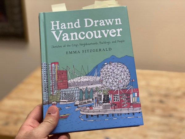
I have here in my hand a copy of Emma Fitzgerald’s third book, Hand Drawn Vancouver. <– affilate link, thx. (151pp, Appetite / Pengin Random House, $US19.95/$CDN24.97).
When Emma asked if I’d take an advance look, I was happy to agree. Who could say no to another one of her guided tours? I’m a big fan of her first two offerings: Hand Drawn Halifax and Sketch By Sketch Along Nova Scotia’s South Shore.
I gather she’s lived in a lot of places, and I think it’s given her the ability to be a local anywhere.
When she takes on a city, she walks it’s length and breadth in all four seasons, gathering stories and sketches, and a carefully-sifted collection of first-hand observations, eavesdropped conversations and street-side confessionals.
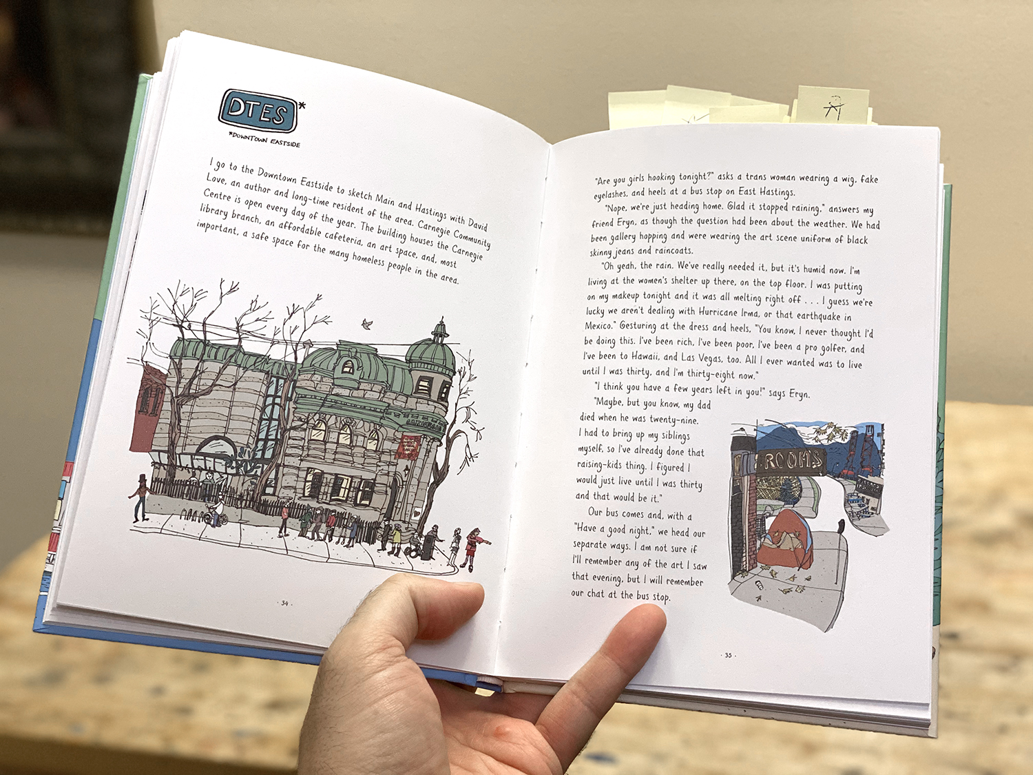
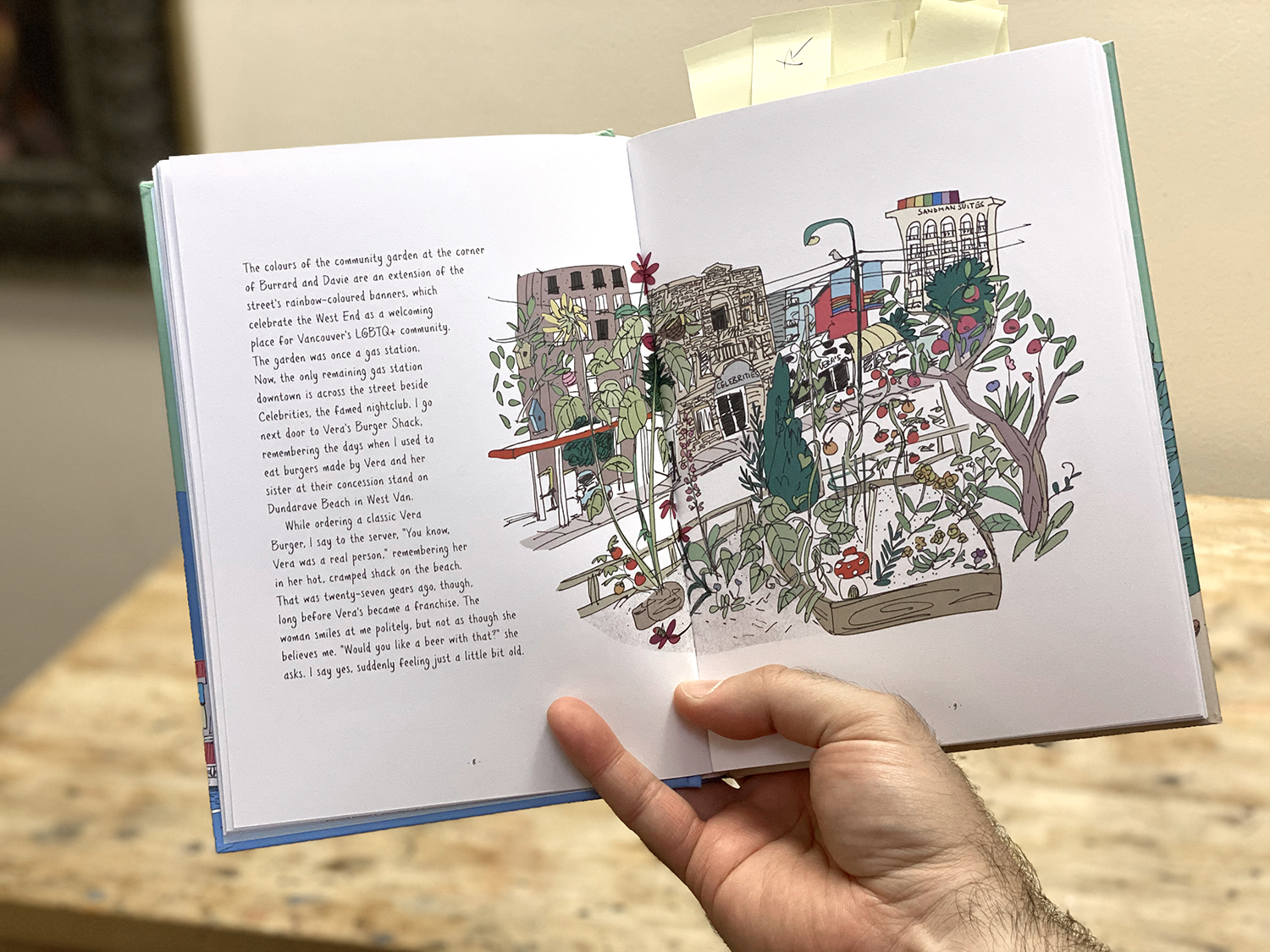
When you first flip through the book, it’s the charming drawings that grab you. Her keen-eyed, quirky sketches are fun and full of little details.
But it’s the stories that make you read every page – and in doing so, fall in love with Vancouver. Or, Emma’s version of a warm and friendly Vancouver with an undertone of real-world grit. Real people living real lives.
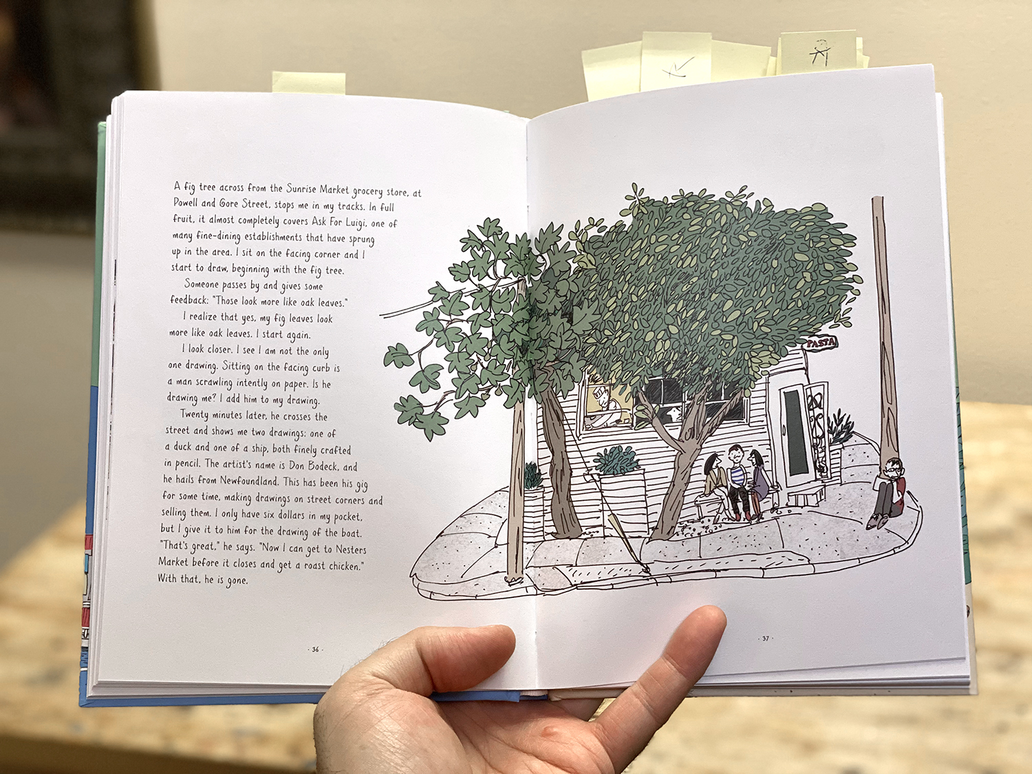
People love to find an artist sketching on the street. It seems to flip a switch that makes them willing to tell you the best stories. The way the world would be if you were everyone’s friend.
Emma’s book is full of exchanges with folks, that go from stranger to closest confidant in the time it takes to draw a line. It makes you want to live her life! She has a different world from the rest of us – with our earphones in and our podcasts playing.
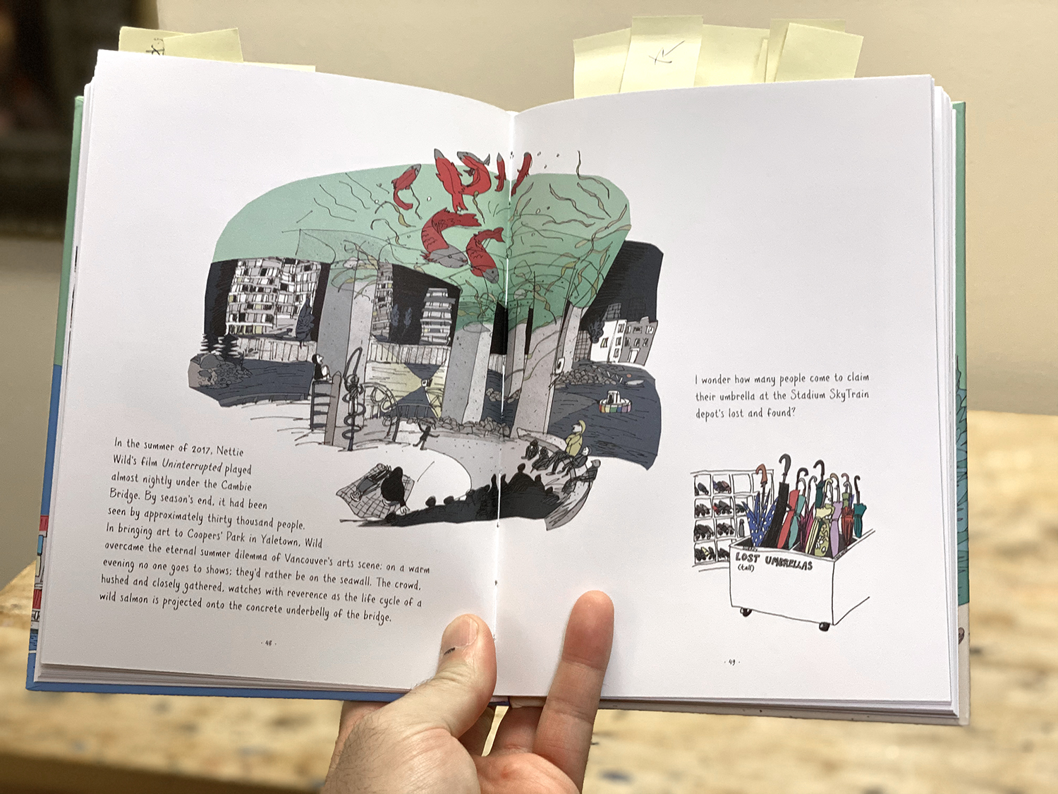
I highly recommend Hand Drawn Vancouver – whether you collect art books, or you’re looking for a souvenir of the city – or if you want the perfect gift for a visitor.
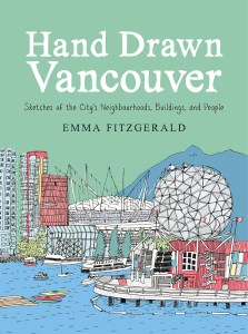 Hand someone this book and you’ll instantly accrue Emma’s hard-won street cred. They’ll feel like they know the town like a local born stepchild. There should certainly be a copy in every AirBnB in the city!
Hand Drawn Vancouver, Sketches of the City’s Neighbourhoods, Buildings and People, available in Print and ebook on June 23 on the usual online retailers, or direct from Random House Canada– or best of all – phone in an order with your local independent bookstore.
~m

Day 22: Problem Solving
So I’m dealing with this mandate: Dark. Abstract. Cinematic.
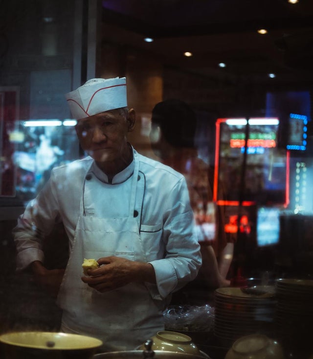
I found this photo in a street photography forum. Apologies to u/wannabenomads.
This kind of thing – with all the reflections – it’s an automatic introduction to abstraction. I just try and paint exactly what’s there, and end up with a Rothko.


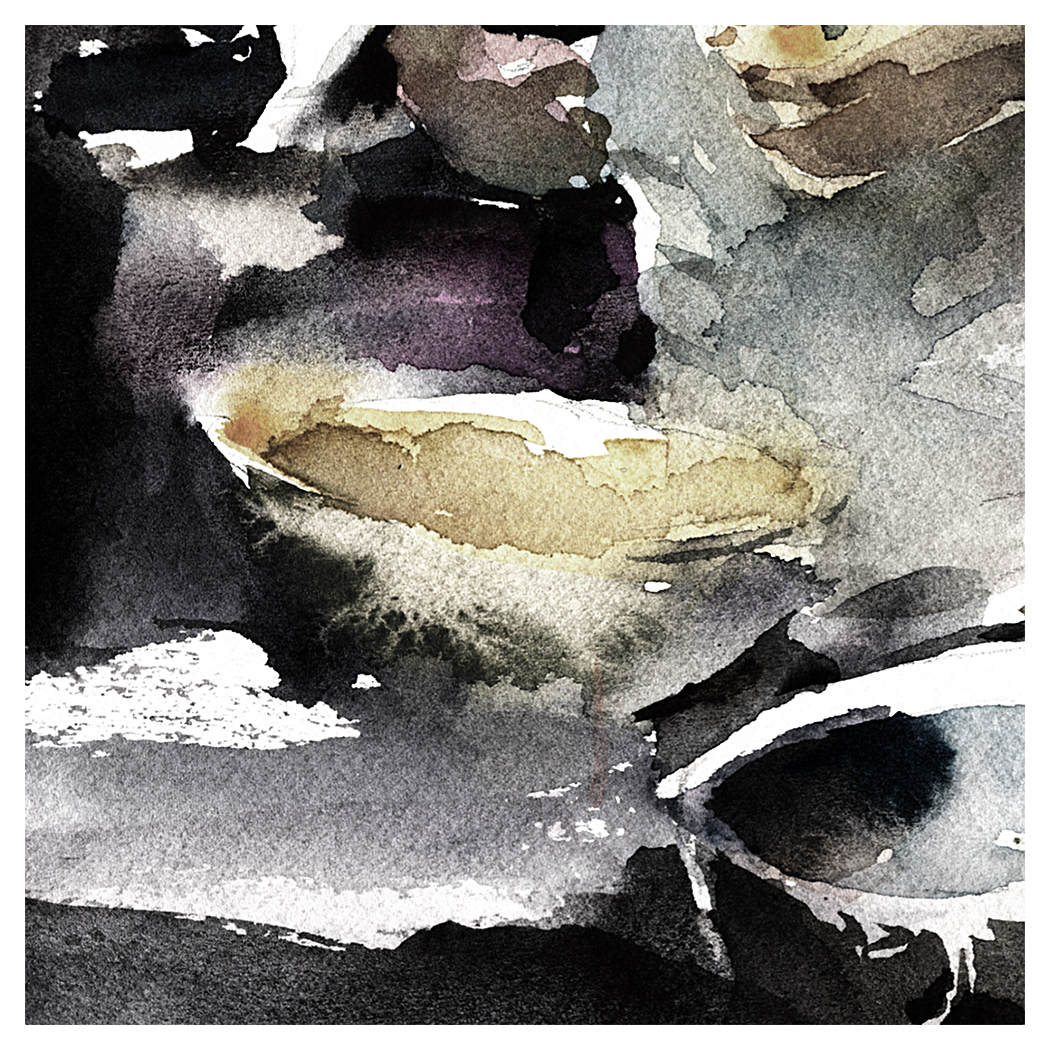
Day 21 : #30x30DirectWatercolor : Cormorant Fisherman

Day 21: Cormorant Fisherman
I was looking at all of my urban sketching reference material and thinking. Nope. Nothing here is not going to beat that rooftops painting. (Day 20).
Maybe I’m over-blowing it, but that’s how it goes :)
But also – this damned rooftop is my favorite thing lately – but it’s nothing like my stated goals. Which were to capture gritty, urban scenes. Potentially at night – but certainly with strong lighting.
Because – why?
I don’t now why.
I think I’m looking for something more dramatic. More cinematic anyway.
So I went back through the files with a new eye – and pulled out the best shots we have of people at work.
This is *also* nothing like my stated goals.
But let’s call it a warm-up.


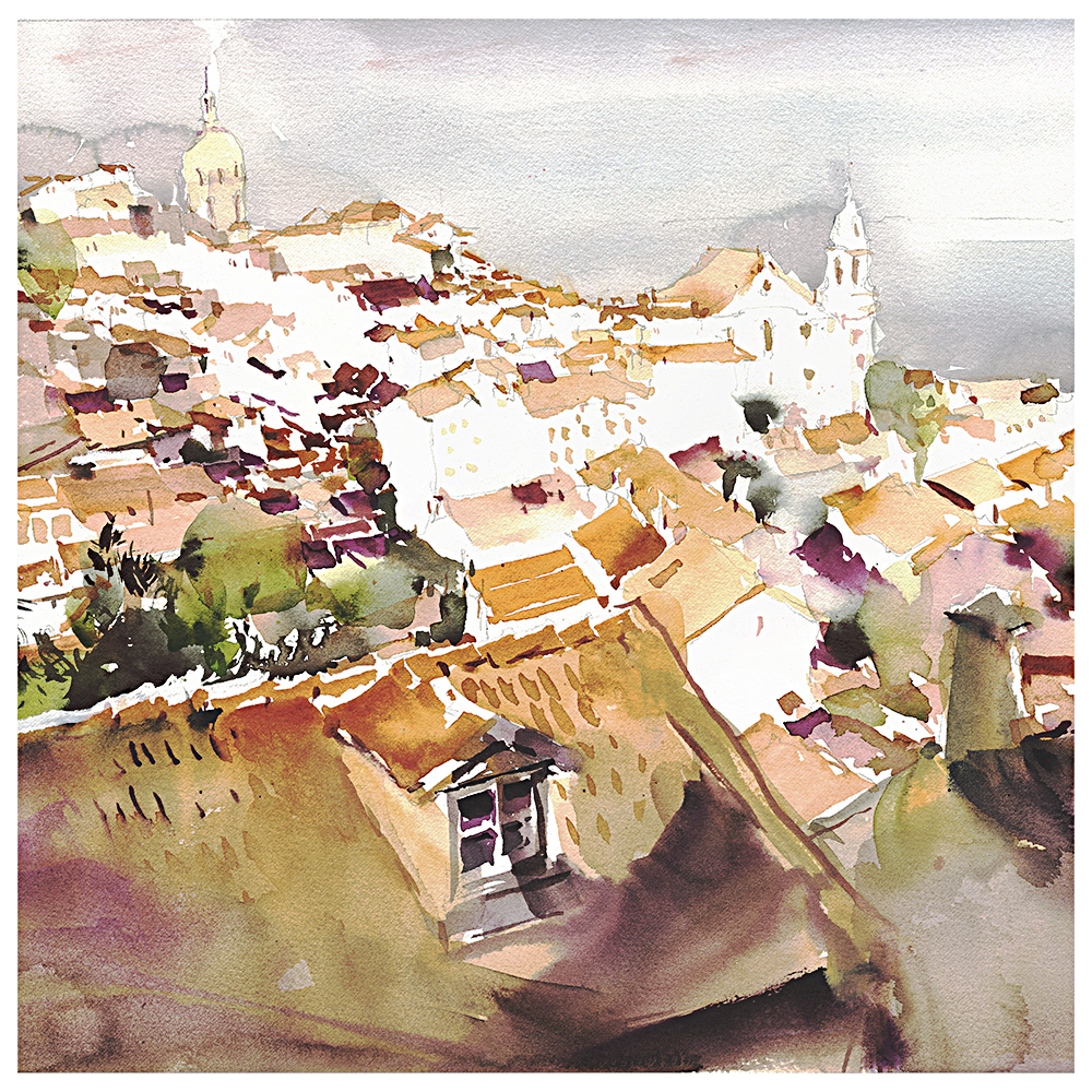
Day 20 : #30x30DirectWatercolor : Rooftops of Lisbon
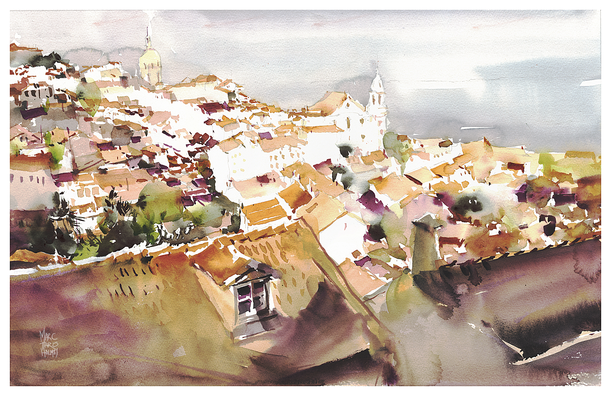
Day 20: Rooftops of Lisbon
I think it might not get better than this :)
This is the winner. If you’re allowed to call your own paintings winners.
Of course, I’m looking back with the benefit of hind-sight.
I paint these things ahead of the game, so I’m done my #30×30 before we start doing it as a group. (This year it took 17 days actually). It’s the only way I can keep up with the scanning, posting and social networking. Even though I’m asking you to do it! But hey – nothing’s stopping you! I’ve said it before – It’s 30 *consecutive* days – you can fudge WHICH thirty days – within reason :) It wouldn’t hurt to start a little early to avoid the rush at the finish line. One fellow told us he did 30 paintings on the FIRST DAY so he could relax for the rest of the marathon.
Anyway.
Honestly – before I was half way along, I knew this one was special.
I was getting nervous – like – don’t let there be an earthquake or something because this is a miracle.
My brush-work was going down just right. I had the measure of the paper, the perfect humidity.
The painting looks like a puzzle, but it felt like watching someone solve a Rubik’s cube. Like – I wasn’t even doing anything.
A genuine out-of-body-experience.
Musicians talk about getting to the point where they enjoy listening to themselves play. This must be the equivalent.
This is why, looking back after all these years – I really feel it’s not about finding the right teacher or buying the right supplies. Those things help. But so does getting a good breakfast every morning.
It isn’t what your brain knows. It’s what your hands know.

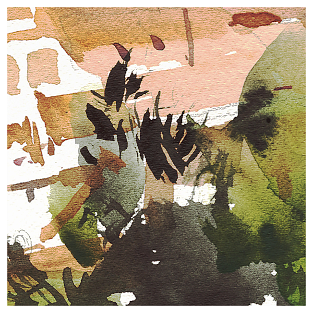

Day 19 : #30x30DirectWatercolor : Lisbon Train Station
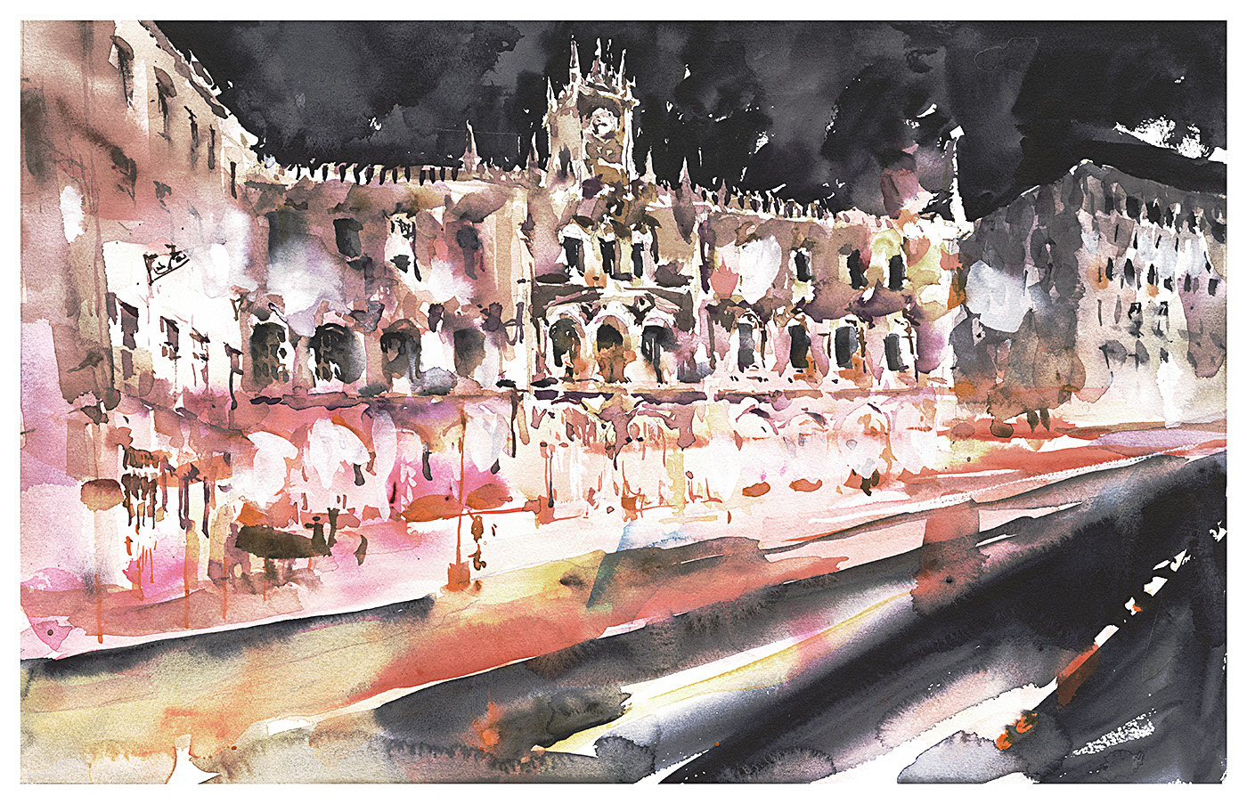
Day 19:
There’s a reliable pattern to a painting marathon. You start out tentative, maybe a little rusty. You push through some bad ones, some exercises, and suddenly there’s a peak – (a little too close to the middle for my liking) – when you hit your stride. You’re doing things you never expected.
Making breakthroughs!
Or at least, taking risks – based on new-found confidence.
This is the point where you have enough good work in the bag you won’t be ashamed of yourself, but you haven’t beaten your personal-best yet either.
It’s a public performance after all – so you find yourself willing to bang out a piece you’d frankly have been scared to try previously.
It’s time to go big, or go home.

If I had to put a finger on it, I’d say what’s changing is my use of brushstrokes, versus shapes.
In the past I might have emphasized fusing all the strokes within a silhouette. So every wet shape is solidly melted together. (If you’re a regular reader, I’m sure you’ve heard me say that.)
Right now, I’m willing to leave things broken up. It’s turning into individual brush-marks floating and layering over each other – building up a mosaic.
Maybe this is coming from my last two years of oil painting?
I don’t know, but I’m open to where it’s going.

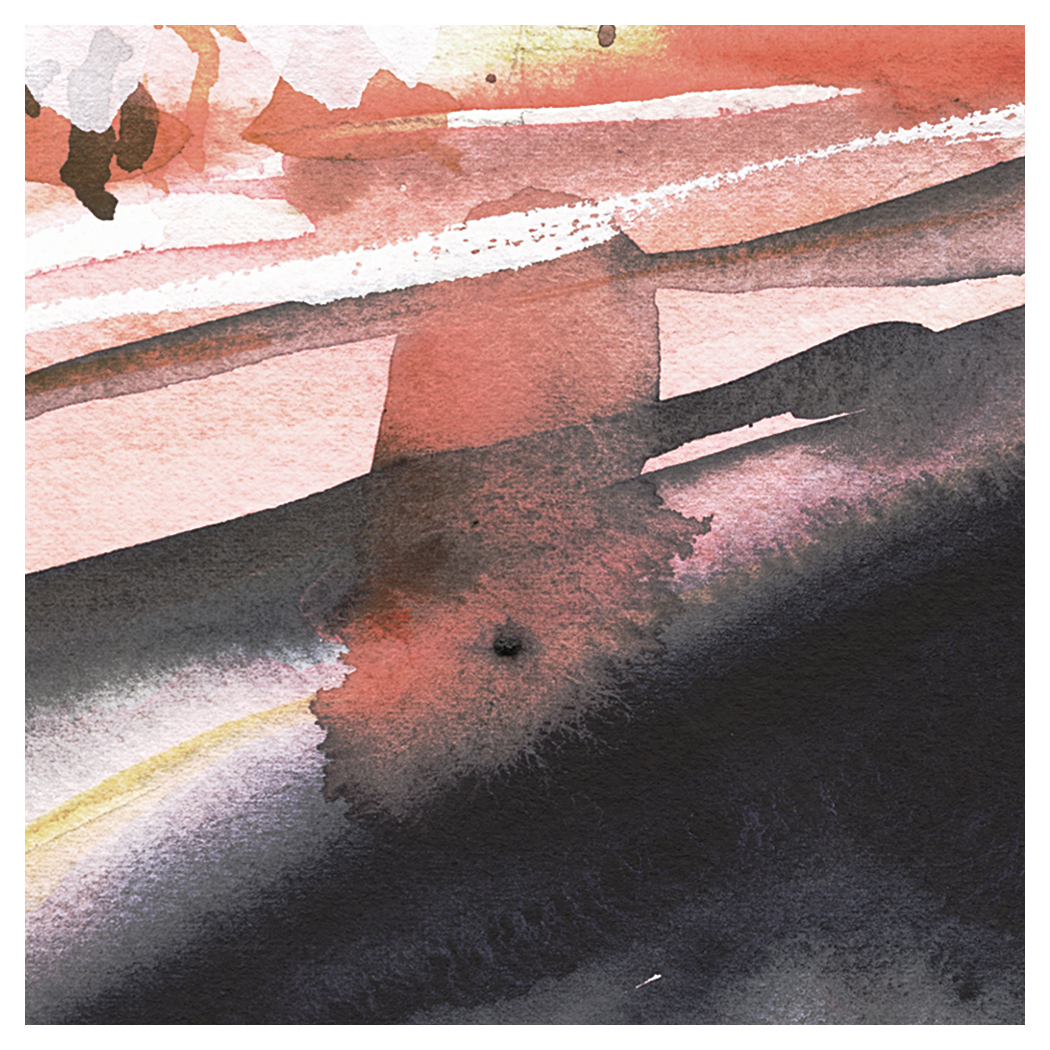
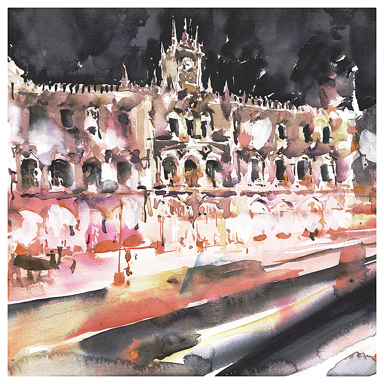
Day Eighteen! Here’s our chat about Uma’s paintings at the halfway point.
As with all of these – thanks for anyone who’s interested enough to watch our un-edited conversations. I hope some people find these helpful. I feel a lot of what we say about each others work could well apply to anyone’s painting. So – here you go!
Enjoy!
~m
Day Seventeen:
Our third chat – Uma Crits Marc at the halfway (ish) point in the marathon!
~m
Day 16 : #30x30DirectWatercolor : Cortona Redux

Day 16: A side street in Cortona, Italy.
This one is intersting – because I can show you the painting I made on location, back in 2015.
Fascinating how different the color is eh? Is that due to working from a photo? Or just my sensibility changing?

I’m not sure – but I can say, the new foliage looks like it’s transmitting sunlight – where the old plants look plastic, despite the intense sun.
The old painting has this rusty orange sense of heat. The light is bleached out and high-key. It was brutal – painting out in the sun. (Crazy tourists!)
In the new painting, the drawing of the street is better – the perspective is less cheated – Because of the reference? I don’t see why, because I could have measured just as easily in real life. Just new skills I guess. Maybe because it’s easier to slow down and check things when you’re working in the comfort of home.
Either way – there’s more depth and subtlety now. I can see myself improving!
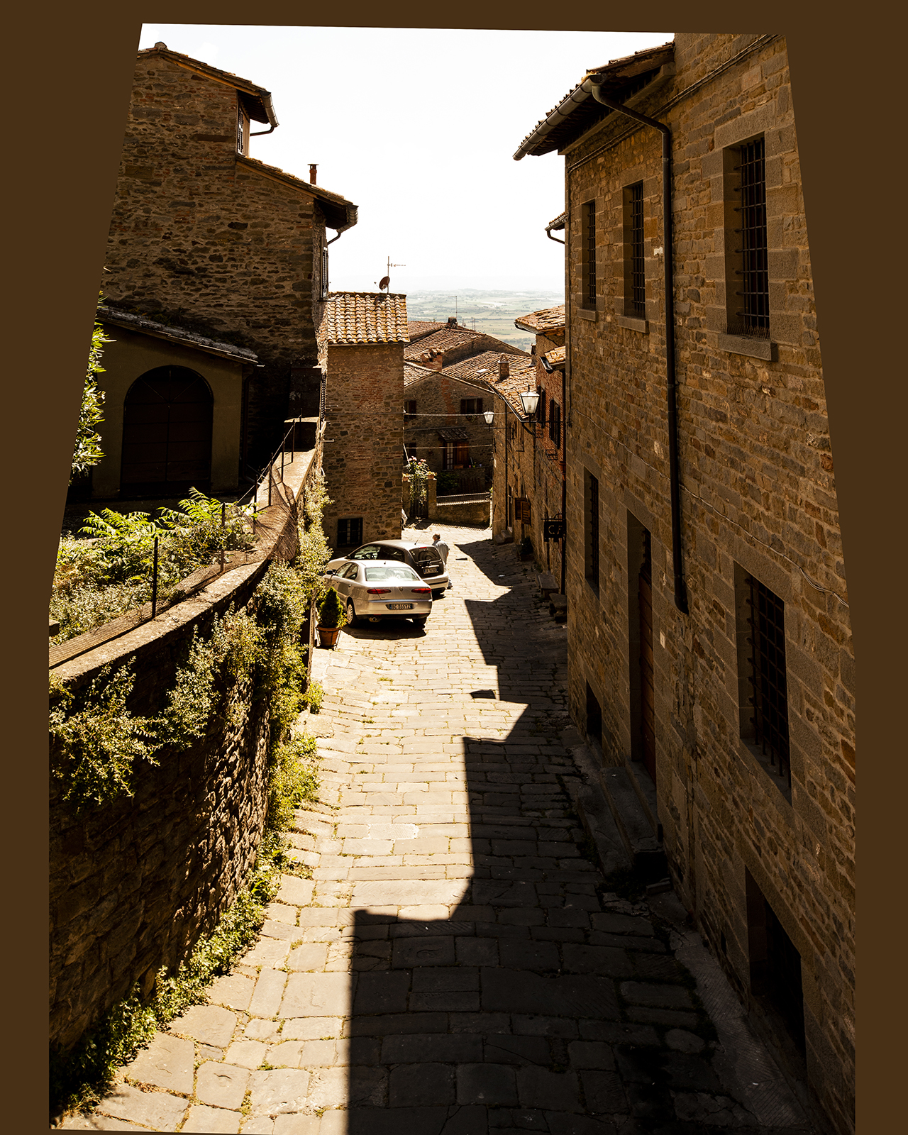
Here by the way, is the photoshop-tweaked-photo I worked from.
The weird angles on the sides are an effect left over after perspective correction. I’ve removed the wide-angle distortion of the lens, so it’s closer to how the human eye sees it. But then I just add back in my own wonky perspective :)
I guess that’s how I roll.
You’re welcome by the way to use any of these photographs on the blog for your own sketches. Or even copy the paintings if you want.
Take care – and see you tomorrow with new videos!
We’ll have part three of our critique going up – discussing the last few days paintings, and – two more big surprises!
Day 14 : #30x30DirectWatercolor : Skip Day!
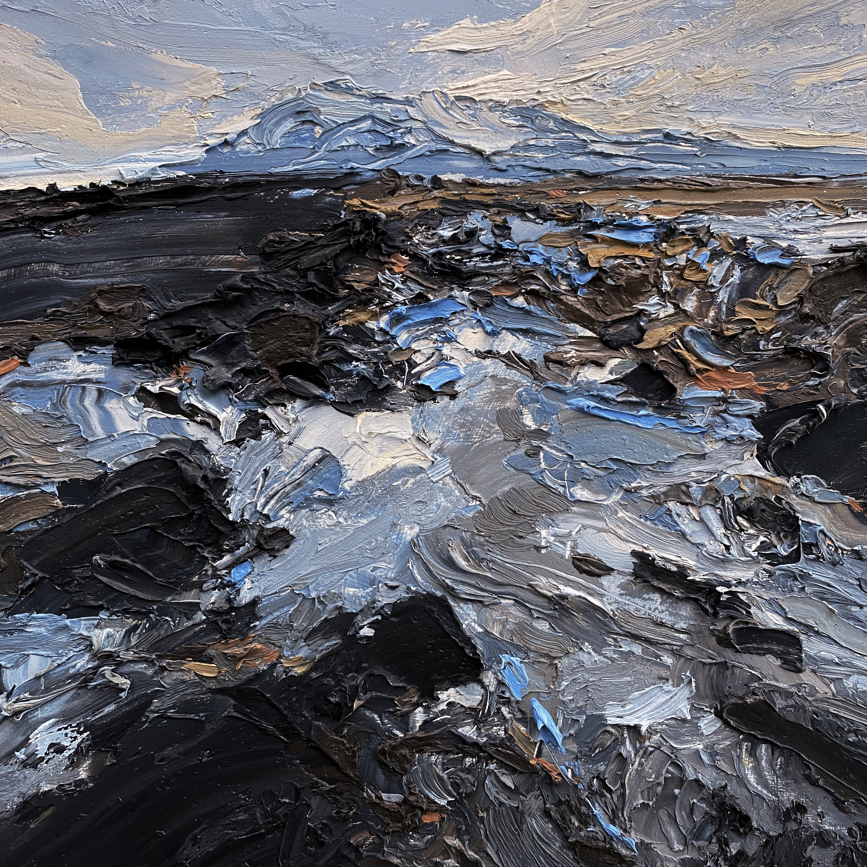
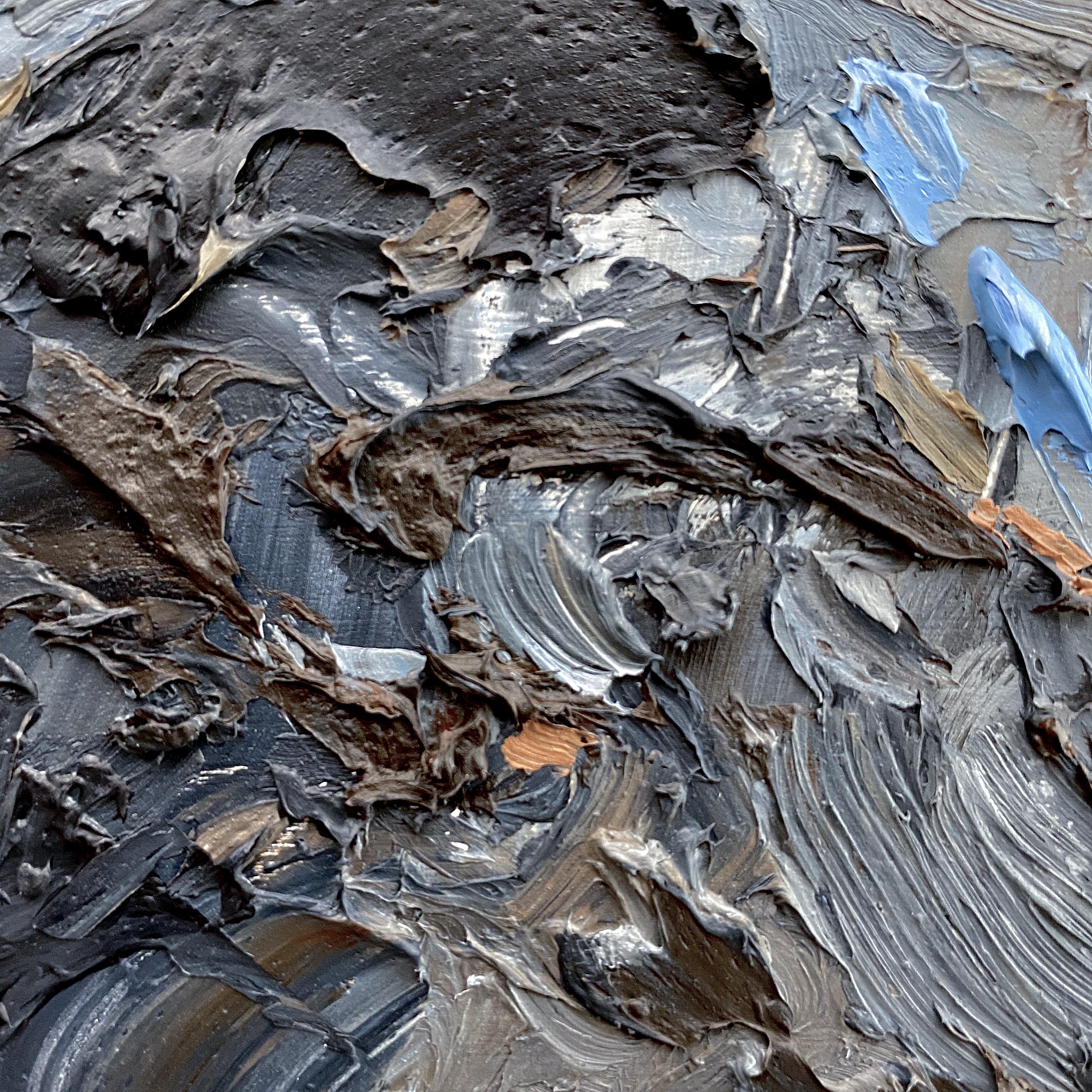
[ The North Remembers, 10×10″ Oil on Panel ]
Didn’t Paint Today! Here’s an old one!
I initially thought what I was doing with my impasto oil paintings was completely different than my watercolors. But – the more I look at them, the more I realize – I can only paint the way I paint. The medium might change the look, but the thinking, or the ‘way of seeing’ is the same.